── Attaching core tidyverse packages ──────────────────────── tidyverse 2.0.0 ──
✔ dplyr     1.1.1     ✔ readr     2.1.4
✔ forcats   1.0.0     ✔ stringr   1.5.0
✔ ggplot2   3.4.1     ✔ tibble    3.2.1
✔ lubridate 1.9.2     ✔ tidyr     1.3.0
✔ purrr     1.0.1
── Conflicts ────────────────────────────────────────── tidyverse_conflicts() ──
✖ dplyr::filter() masks stats::filter()
✖ dplyr::lag()    masks stats::lag()
ℹ Use the ]8;;http://conflicted.r-lib.org/conflicted package]8;; to force all conflicts to become errorsVisualizing geospatial data I
Lecture 18
Visualizing geographic areas
Without any projection, on the cartesian coordinate system
Mercator projection
Meridians are equally spaced and vertical, parallels are horizontal lines whose spacing increases the further we move away from the equator
Mercator projection
without the weird straight lines through the earth!
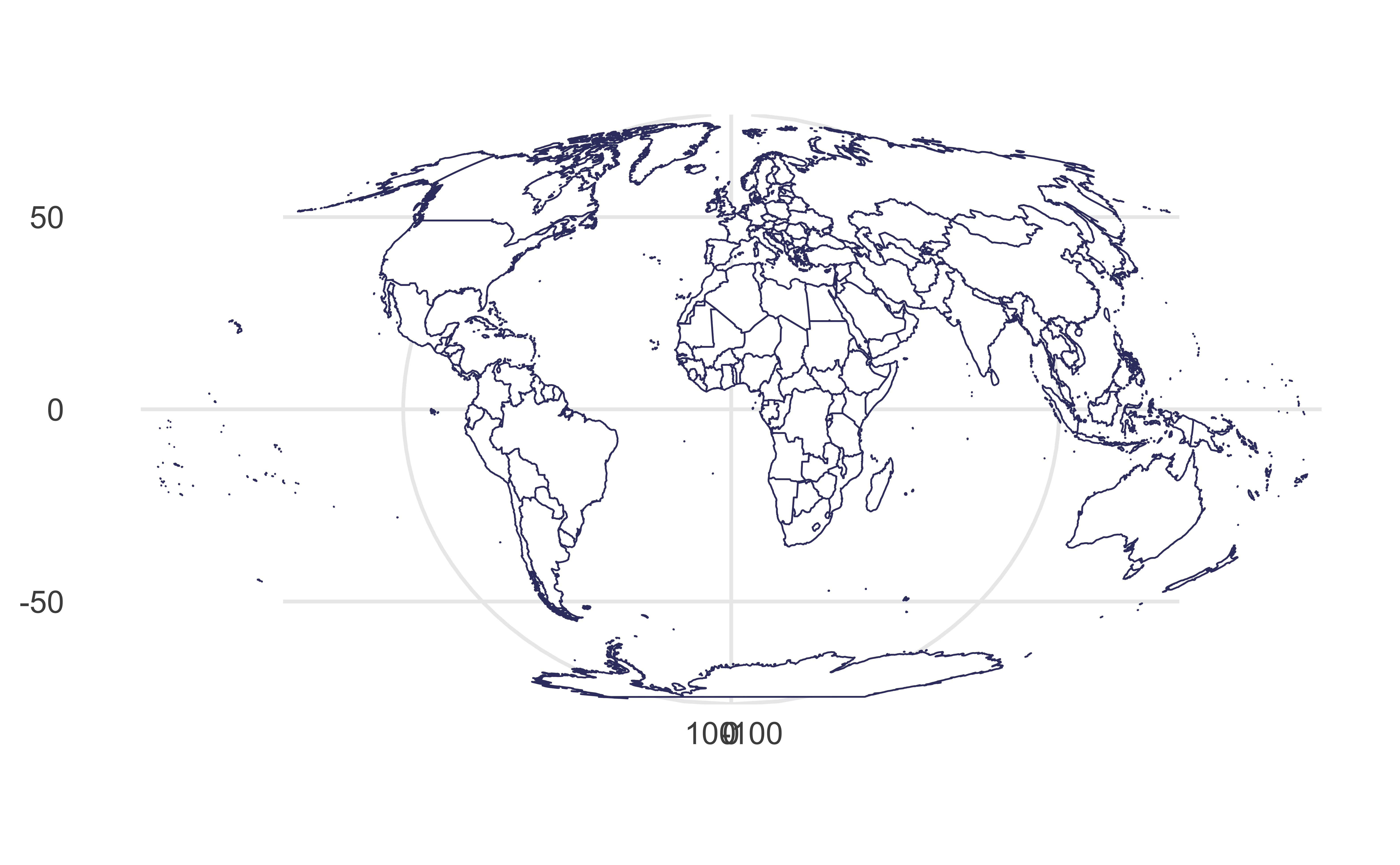
Sinusoidal projection
Parallels are equally spaced
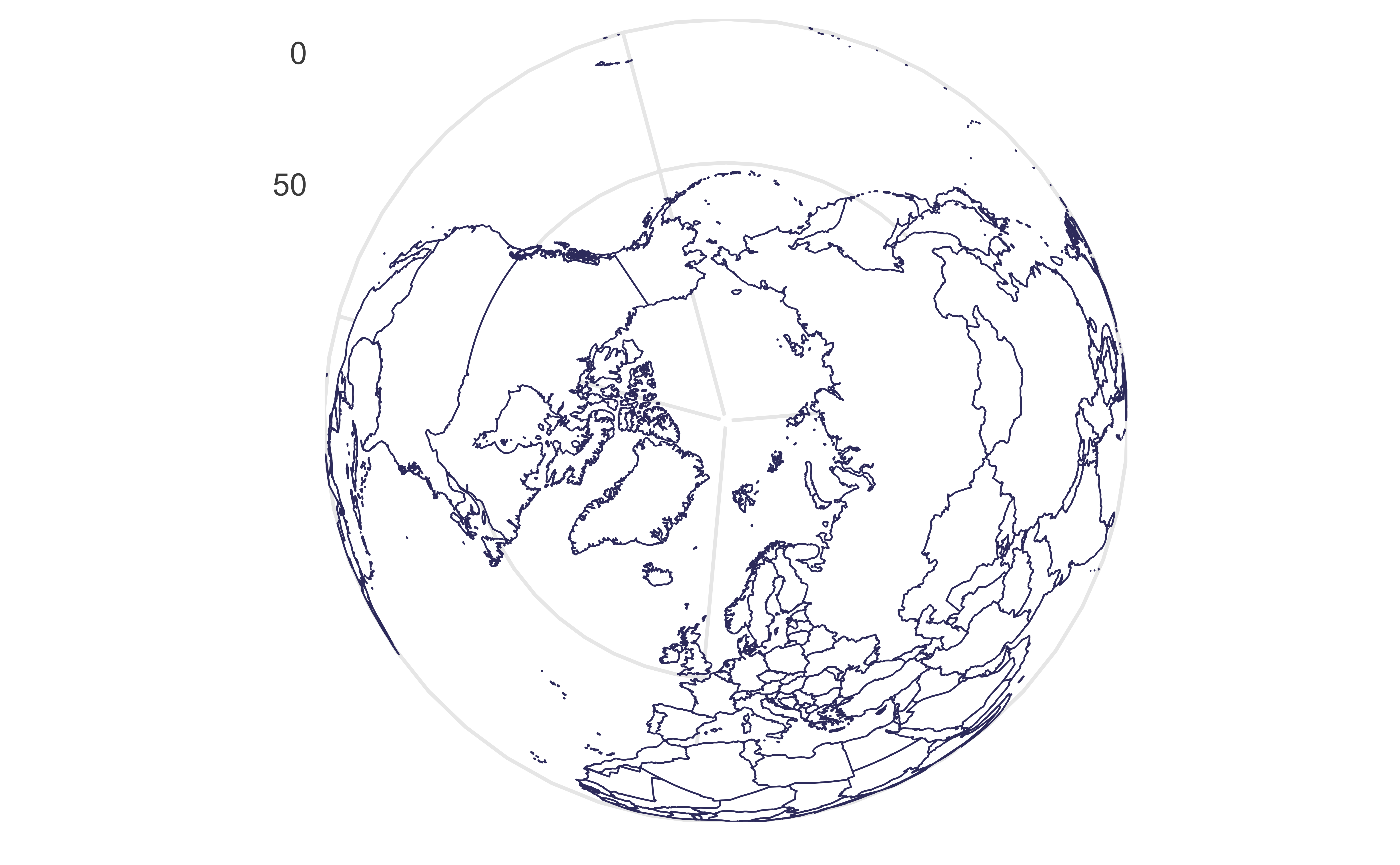
Orthographic projection
Viewed from infinity
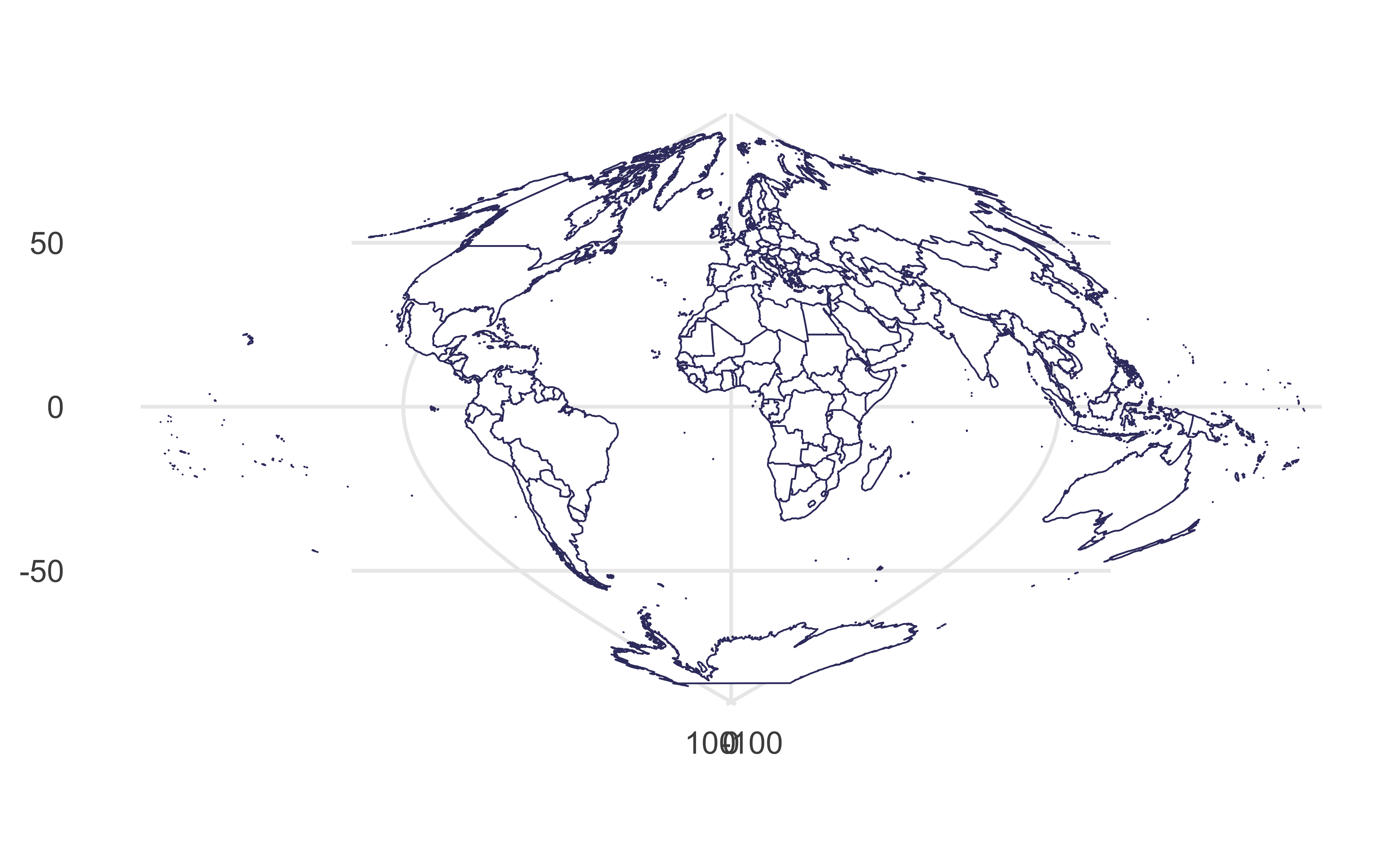
Mollweide projection
Equal-area, hemisphere is a circle
Visualizing distances
Draw a line between Istanbul and Los Angeles.
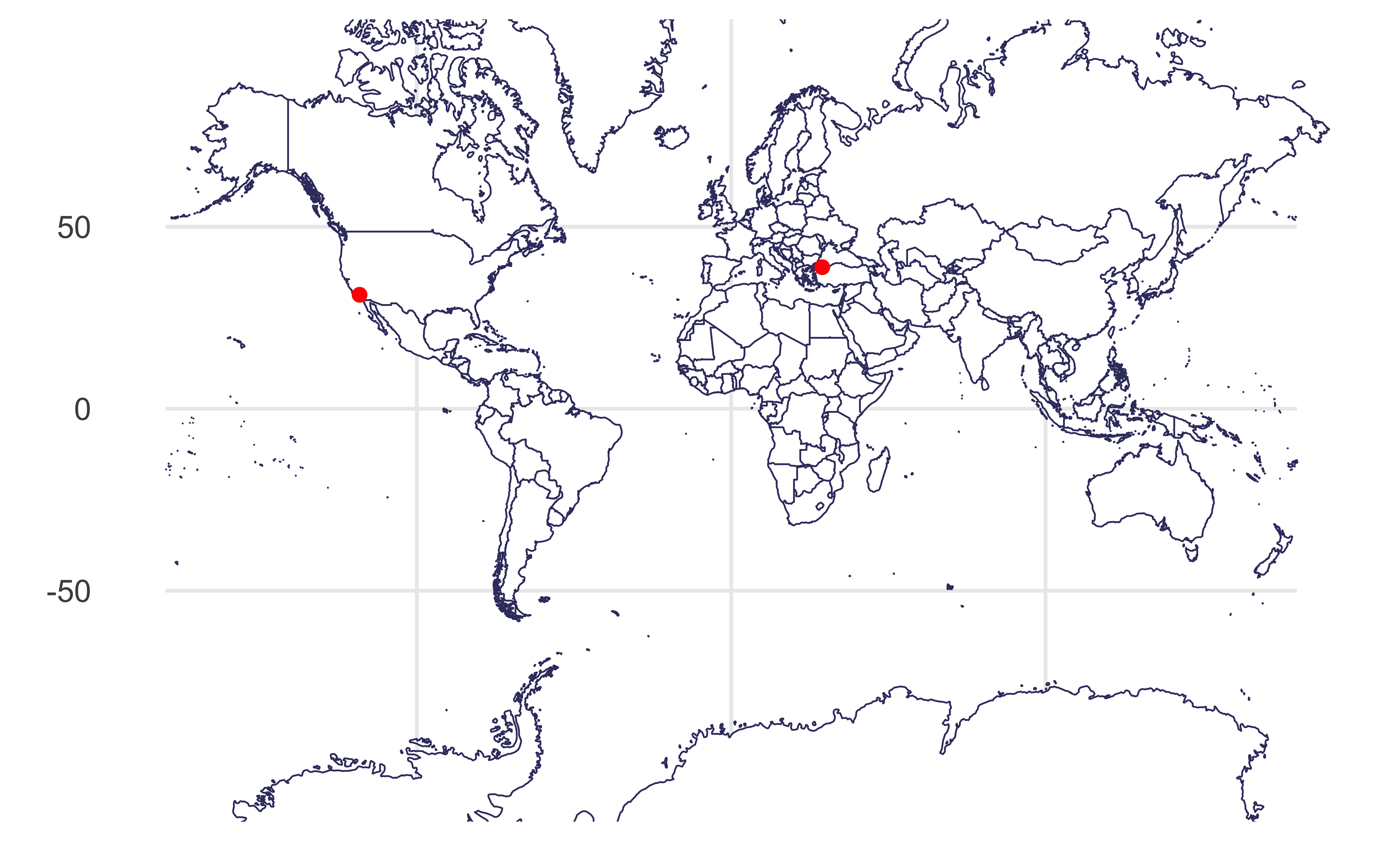
Visualizing distances
As if the earth is flat:
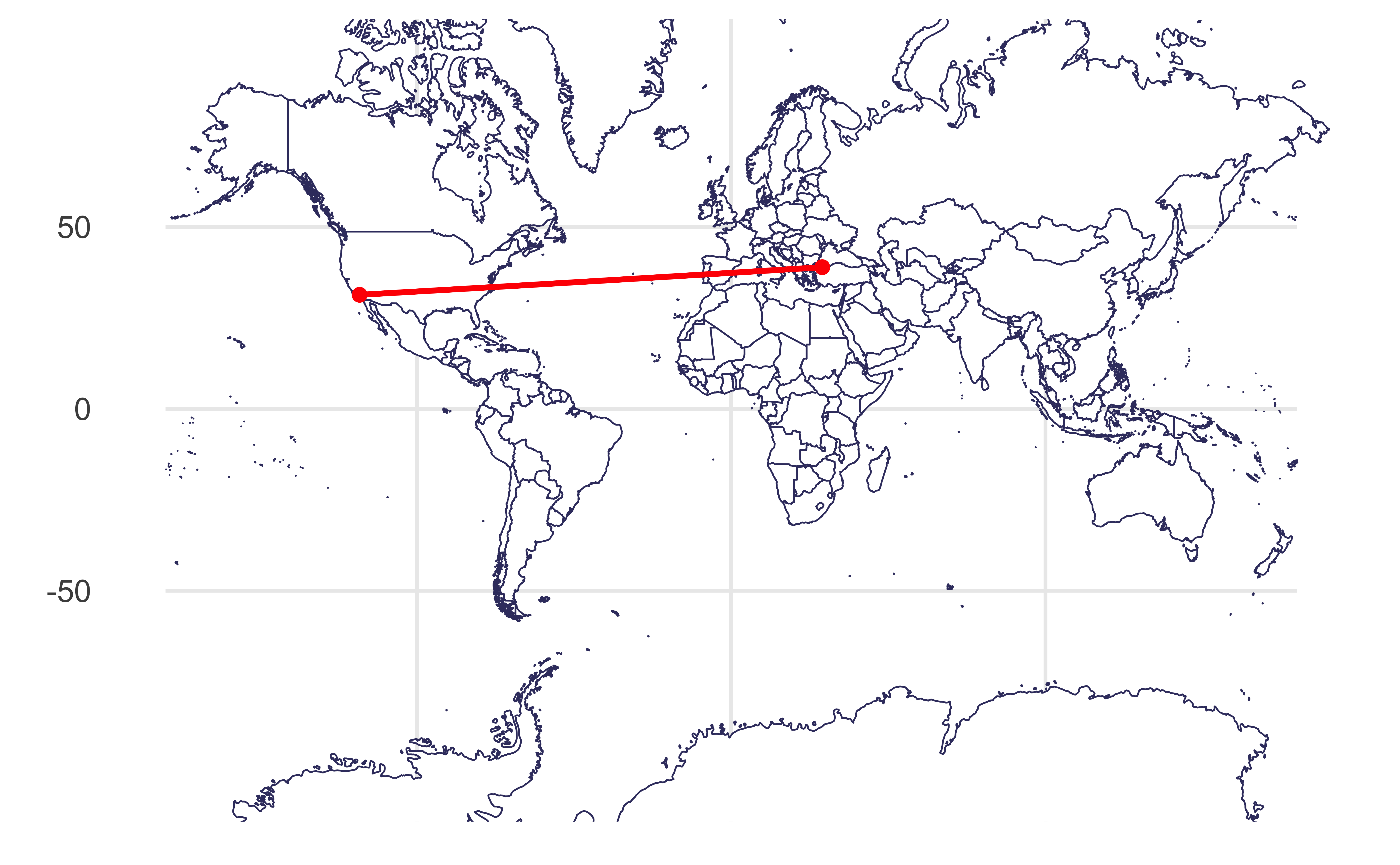
Visualizing distances
Based on a spherical model of the earth:
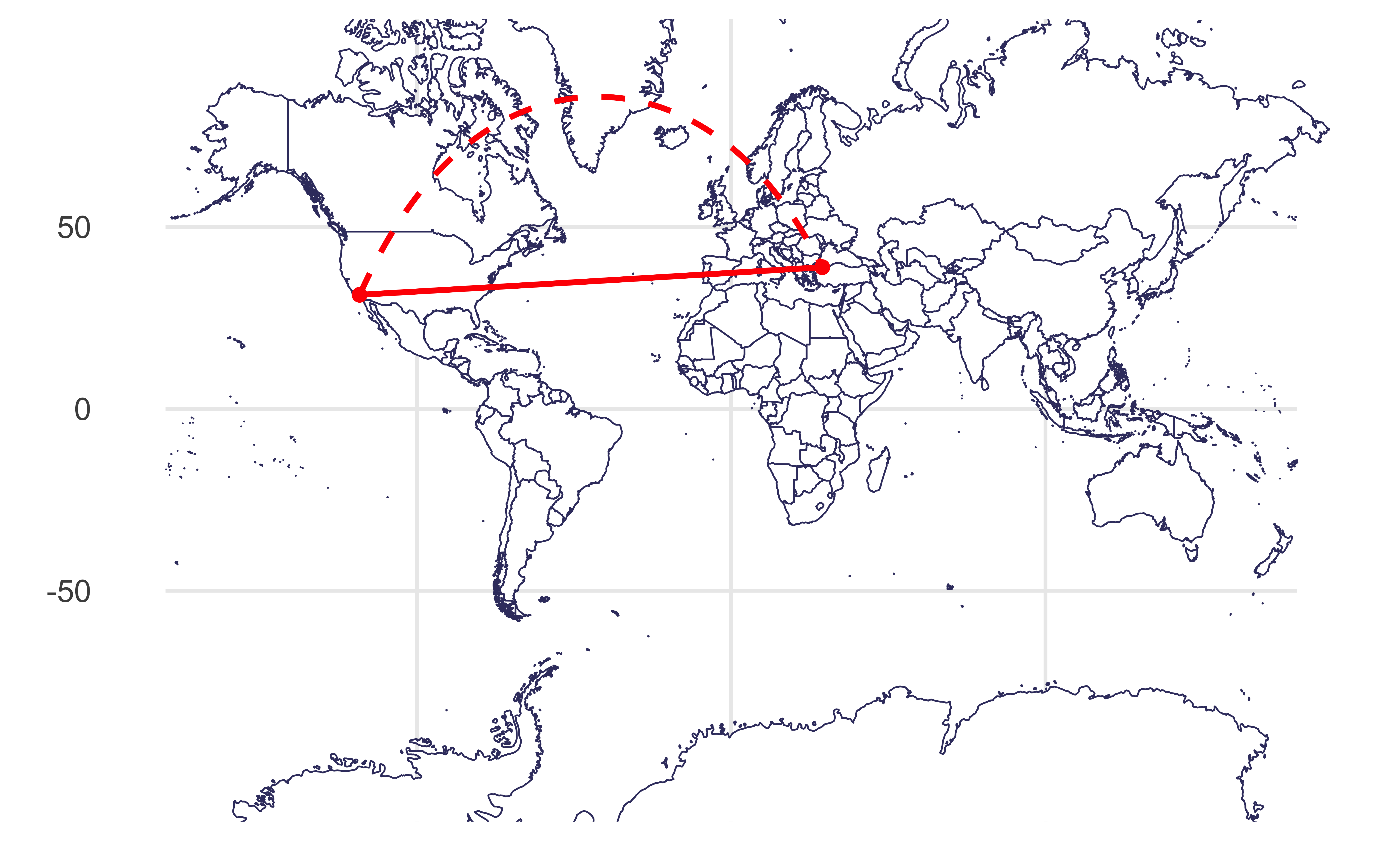
Plotting both distances

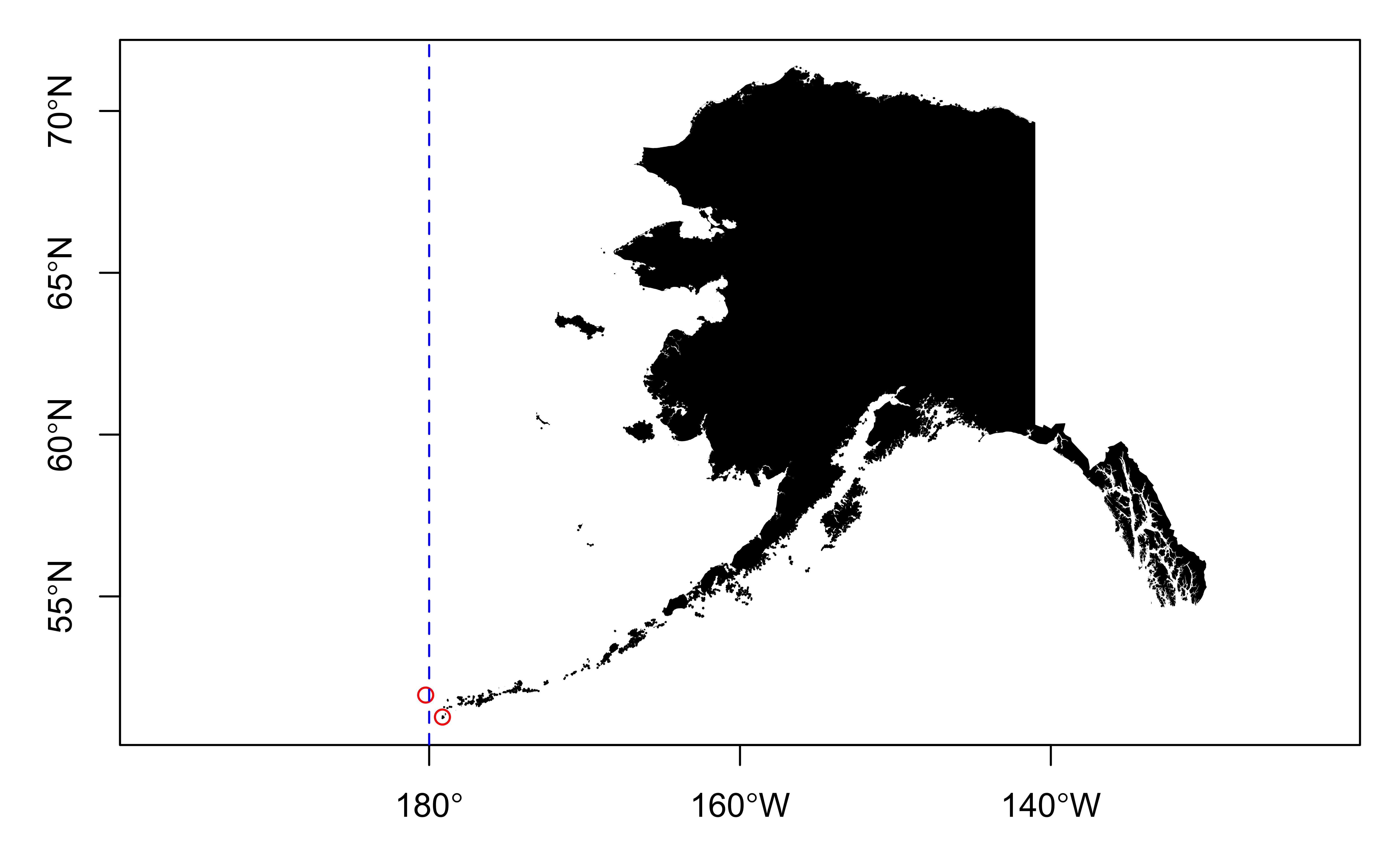
Dateline
Improve
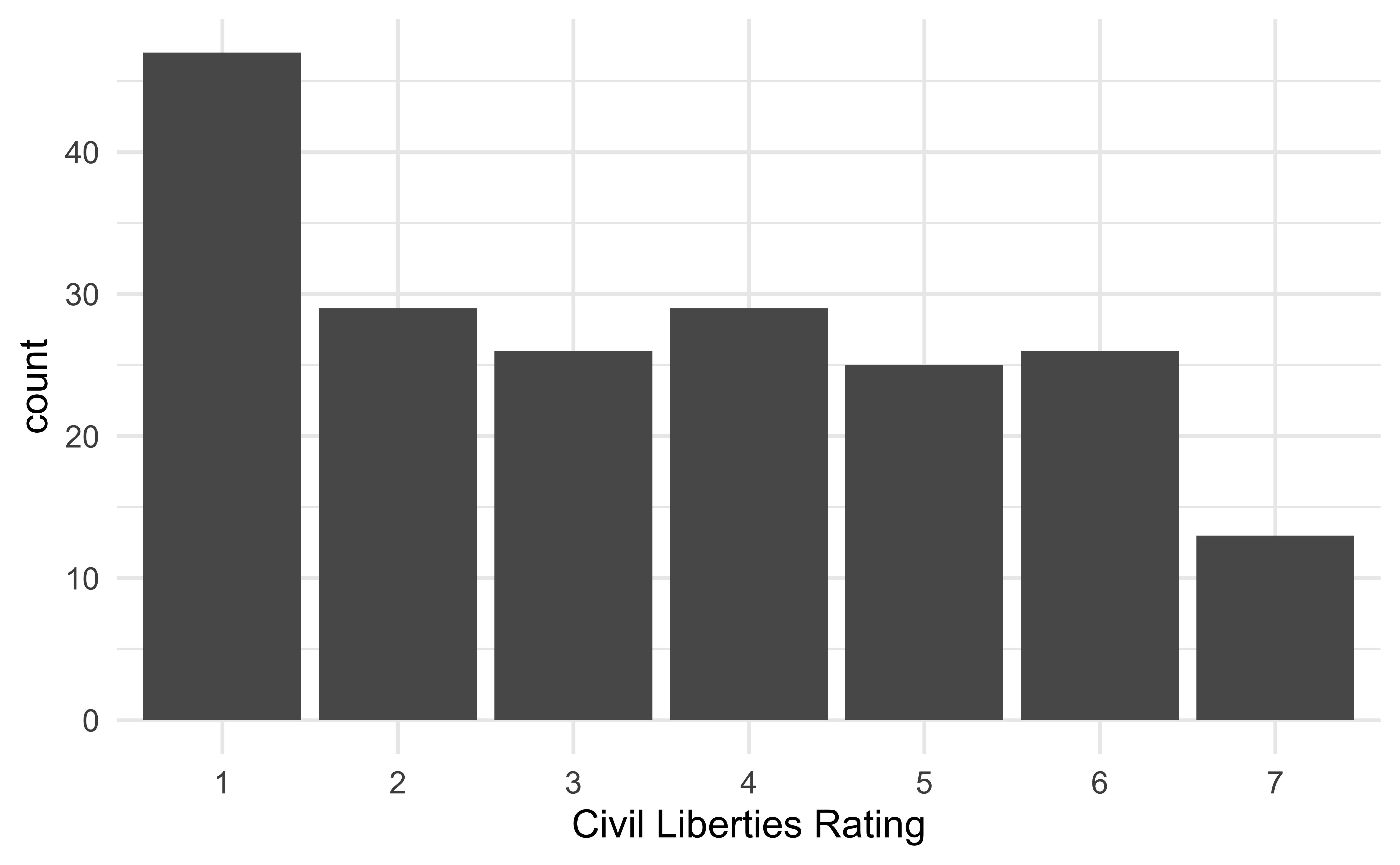
The following visualization shows the distribution civil liberties ratings (1 - greatest degree of freedom to 7 - smallest degree of freedom). This is, undoubtedly, not the best visualization we can make of these data. How can we improve it?
Mapping the world

Mapping freedom
What is missing/misleading about the following map?

Let’s map!

Facet by location
Warning: Removed 1802 rows containing non-finite values
(`stat_align()`).
Geofacet by state

Geofacet by state, with improvements
Geofacet by state + presidential election result
us_state_vaccinations |>
  left_join(election_2020, by = c("location" = "state")) |>
  ggplot(aes(x = date, y = people_fully_vaccinated_per_hundred)) +
  geom_area(aes(fill = win)) +
  facet_geo(~location) +
  scale_y_continuous(limits = c(0, 100), breaks = c(0, 50, 100), minor_breaks = c(25, 75)) +
  scale_x_date(breaks = c(ymd("2021-01-01", "2021-05-01", "2021-09-01")), date_labels = "%b") +
  scale_fill_manual(values = c("#2D69A1", "#BD3028")) +
  labs(
    x = NULL, y = NULL,
    title = "Covid-19 vaccination rate in the US",
    subtitle = "Daily number of people fully vaccinated, per hundred",
    caption = "Source: Our World in Data",
    fill = "2020 Presidential\nElection"
  ) +
  theme(
    strip.text.x = element_text(size = 7),
    axis.text = element_text(size = 8),
    plot.title.position = "plot",
    legend.position = c(0.93, 0.15),
    legend.text = element_text(size = 9),
    legend.title = element_text(size = 11),
    legend.background = element_rect(color = "gray", size = 0.5)
)![]()
Geofacet by state + presidential election result