# load packages
library(countdown)
library(tidyverse)
library(scales)
library(ggthemes)
library(coloratio) # devtools::install_github("matt-dray/coloratio")

# set theme for ggplot2
ggplot2::theme_set(ggplot2::theme_minimal(base_size = 14))

# set width of code output
options(width = 65)

# set figure parameters for knitr
knitr::opts_chunk$set(
  fig.width = 7,        # 7" width
  fig.asp = 0.618,      # the golden ratio
  fig.retina = 3,       # dpi multiplier for displaying HTML output on retina
  fig.align = "center", # center align figures
  dpi = 300             # higher dpi, sharper image
)Data visualization accessibility
Lecture 14
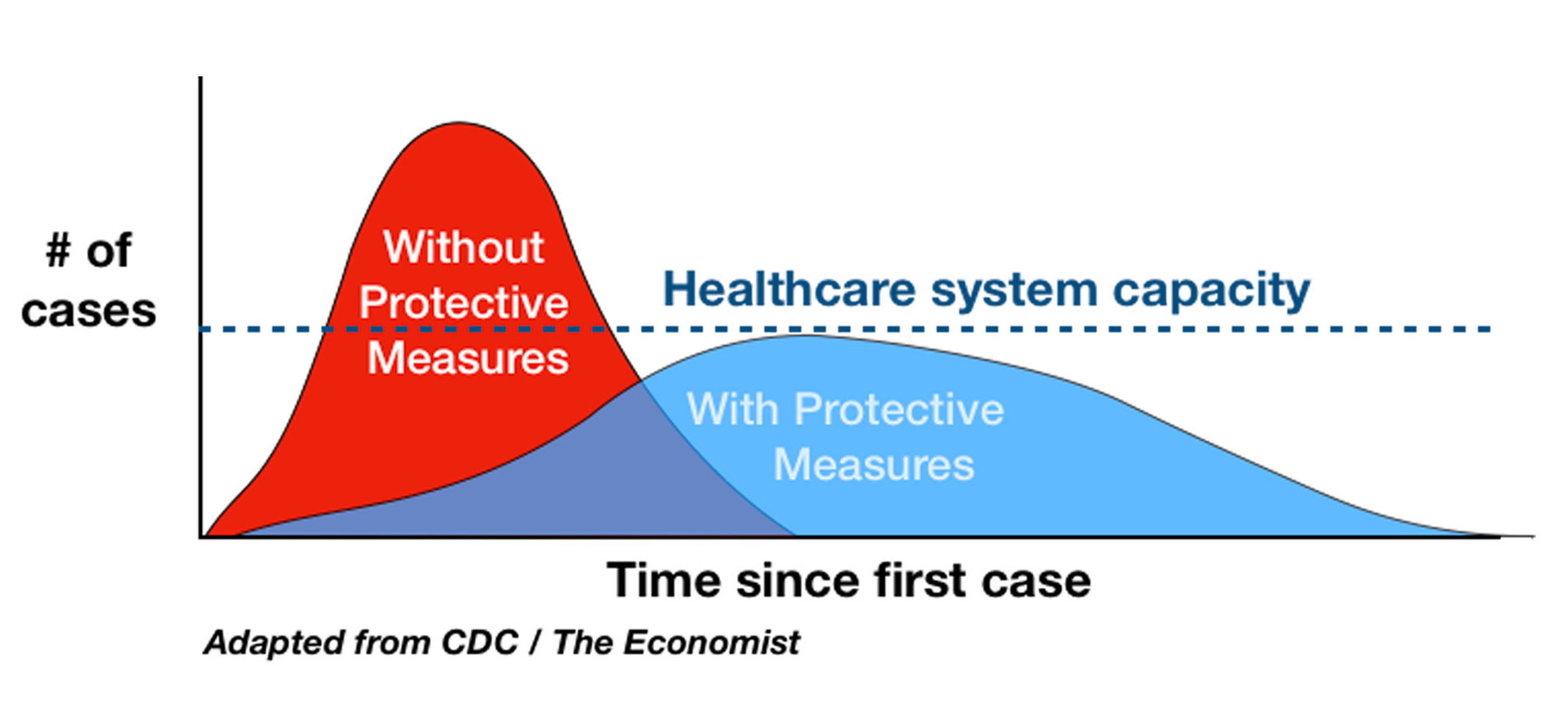
Flatten the curve
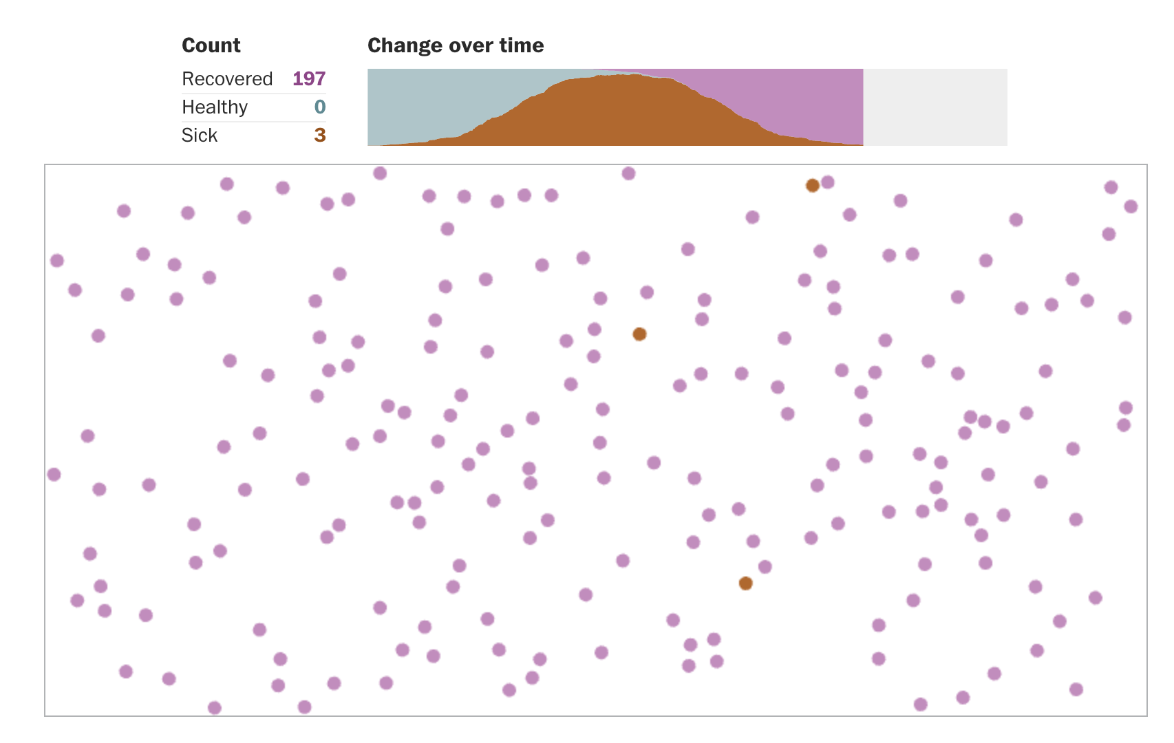
Exponential spread
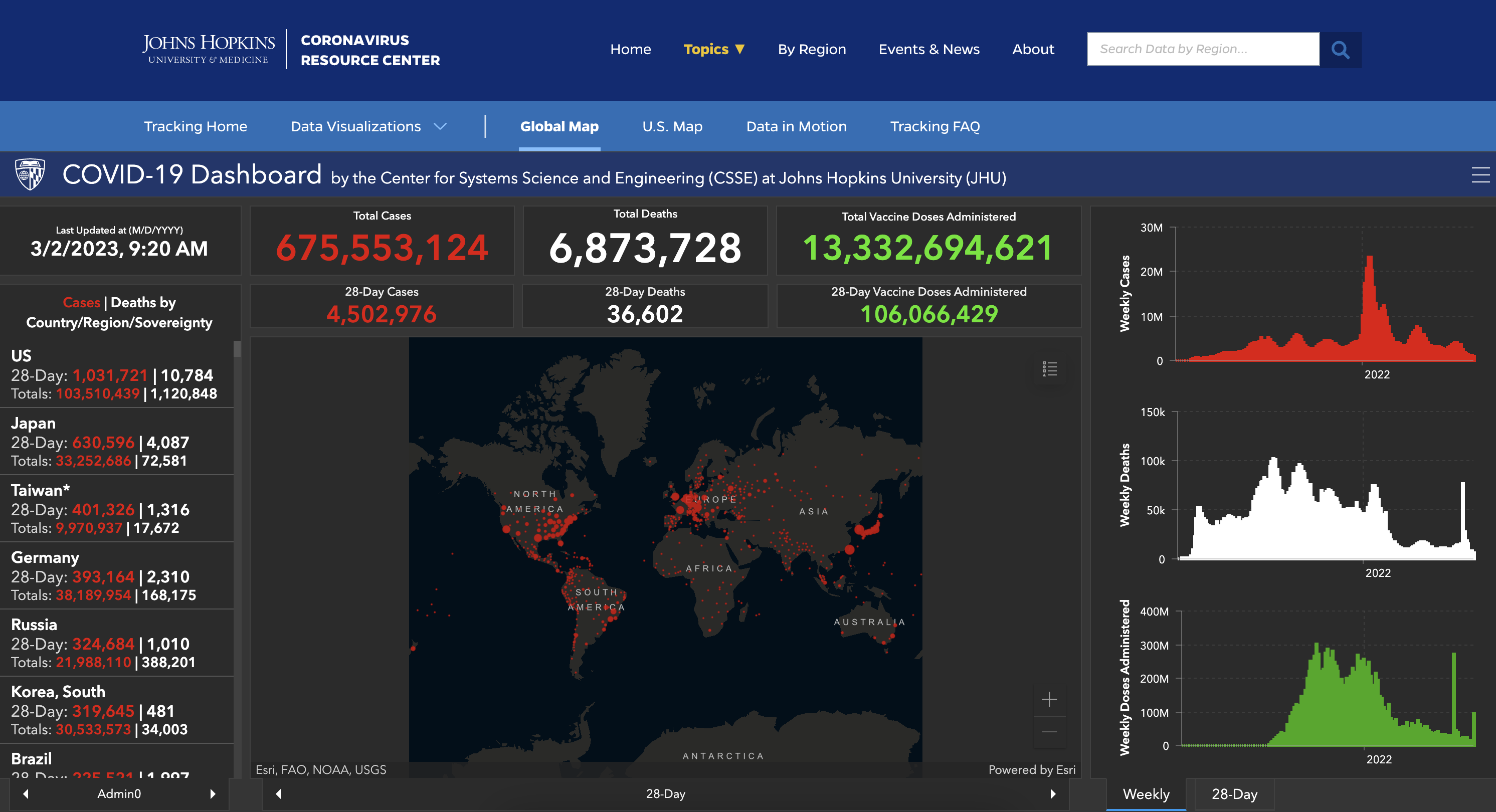
JHU COVID-19 Dashboard
Alt text for bar charts
- Provide title and axis labels
- Briefly describe the chart and give a summary of any trends it displays
- Convert bar charts to accessible tables or lists
- Avoid describing visual attributes of the bars (e.g., dark blue, gray, yellow) unless there’s an explicit need to do so
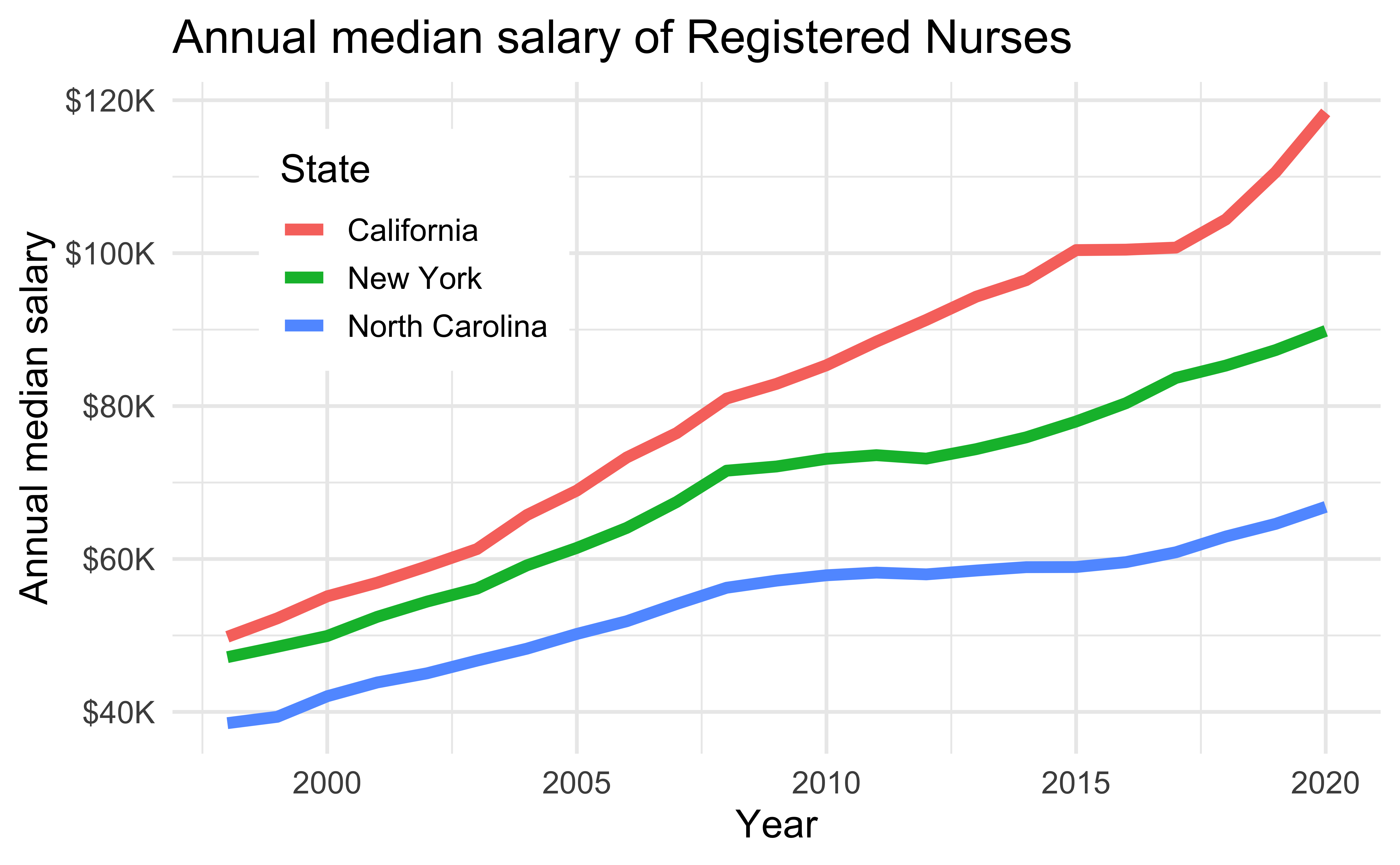
Alt text for line graphs
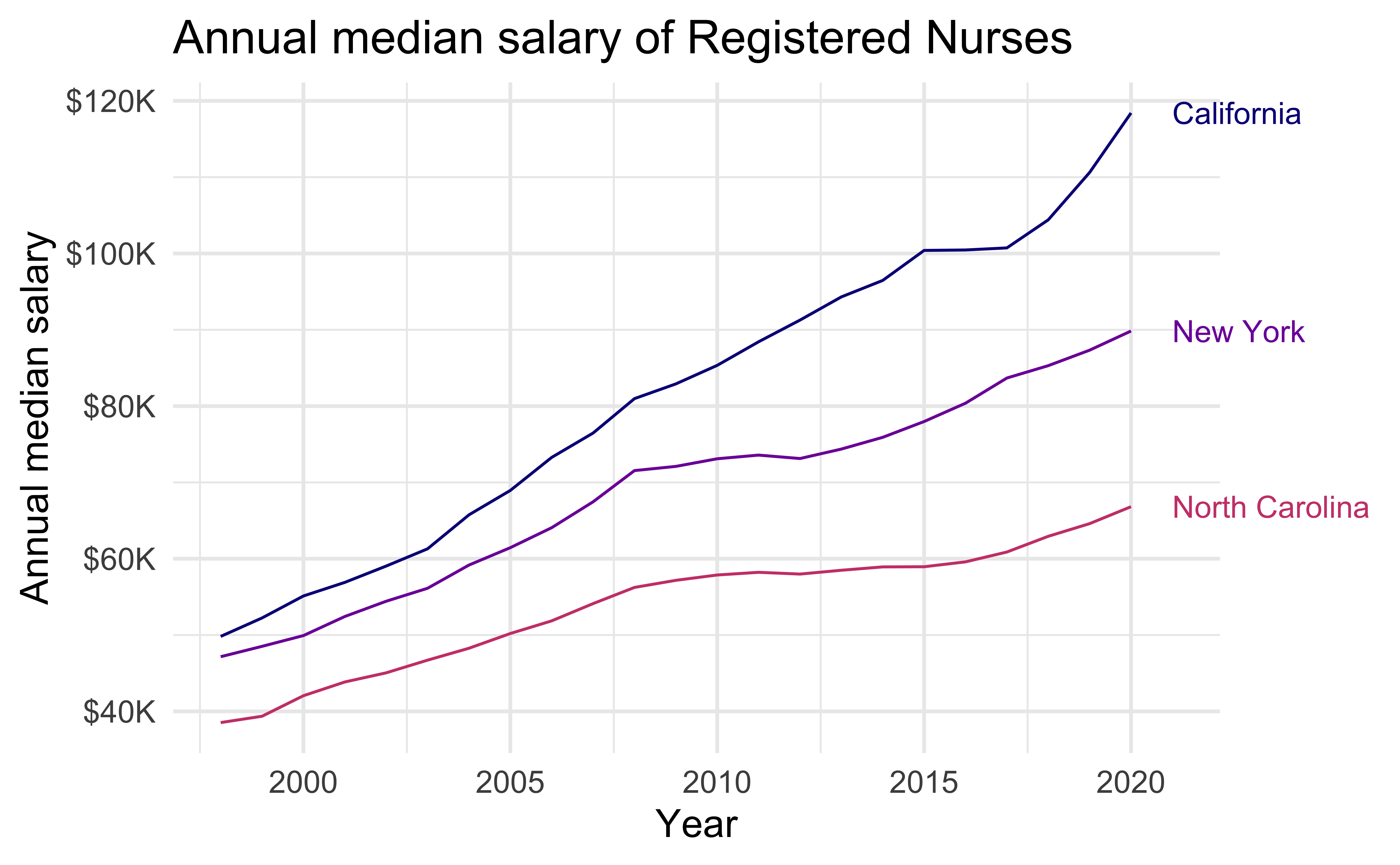
Write alt text for the line graph above.
- Provide title and axis labels
- Briefly describe the graph and give a summary of any trends it displays
- Convert data represented in lines to accessible tables or lists where feasible
- Avoid describing visual attributes of the lines (e.g., purple, pink) unless there’s an explicit need to do so
Alt text for scatter plots
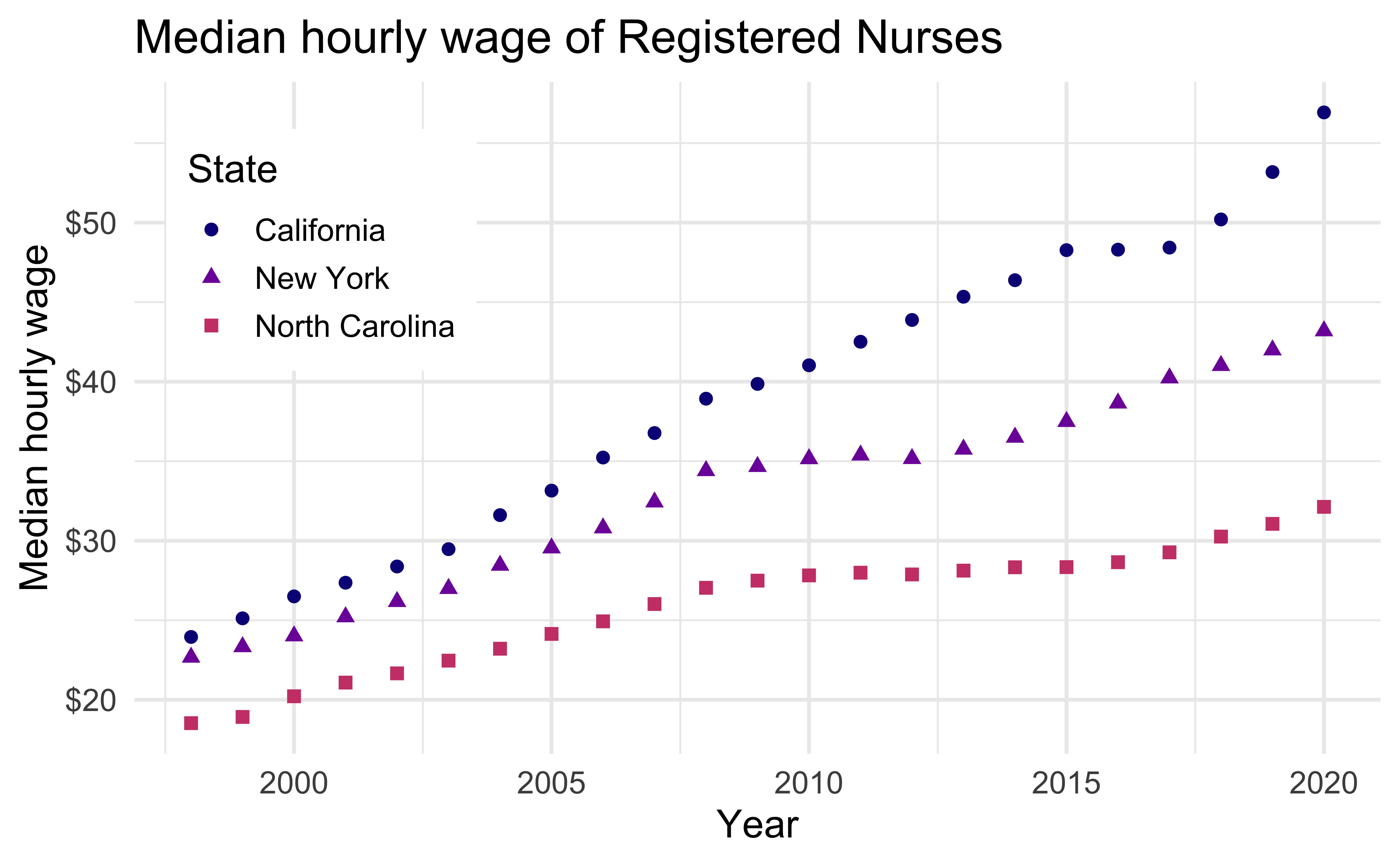
Write alt text for the scatter plot above.
Scatter plots are among the more difficult graphs to describe, especially if there is a need to make specific data point accessible.
- Identify the image as a scatter plot
- Provide the title and axis labels
- Focus on the overall trend
- If it’s necessary to be more specific, convert the data into an accessible table
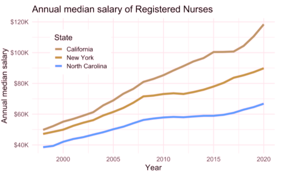
Color scales
Use colorblind friendly color scales (e.g., Okabe Ito, viridis)
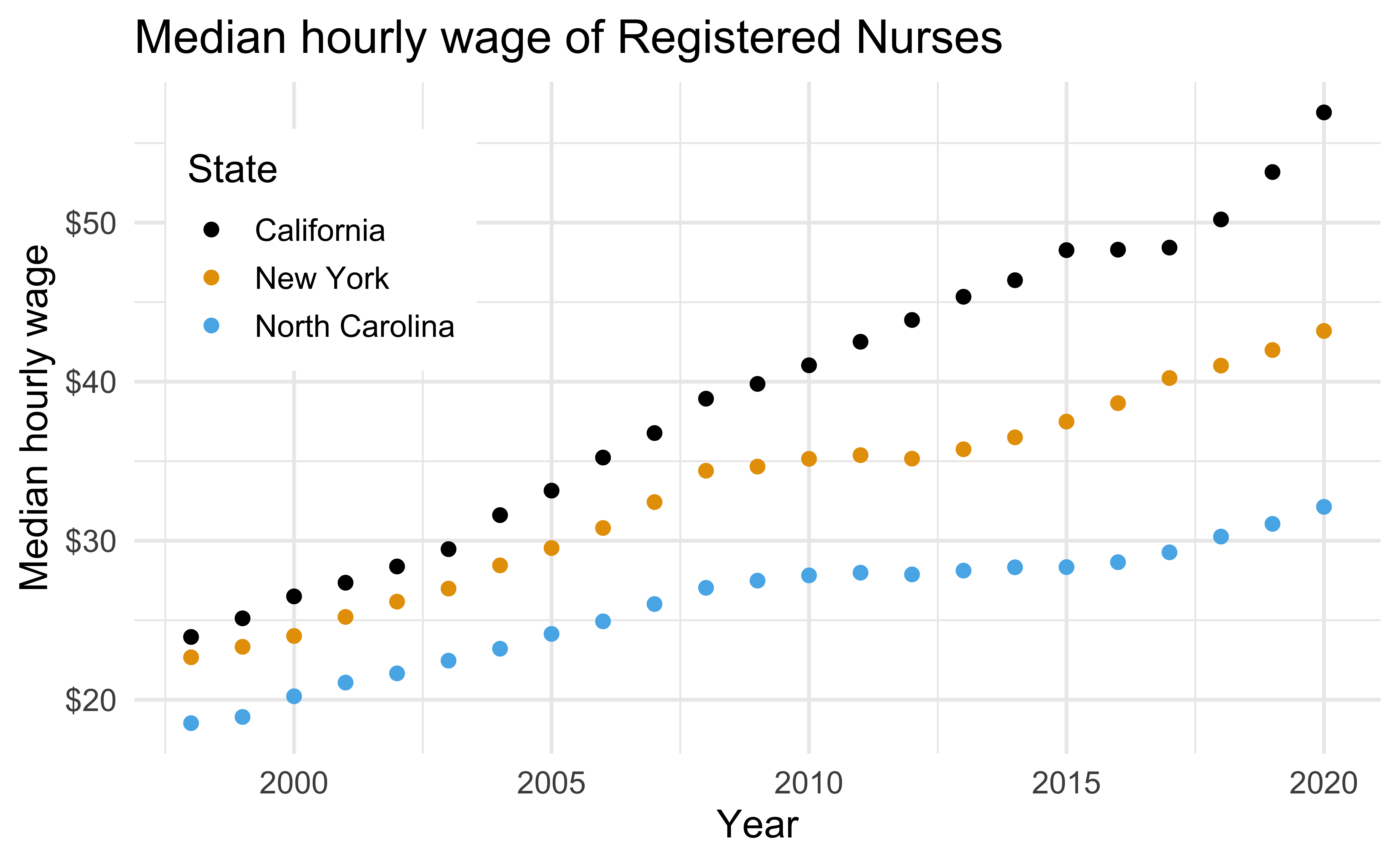
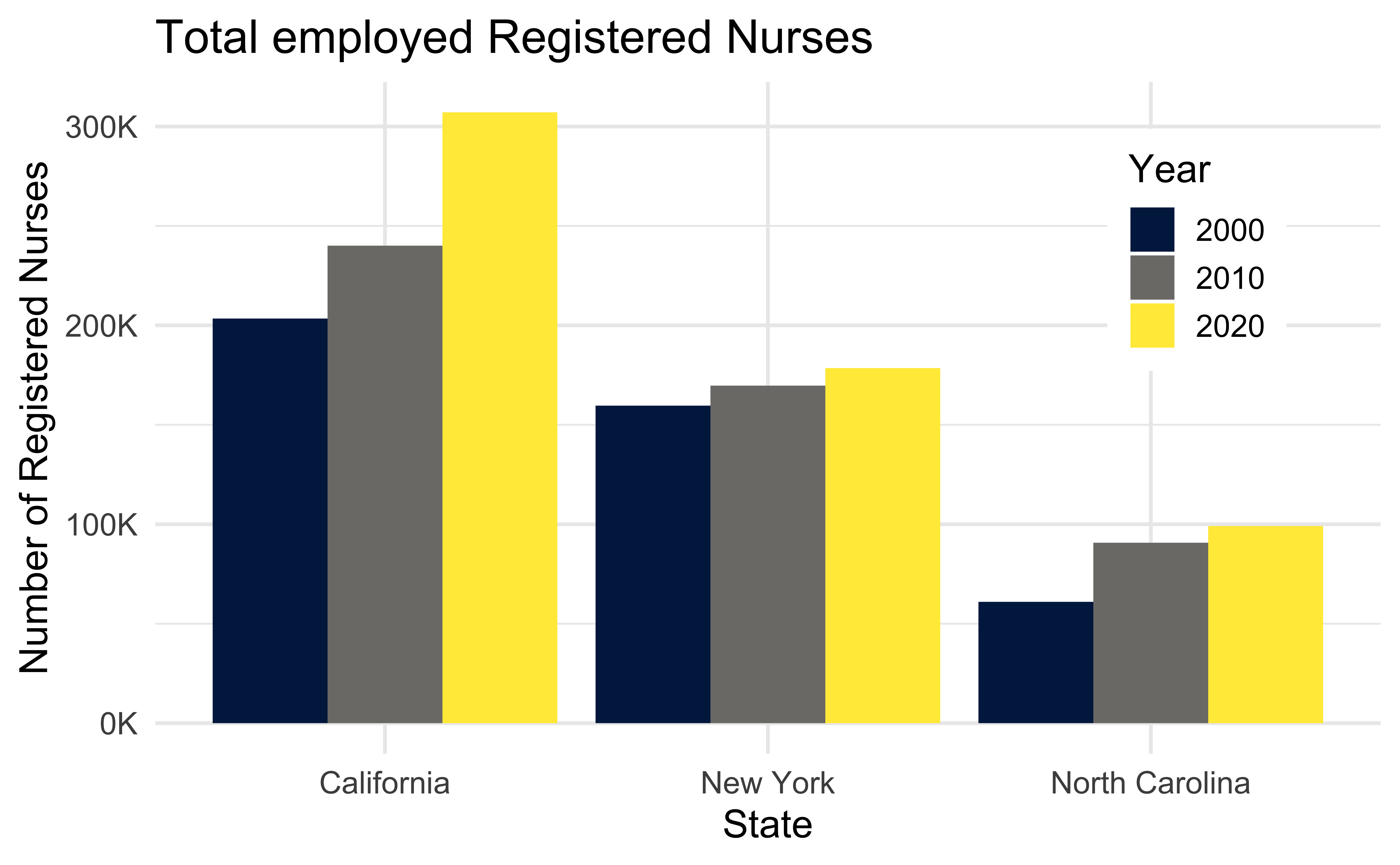
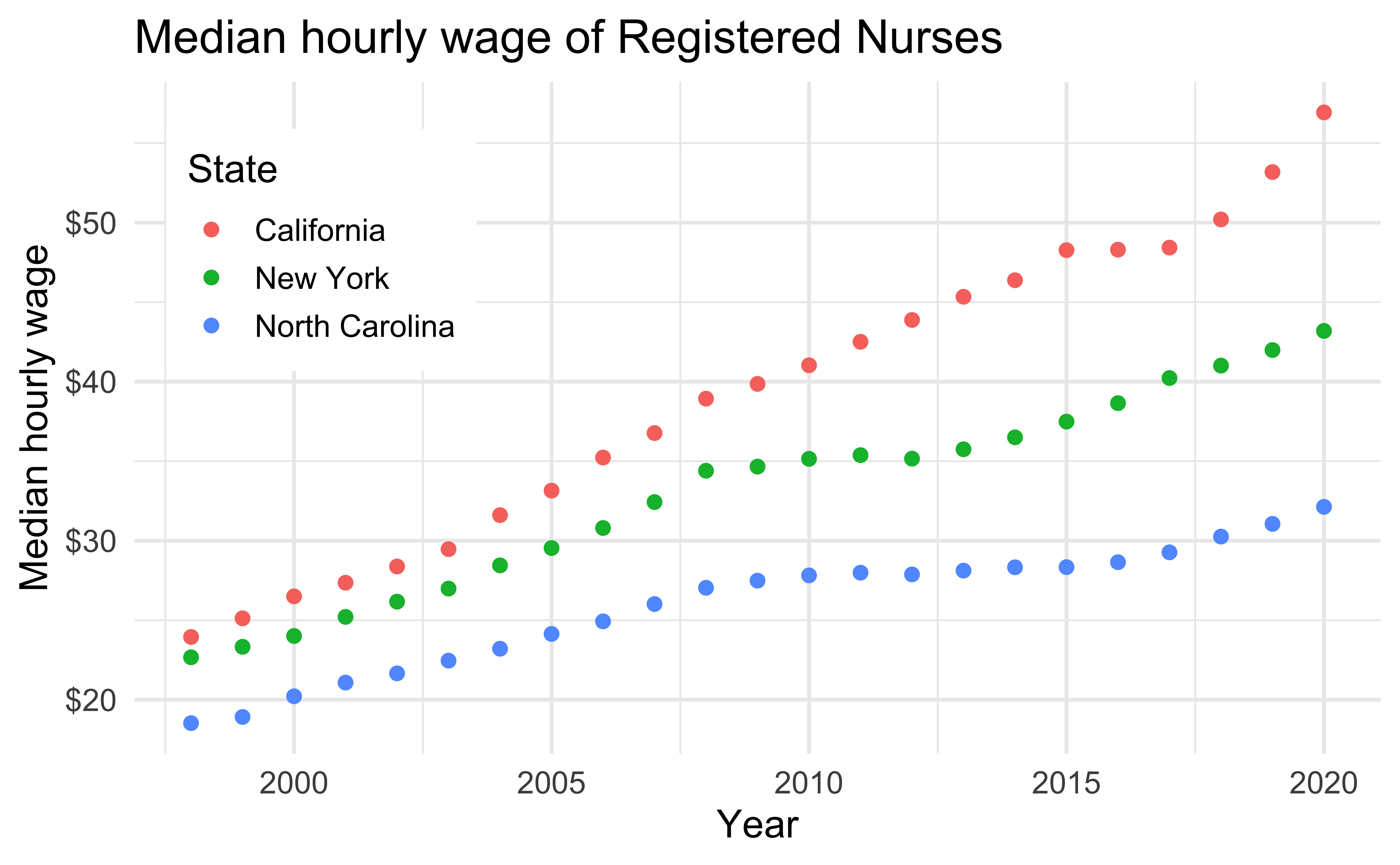
nurses_subset |>
ggplot(aes(x = year, y = hourly_wage_median, color = state)) +
geom_point(size = 2) +
ggthemes::scale_color_colorblind() +
scale_y_continuous(labels = label_dollar()) +
labs(
x = "Year", y = "Median hourly wage", color = "State",
title = "Median hourly wage of Registered Nurses"
) +
theme(
legend.position = c(0.15, 0.75),
legend.background = element_rect(fill = "white", color = "white")
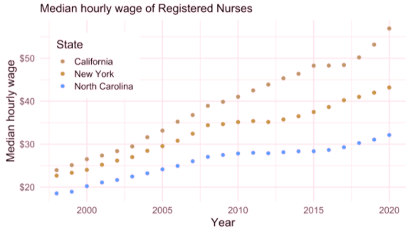
)The default ggplot2 color scale + deuteranopia
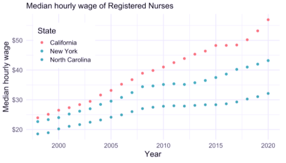
Deuteranopia: A type of red-green confusion
Default ggplot2 scale

Default ggplot2 scale with deuteranopia
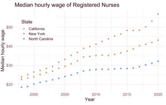
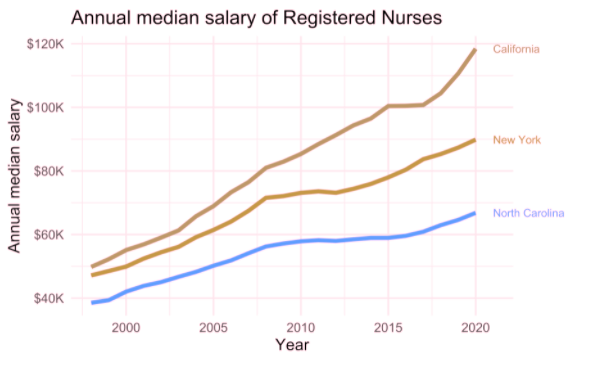
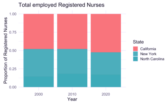
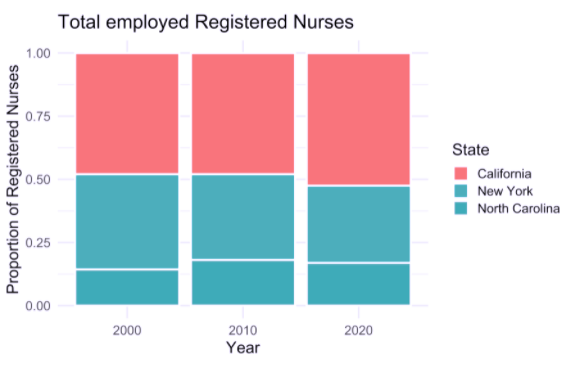
The default ggplot2 color scale + tritanopia
Tritanopia: A type of yellow-blue confusion
Default ggplot2 scale
Default ggplot2 scale with tritanopia
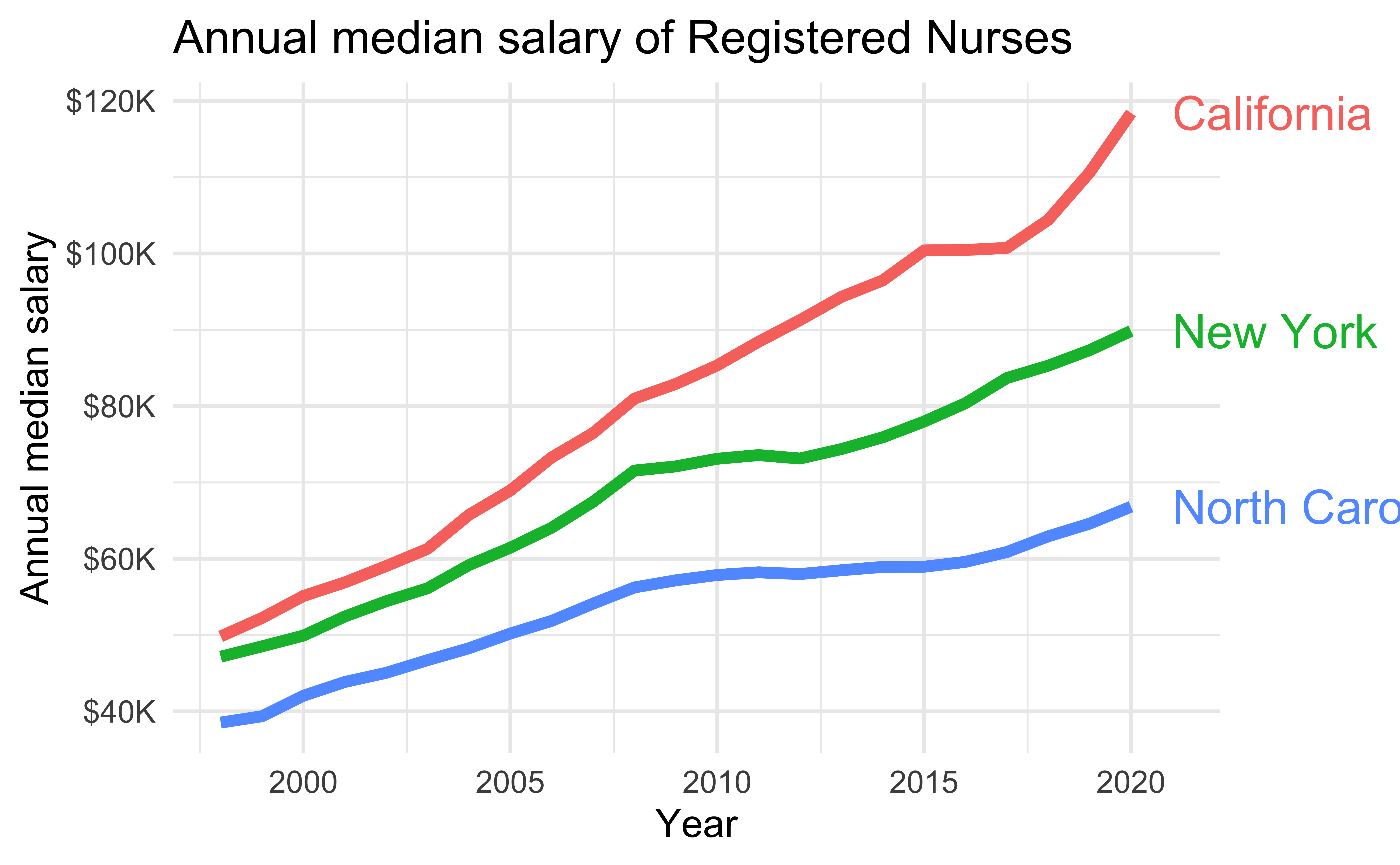
Double encoding
Use shape and color where possible
Default ggplot2 scale
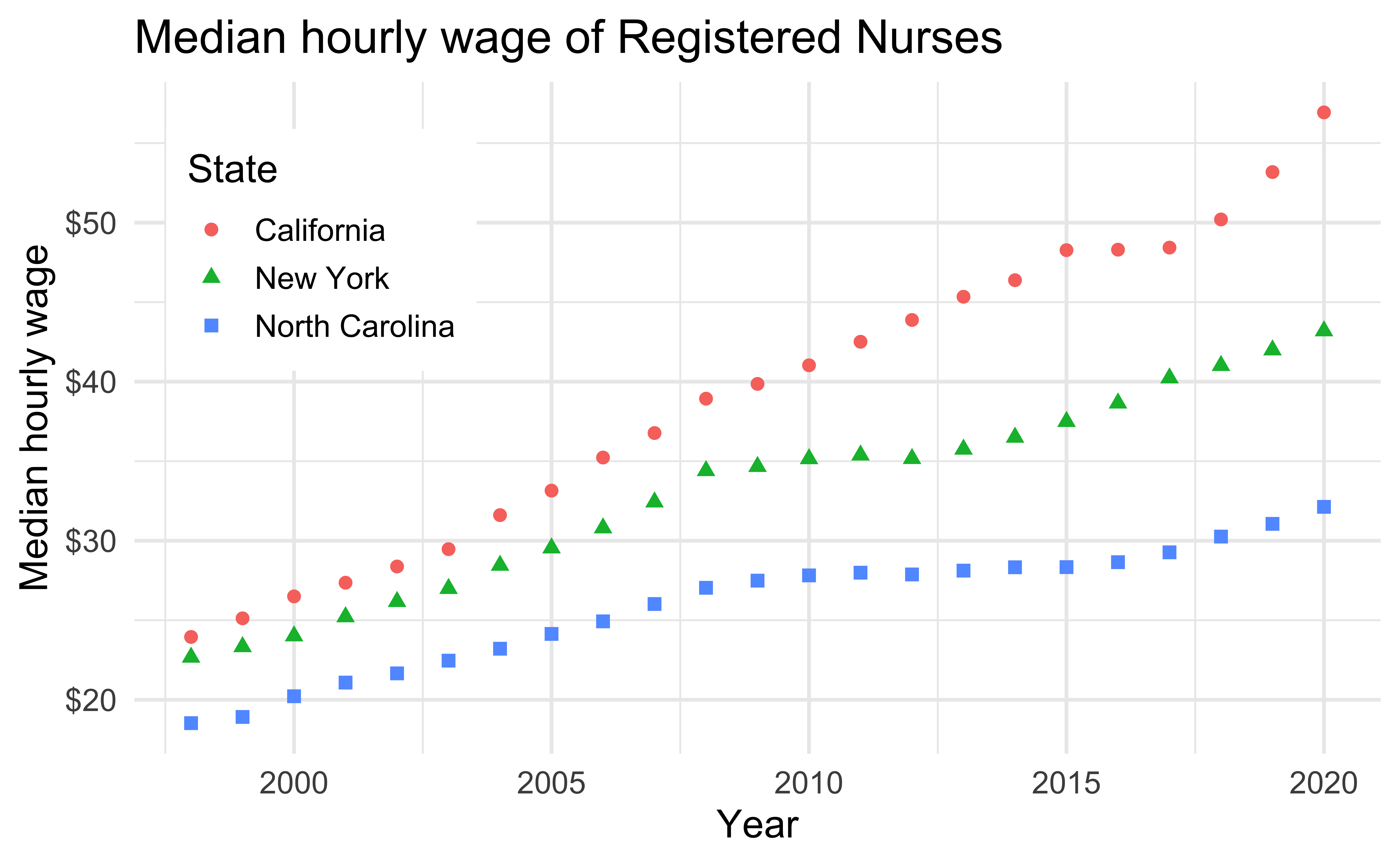
Default ggplot2 scale with deuteranopia
Without direct labeling
Default ggplot2 scale
Default ggplot2 scale with deuteranopia
With direct labeling
Default ggplot2 scale
Default ggplot2 scale with deuteranopia
Without whitespace
Default ggplot2 scale
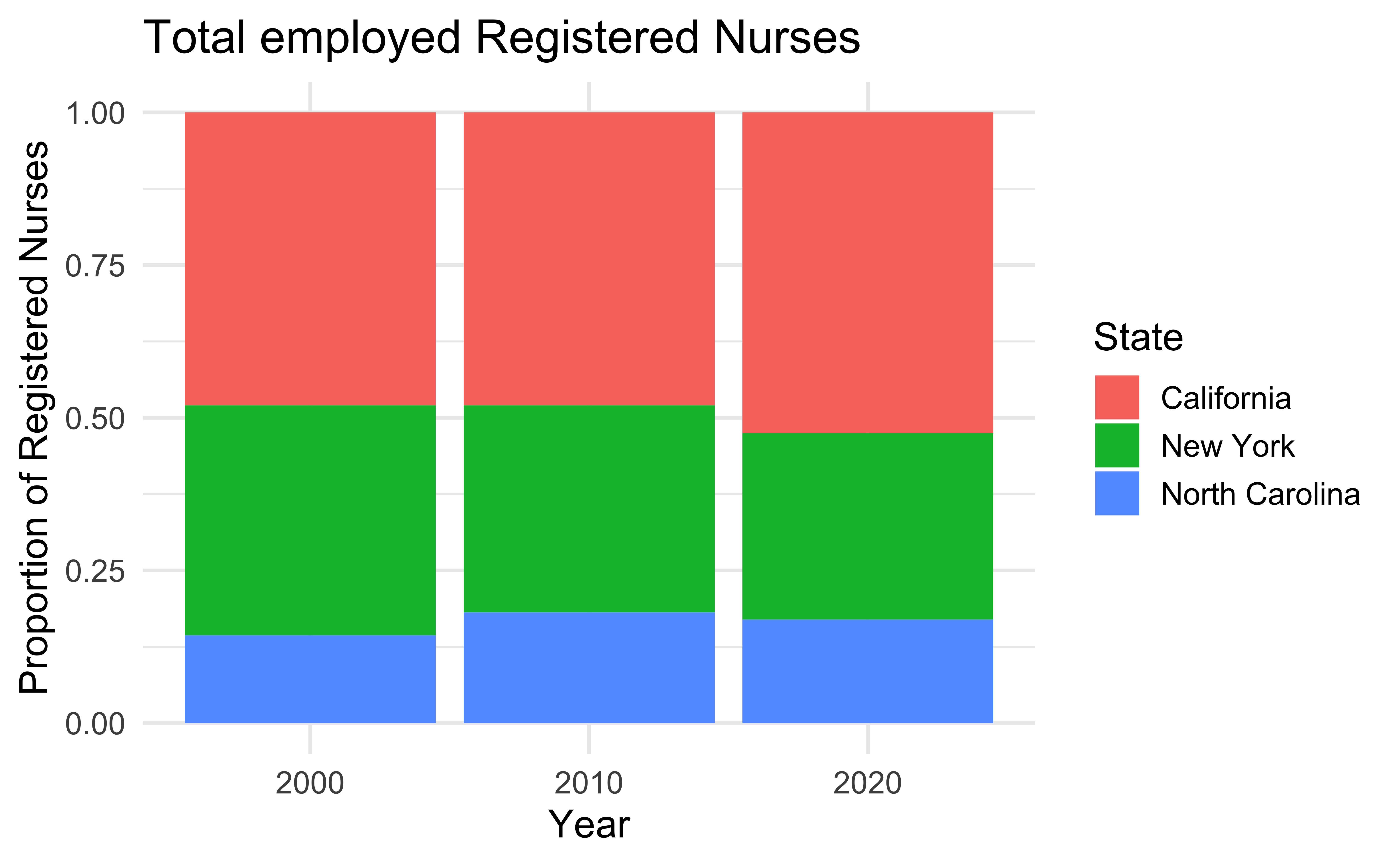
Default ggplot2 scale with tritanopia
With whitespace
Default ggplot2 scale
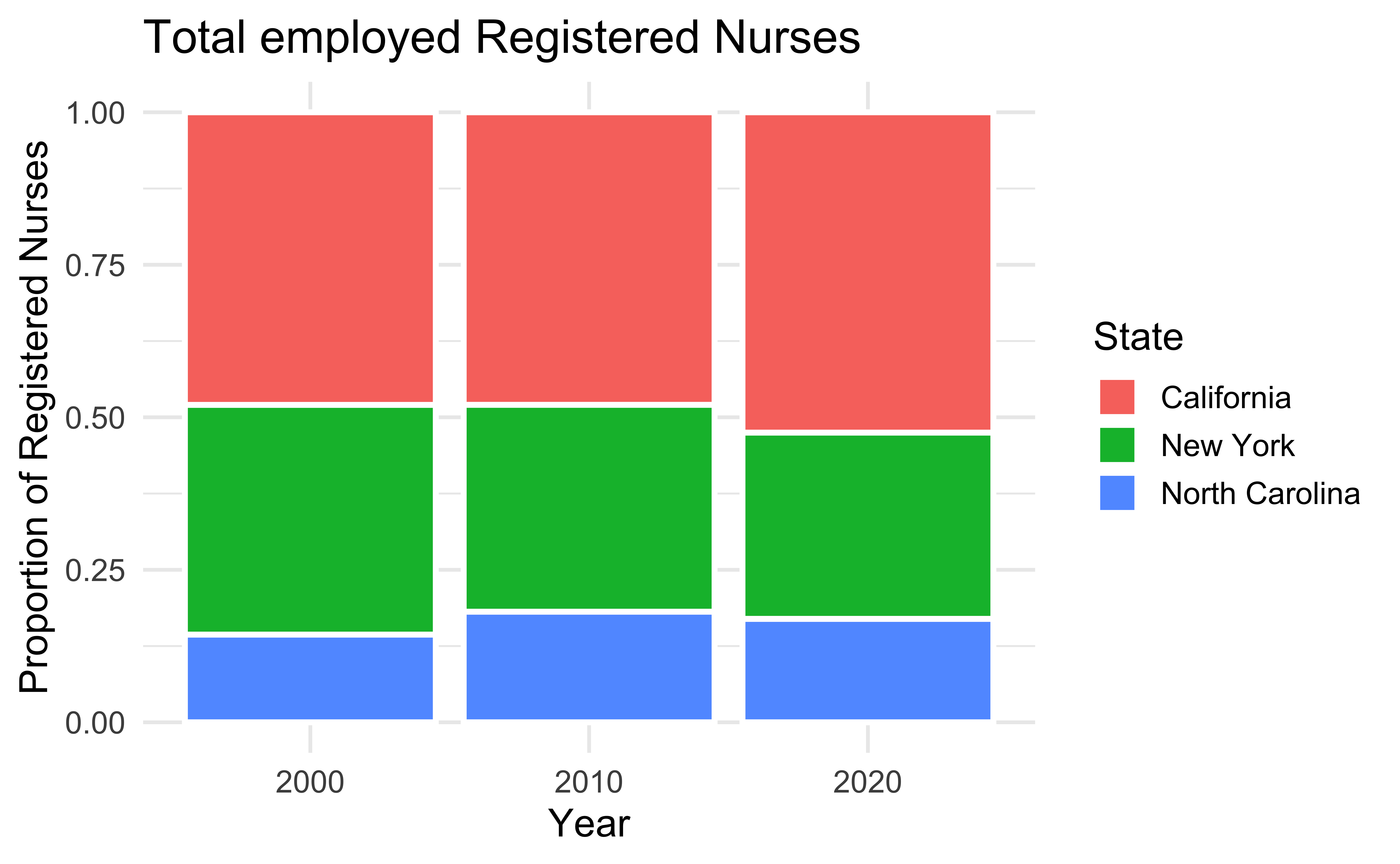
Default ggplot2 scale with tritanopia
Acknowledgements
COVID visualization examples:
- The New York Times. Flattening the Coronavirus Curve
- The Washington Post. Why outbreaks like coronavirus spread exponentially, and how to “flatten the curve”
- COVID-19 Dashboard by the Center for Systems Science and Engineering (CSSE) at Johns Hopkins University (JHU)
- T. Littlefield (2020) COVID-19 Statistics Tracker
Lundgard, Alan, and Arvind Satyanarayan. “Accessible Visualization via Natural Language Descriptions: A Four-Level Model of Semantic Content.” IEEE transactions on visualization and computer graphics (2021).
Silvia Canelón and Liz Hare. Revealing Room for Improvement in Accessibility within a Social Media Data Visualization Learning Community
![]()