# load packages
library(countdown)
library(tidyverse)
library(palmerpenguins)
library(fs)
library(lubridate)
library(scales)
library(openintro)
library(colorspace)
library(glue)

# set theme for ggplot2
ggplot2::theme_set(ggplot2::theme_minimal(base_size = 14))

# set width of code output
options(width = 65)

# set figure parameters for knitr
knitr::opts_chunk$set(
  fig.width = 7, # 7" width
  fig.asp = 0.618, # the golden ratio
  fig.retina = 3, # dpi multiplier for displaying HTML output on retina
  fig.align = "center", # center align figures
  dpi = 300 # higher dpi, sharper image
)Themes, axes, annotations
Lecture 10
Complete themes
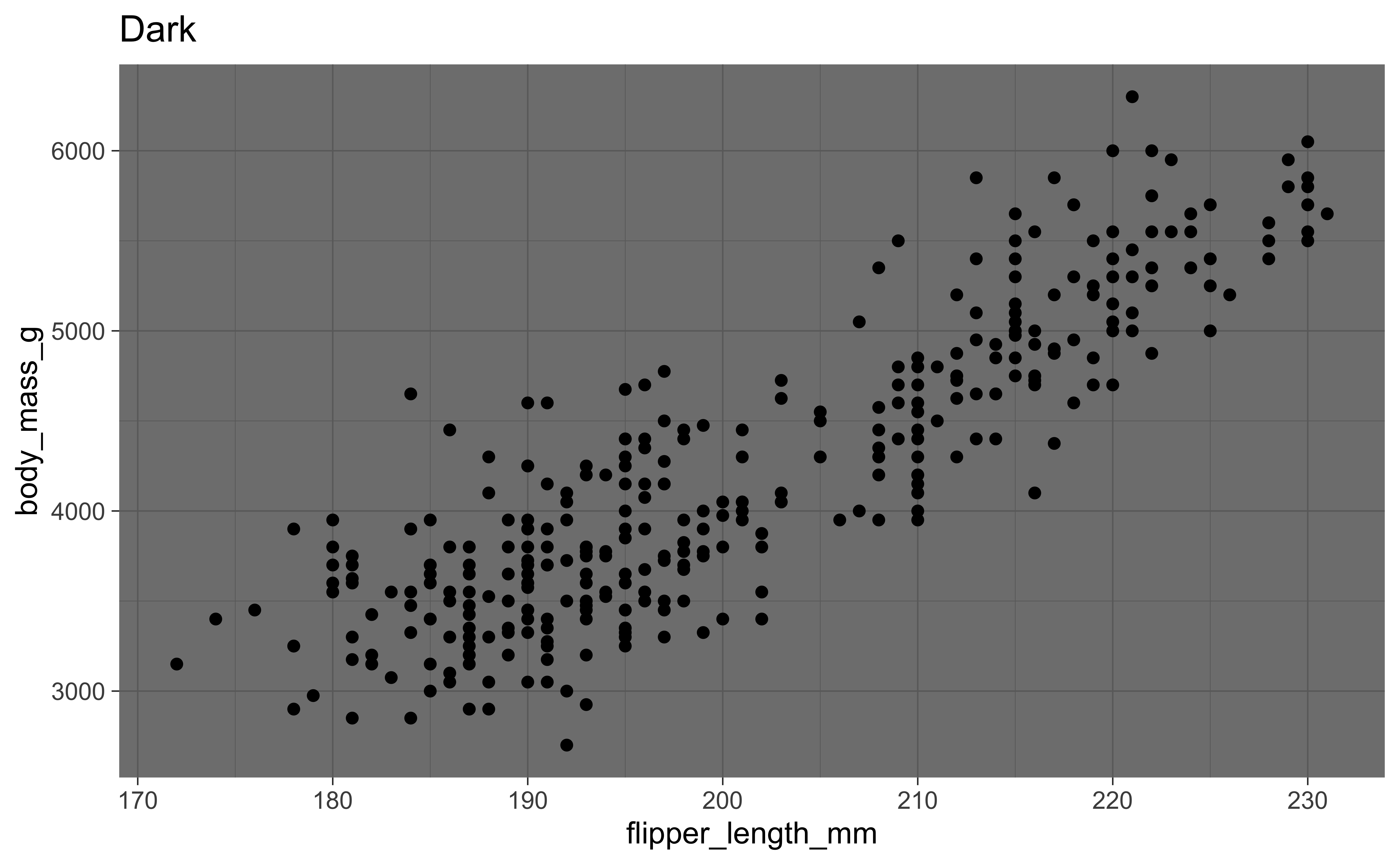
p <- ggplot(penguins, aes(x = flipper_length_mm, y = body_mass_g)) +
  geom_point()

p + theme_gray() + labs(title = "Gray")
p + theme_void() + labs(title = "Void")
p + theme_dark() + labs(title = "Dark")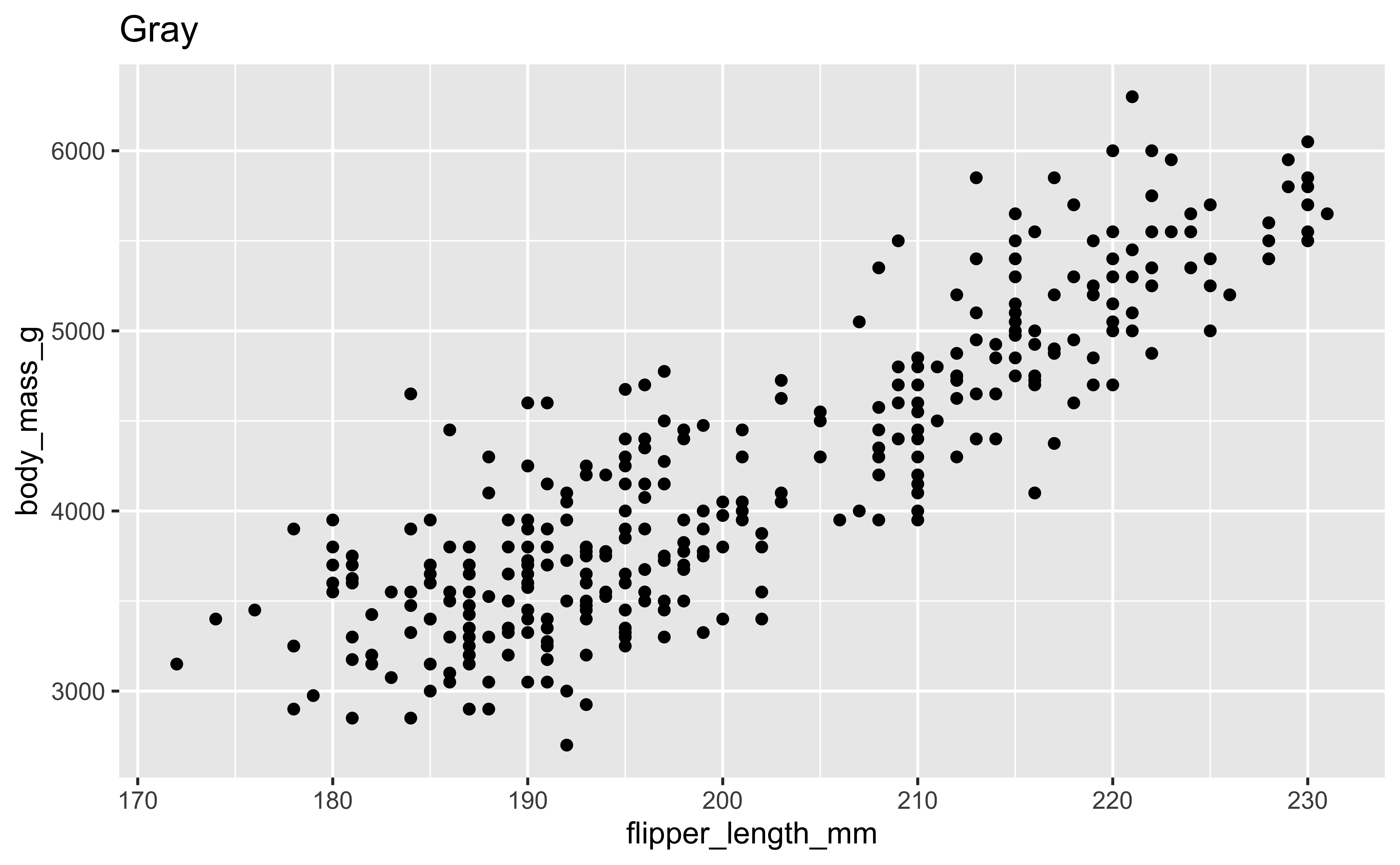

Themes from ggthemes
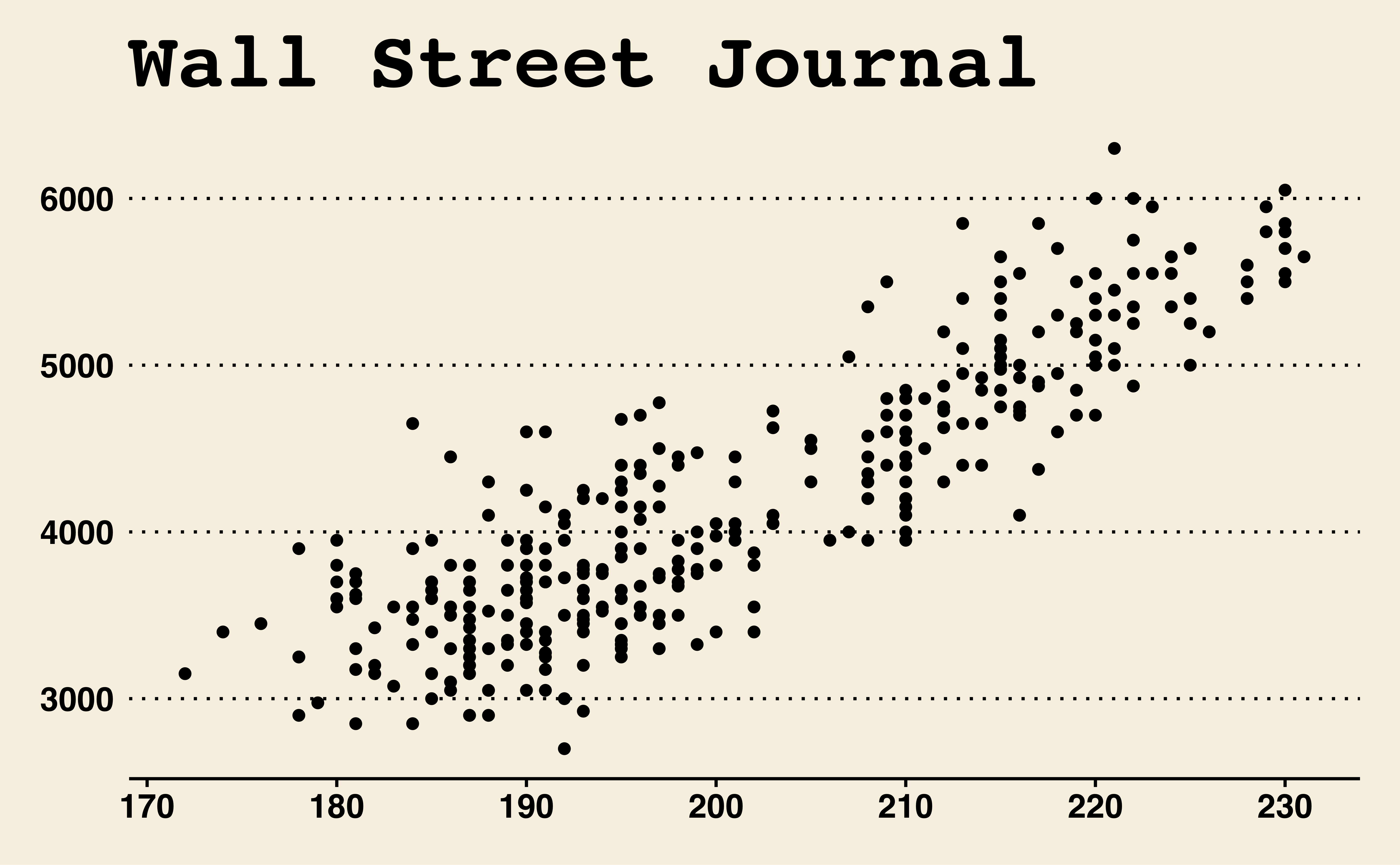
library(ggthemes)
p + theme_fivethirtyeight() + labs(title = "FiveThirtyEight")
p + theme_economist() + labs(title = "Economist")
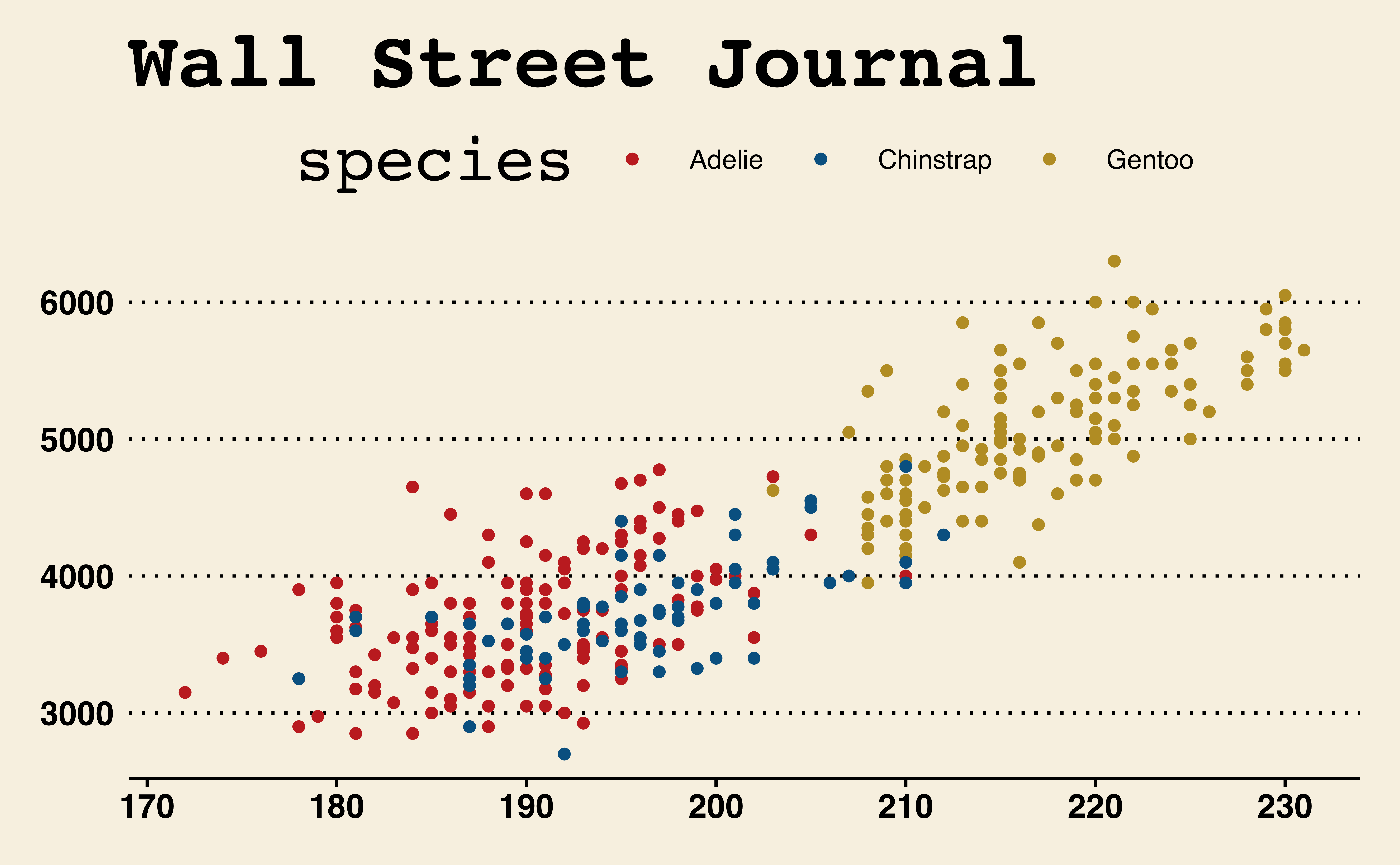
p + theme_wsj() + labs(title = "Wall Street Journal")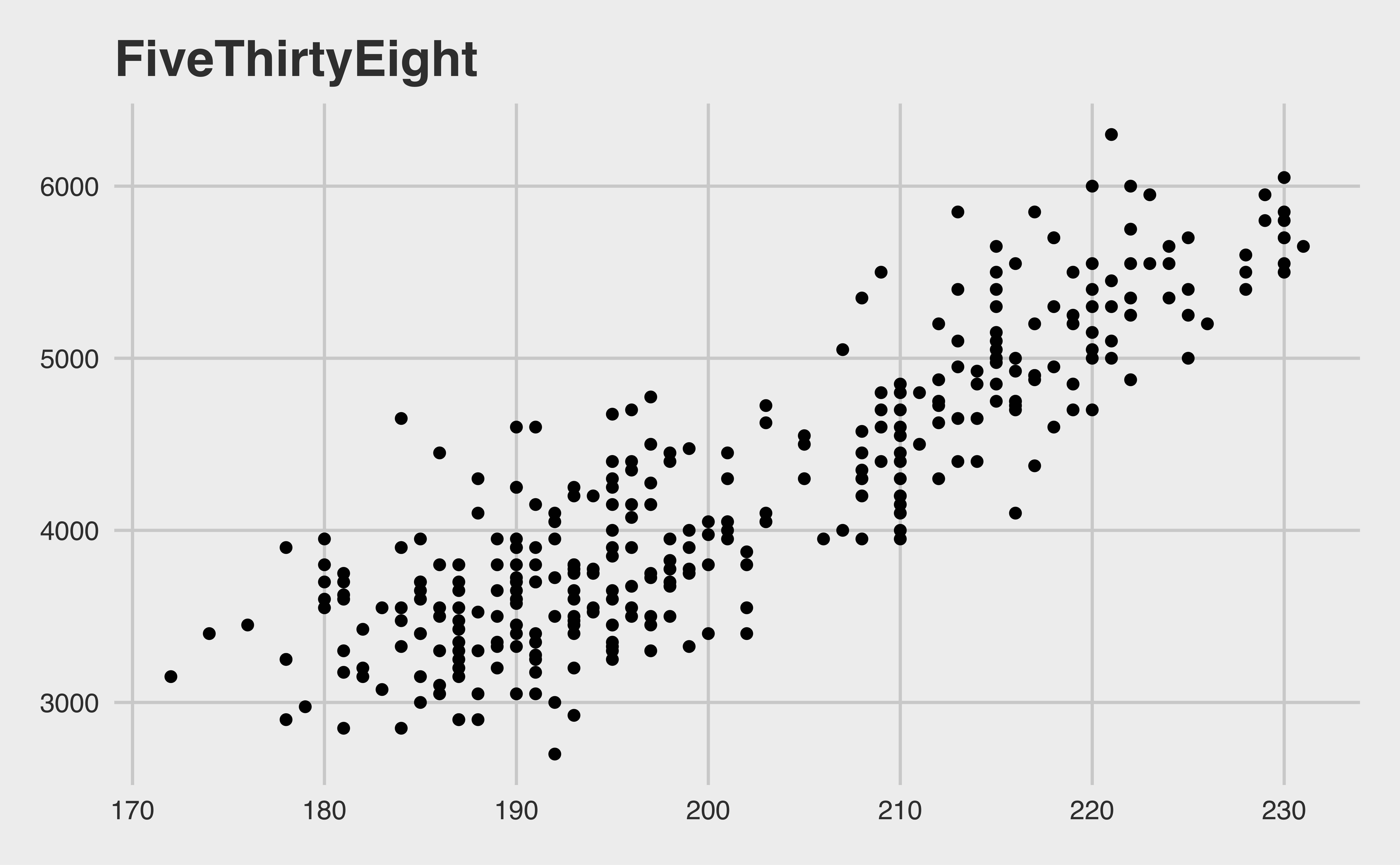

Themes and color scales from ggthemes
Duke theme!
Warning
This package is a work in progress. Feedback and issues welcome! See https://aidangildea.github.io/duke/ for more info.
Modifying theme elements
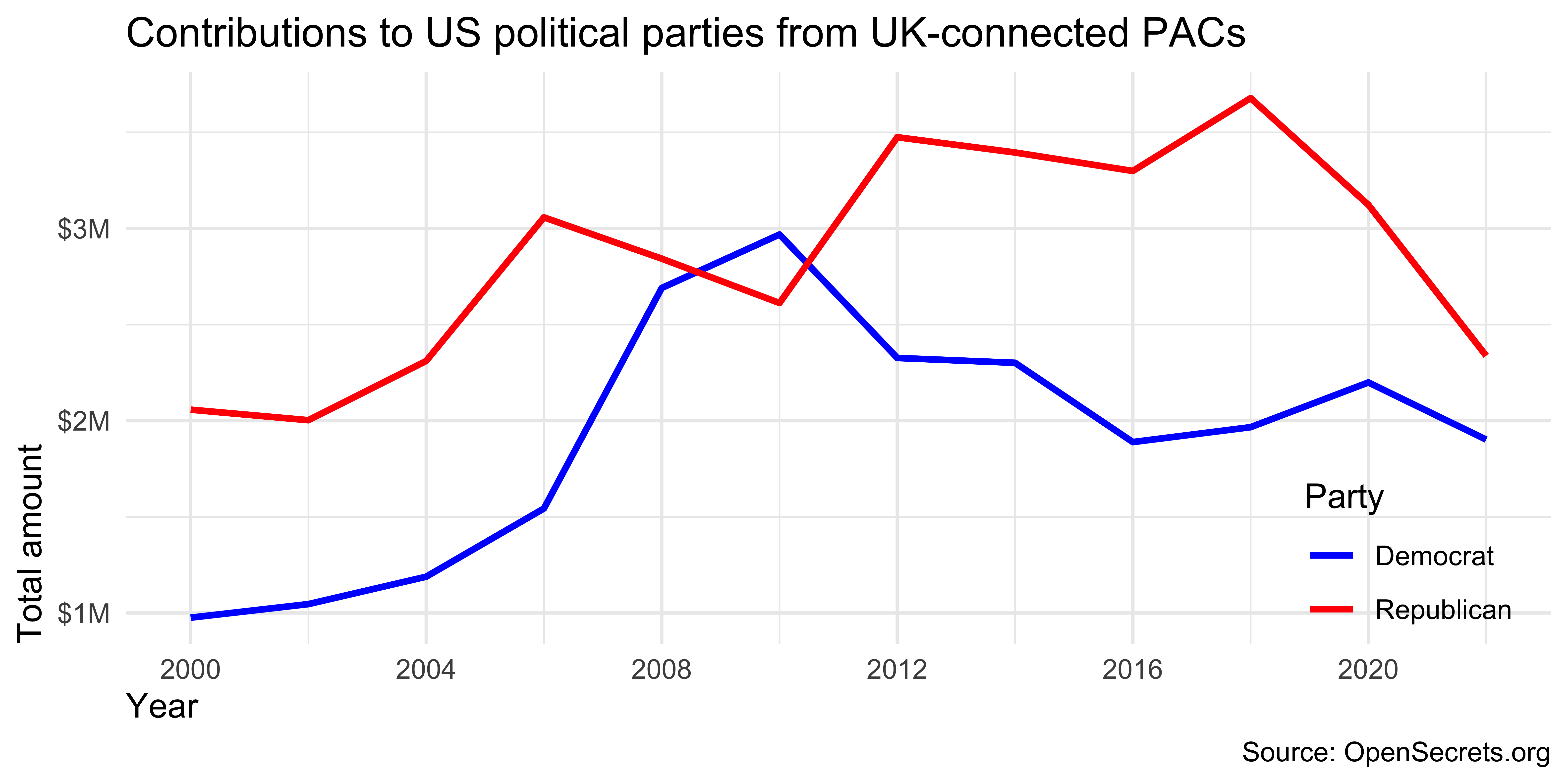
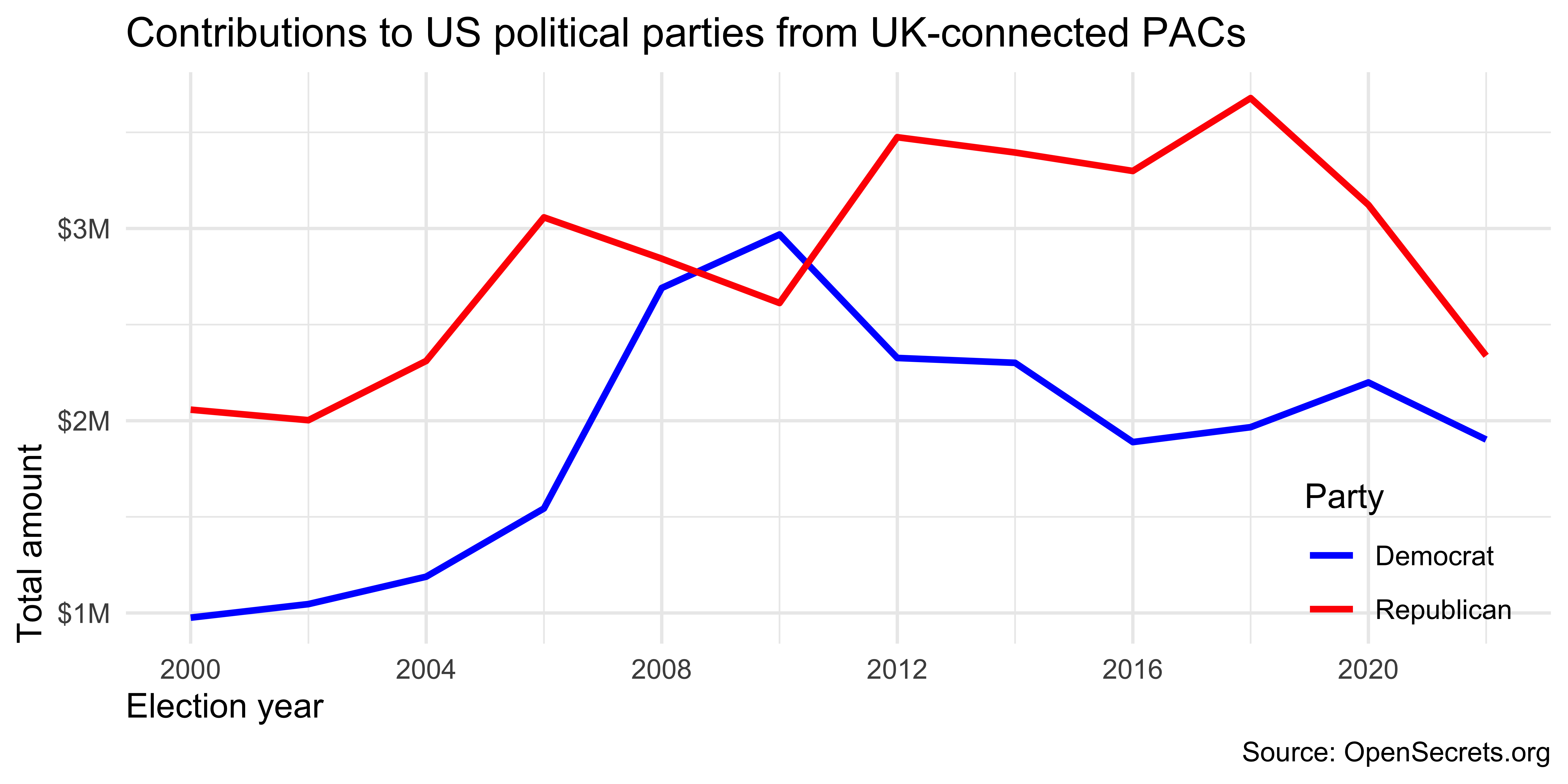
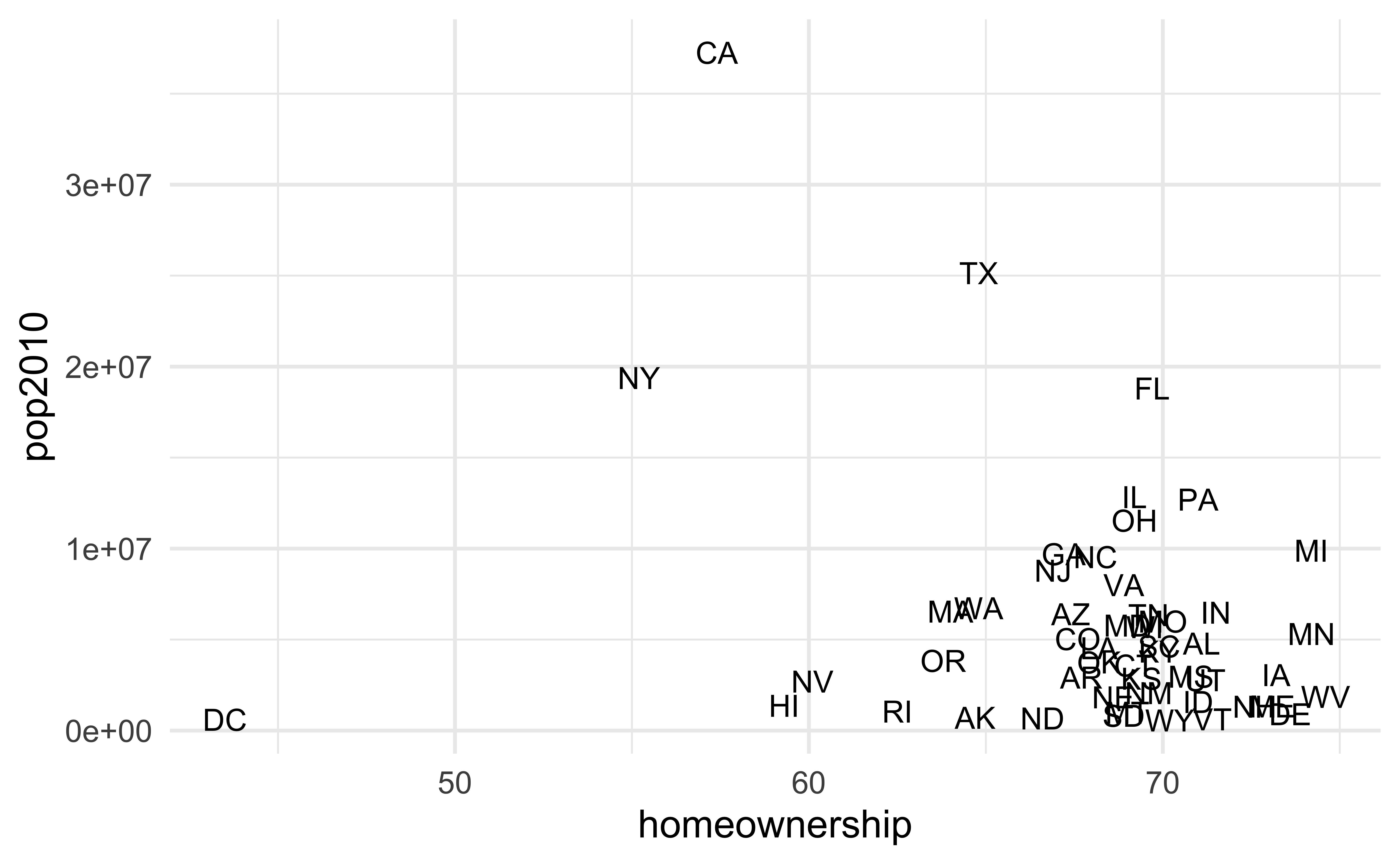
Axis breaks
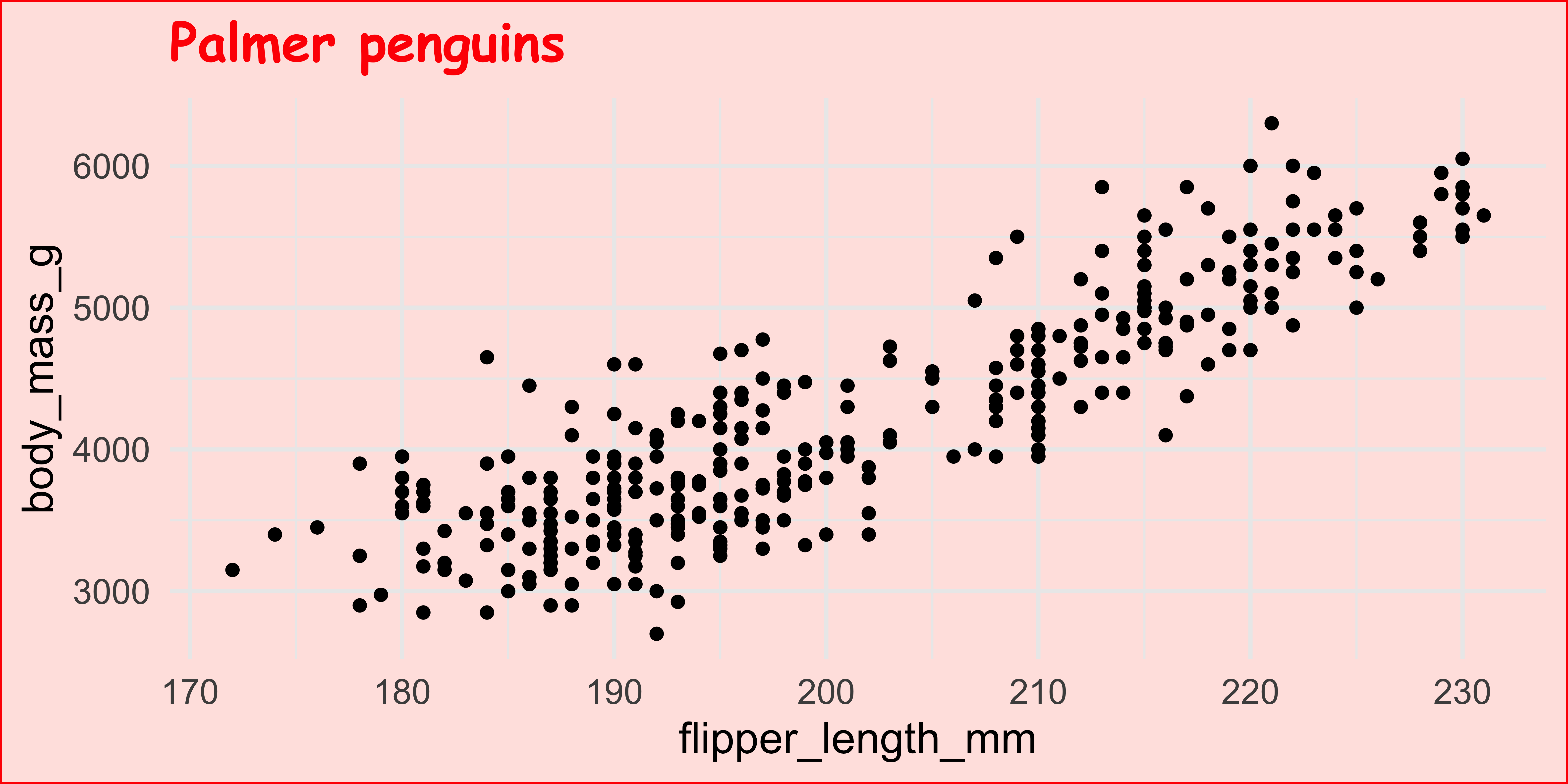
How can the following figure be improved with custom breaks in axes, if at all?
Context matters

Conciseness matters
Precision matters
Why annotate?
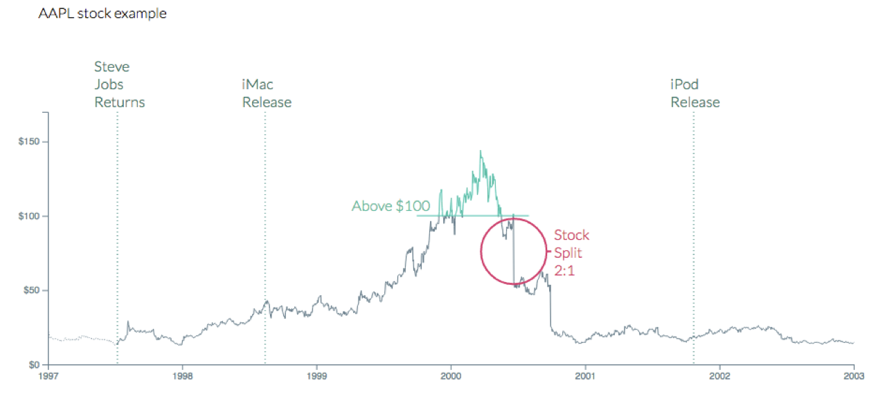
geom_text()
Can be useful when individual observations are identifiable, but can also get overwhelming…
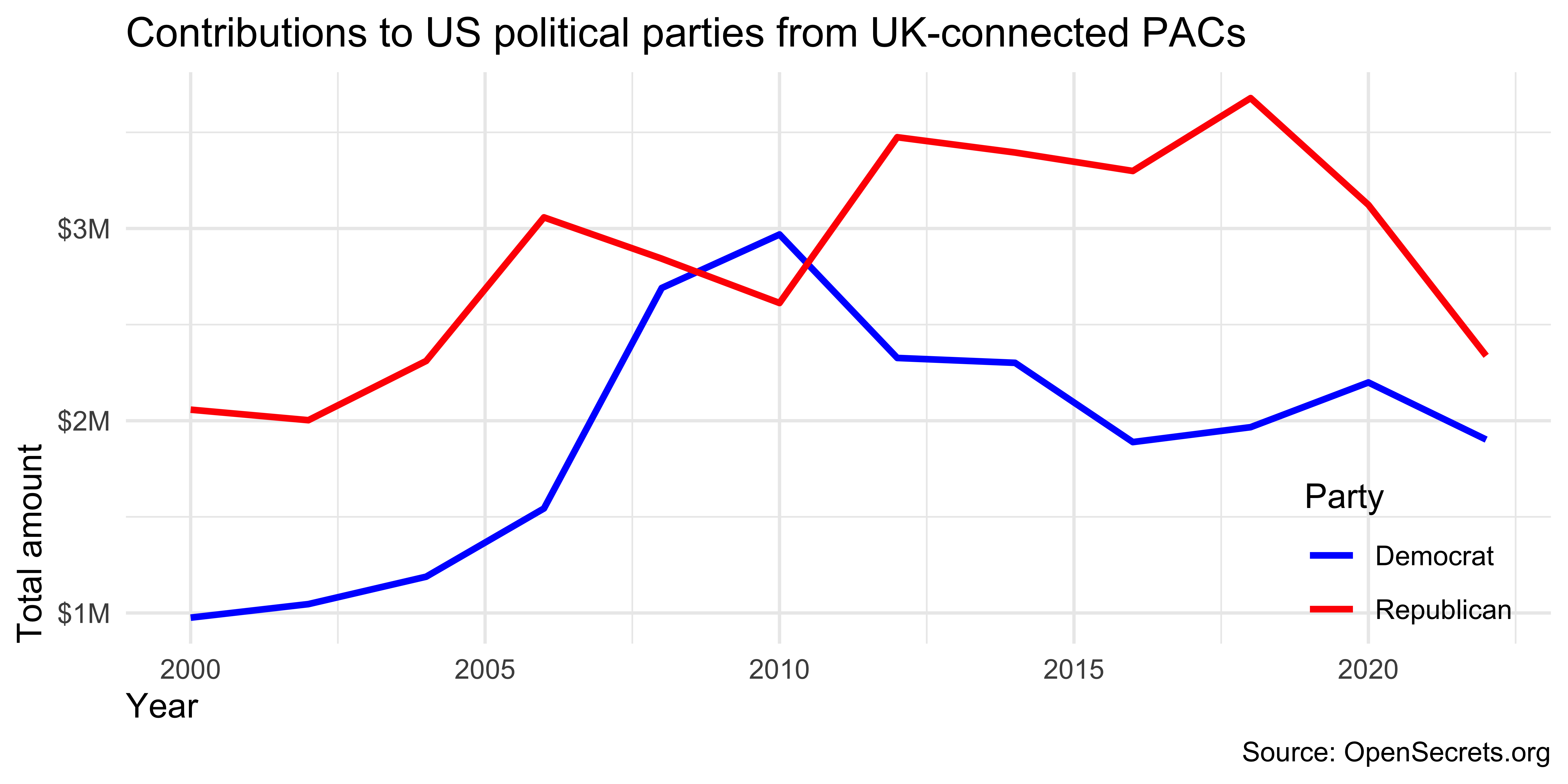
How would you improve this visualization? Discuss with your neighbor and add your ideas to the Slack thread.
03:00
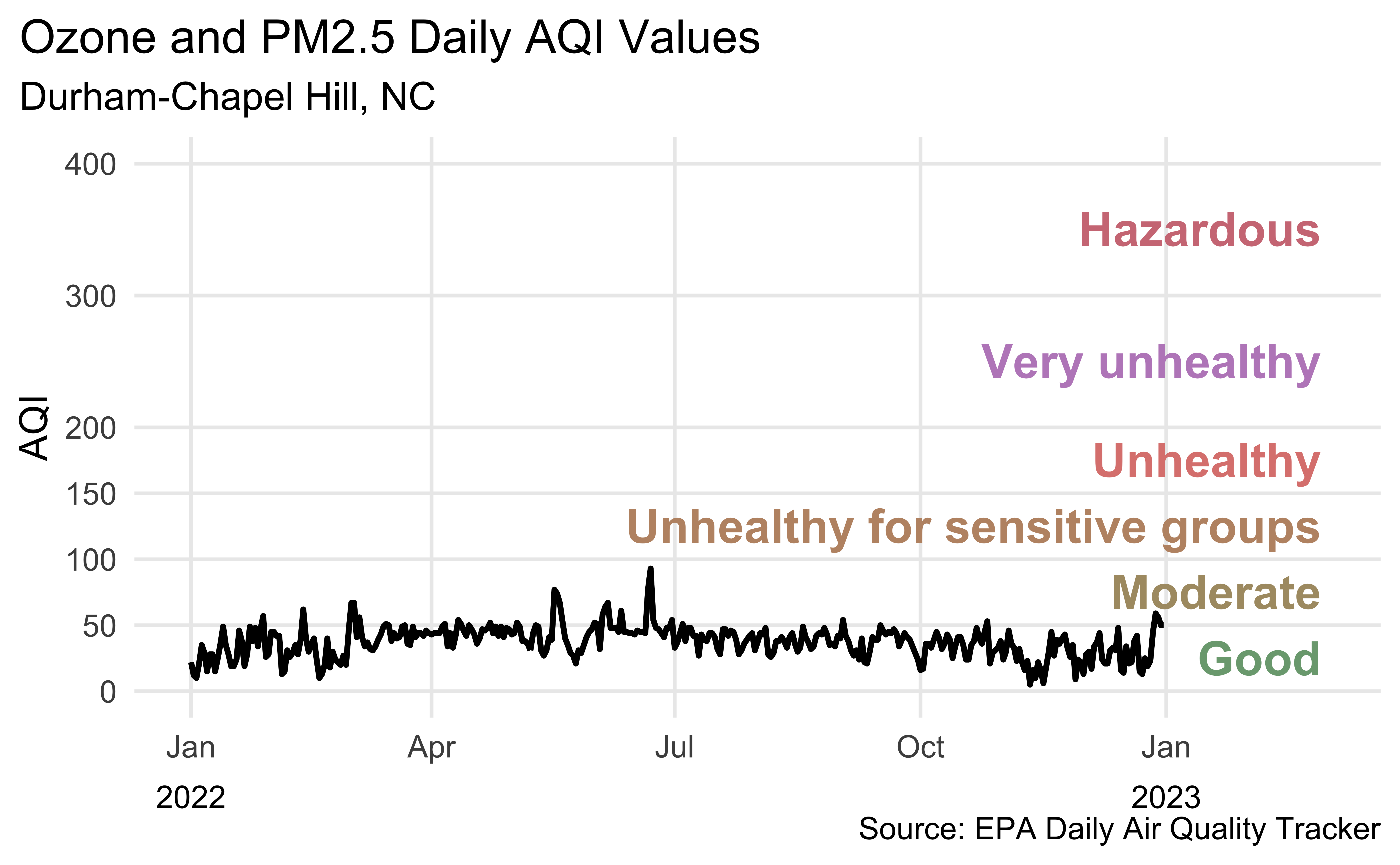
Revisit Durham AQI
Recreate the following visualization, in Part 2 of ae-09. This picks up where you left off in ae-08.
All of the data doesn’t tell a story
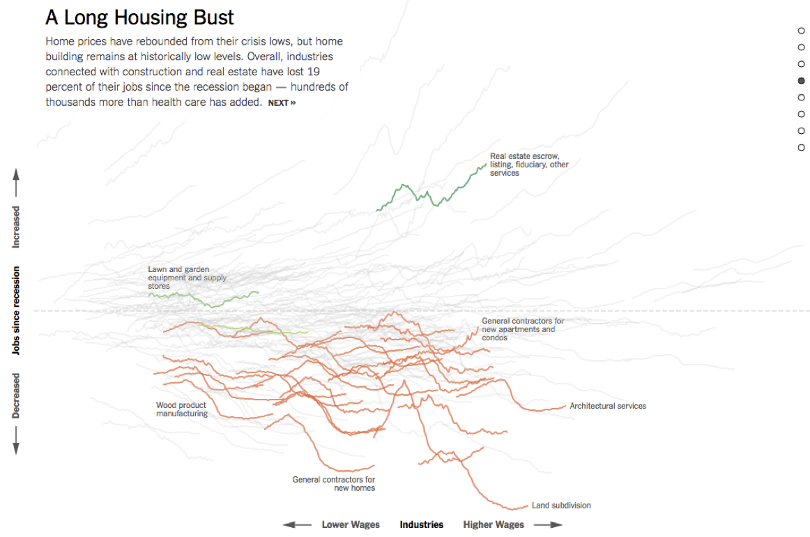
Plot AQI over years
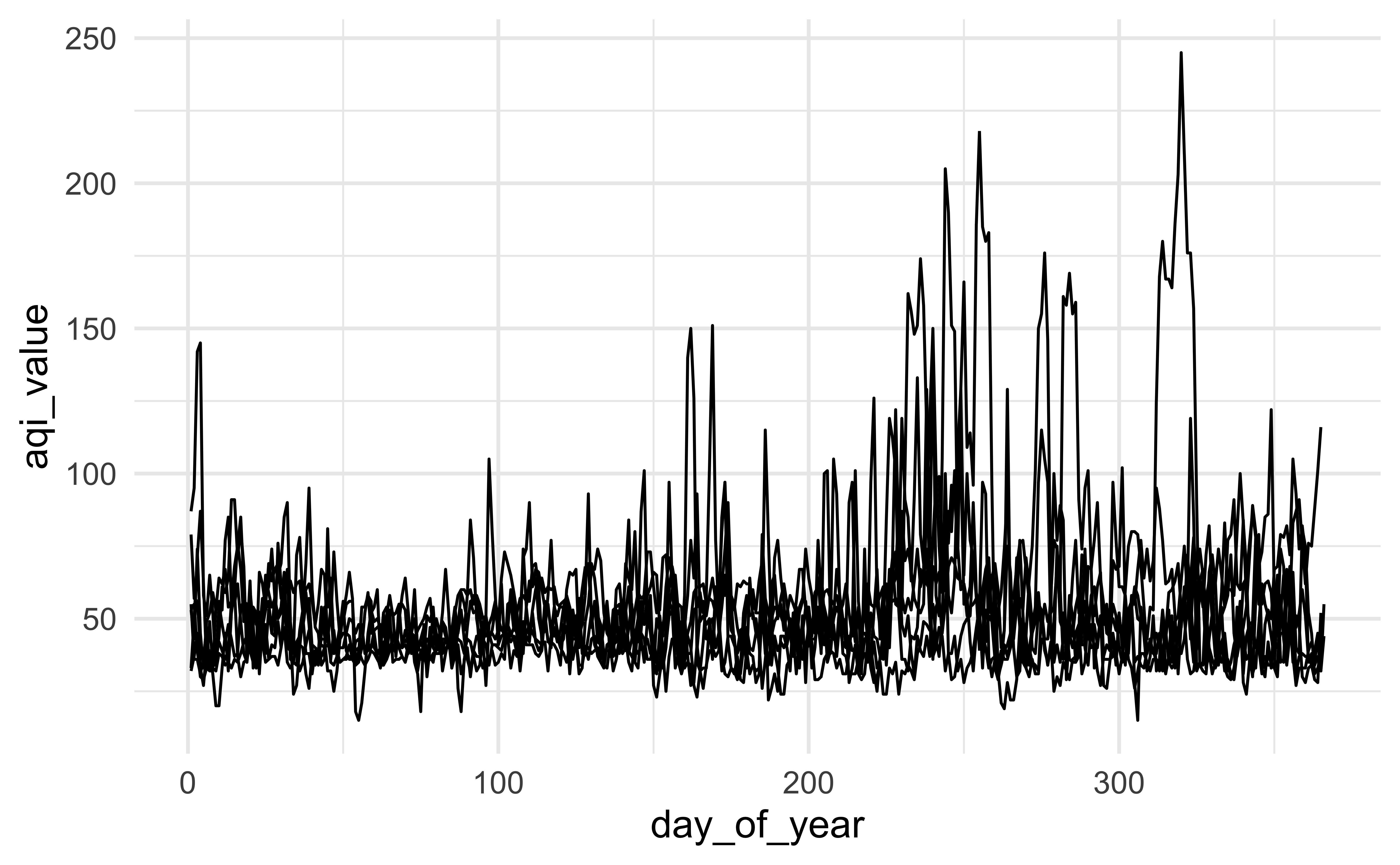
Plot AQI over years
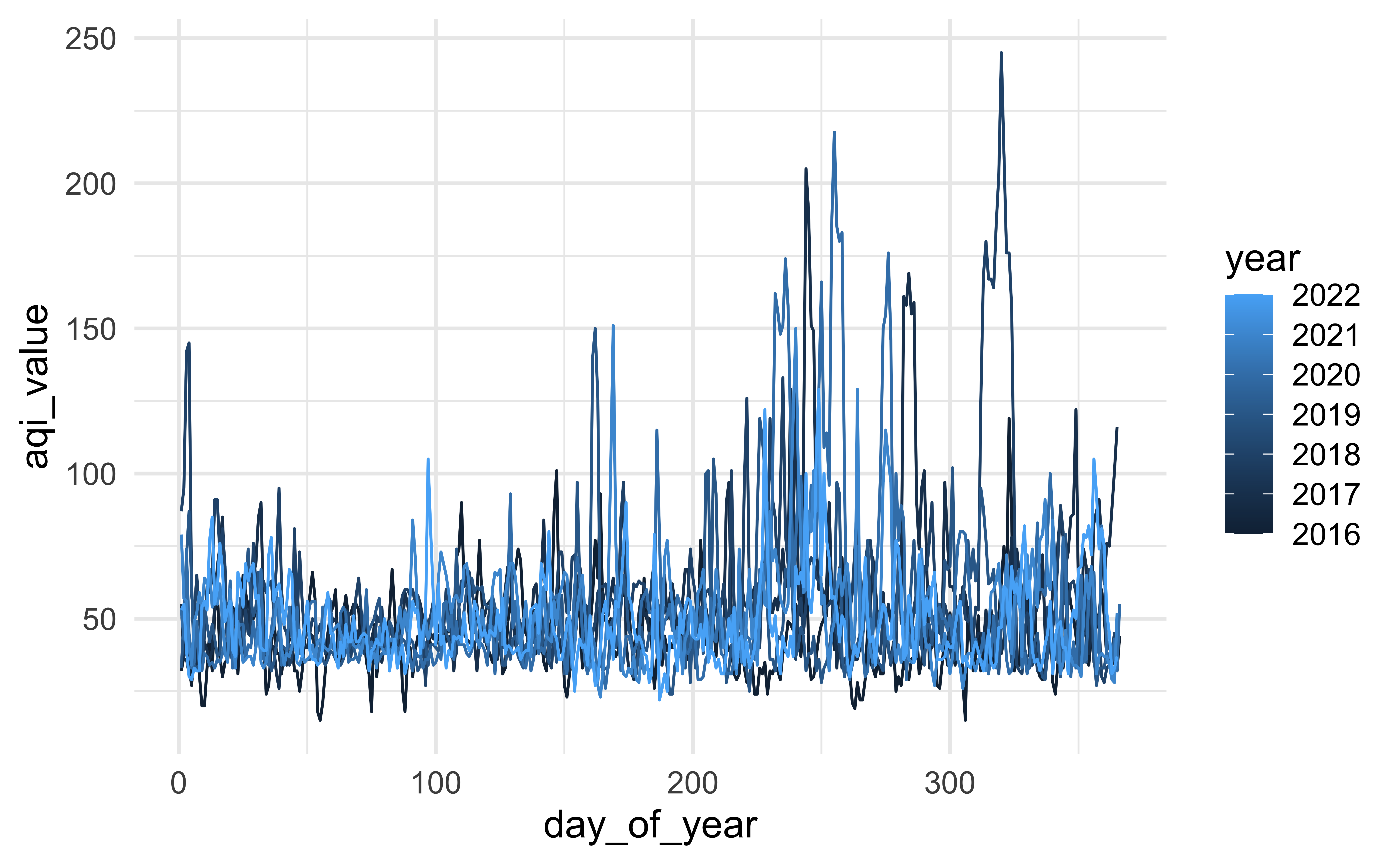
Plot AQI over years
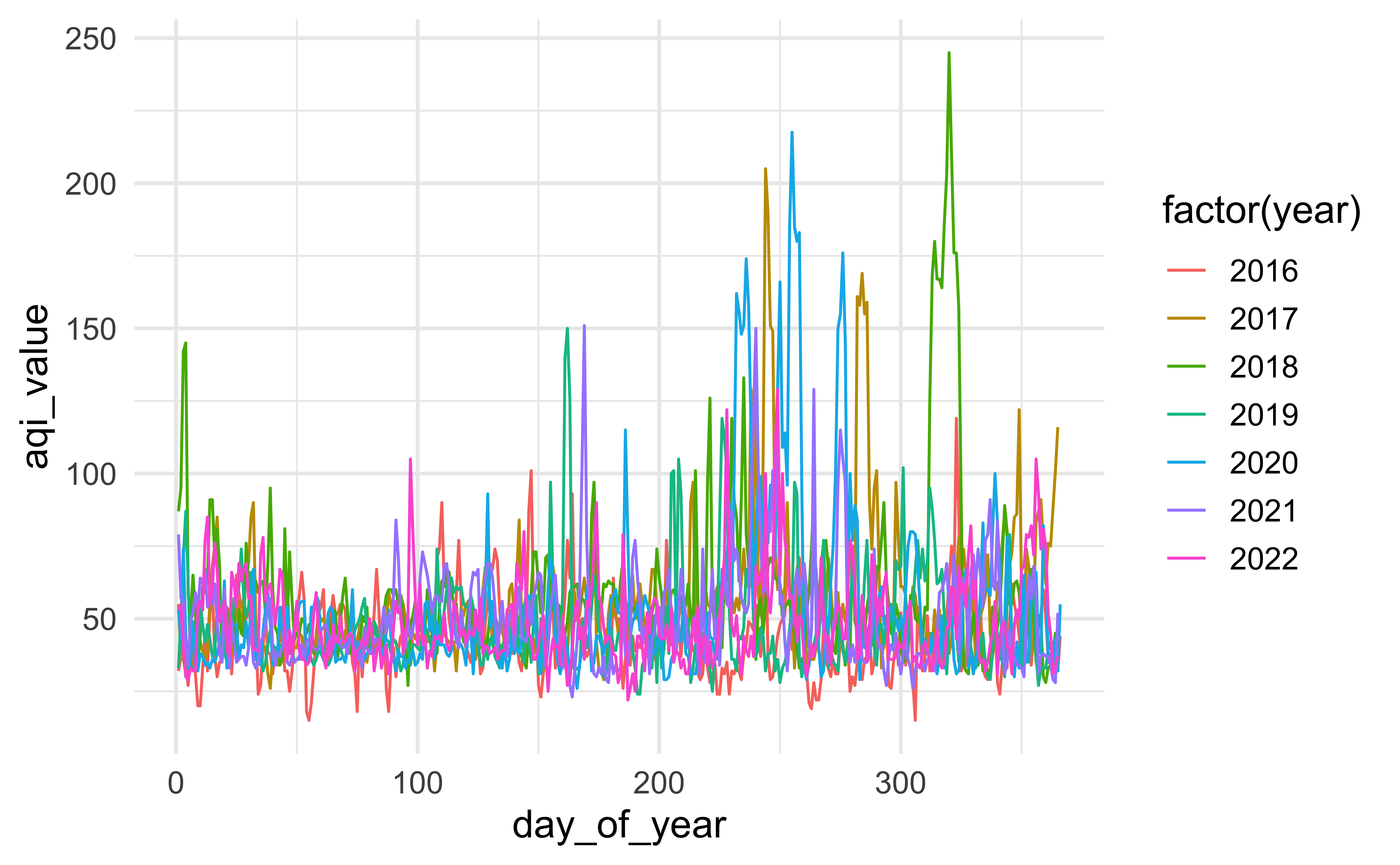
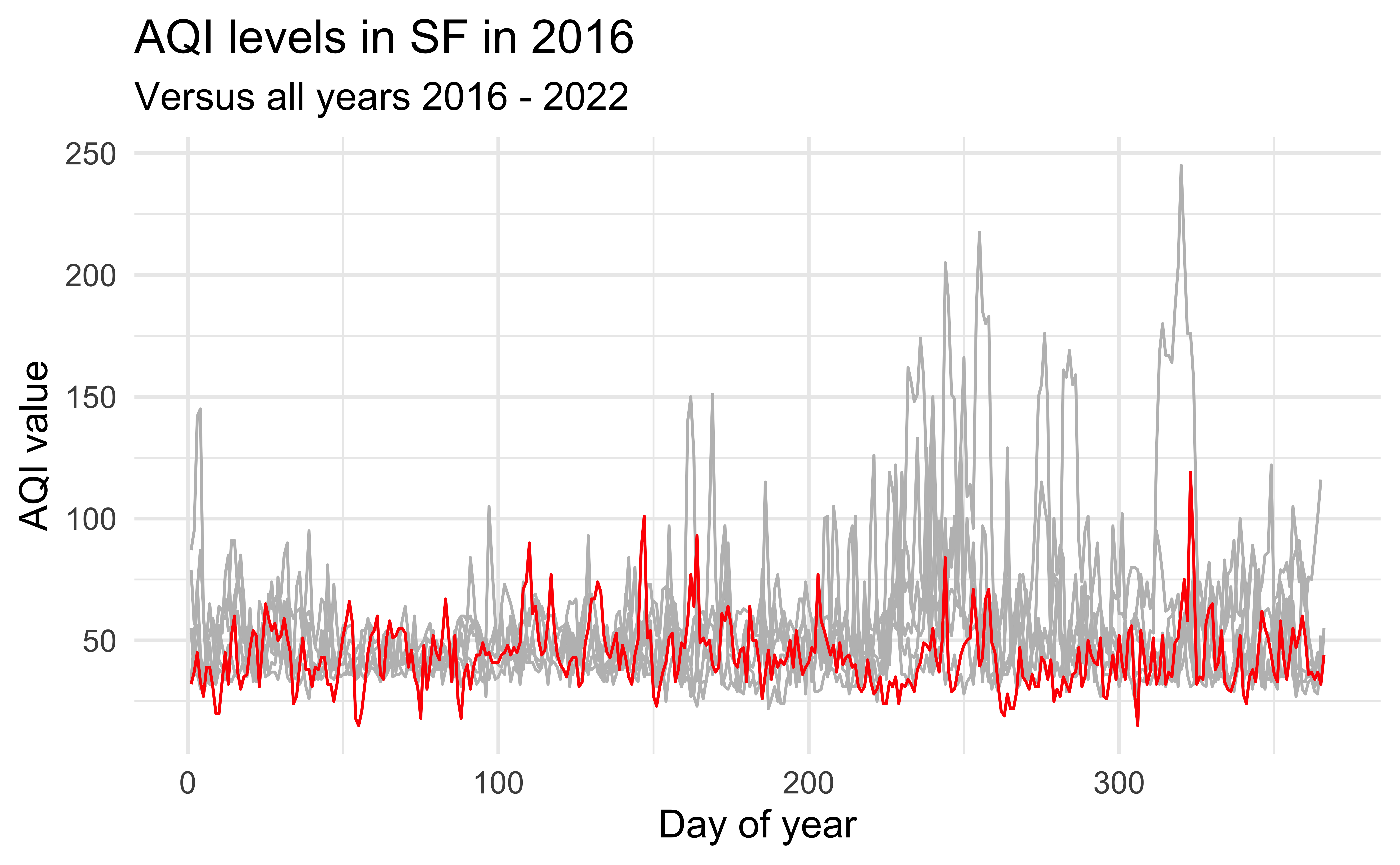
Highlight 2016
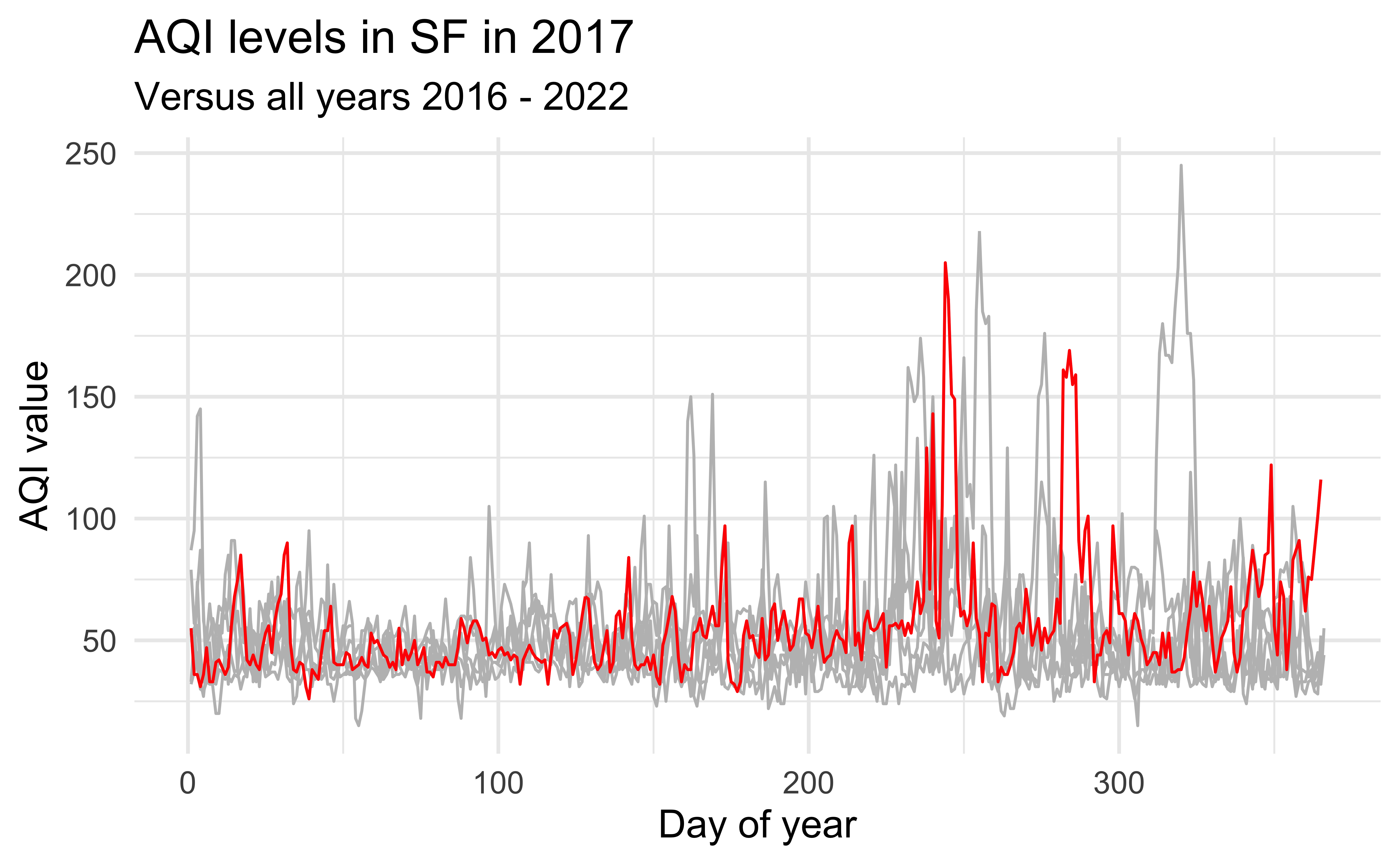
Highlight 2017
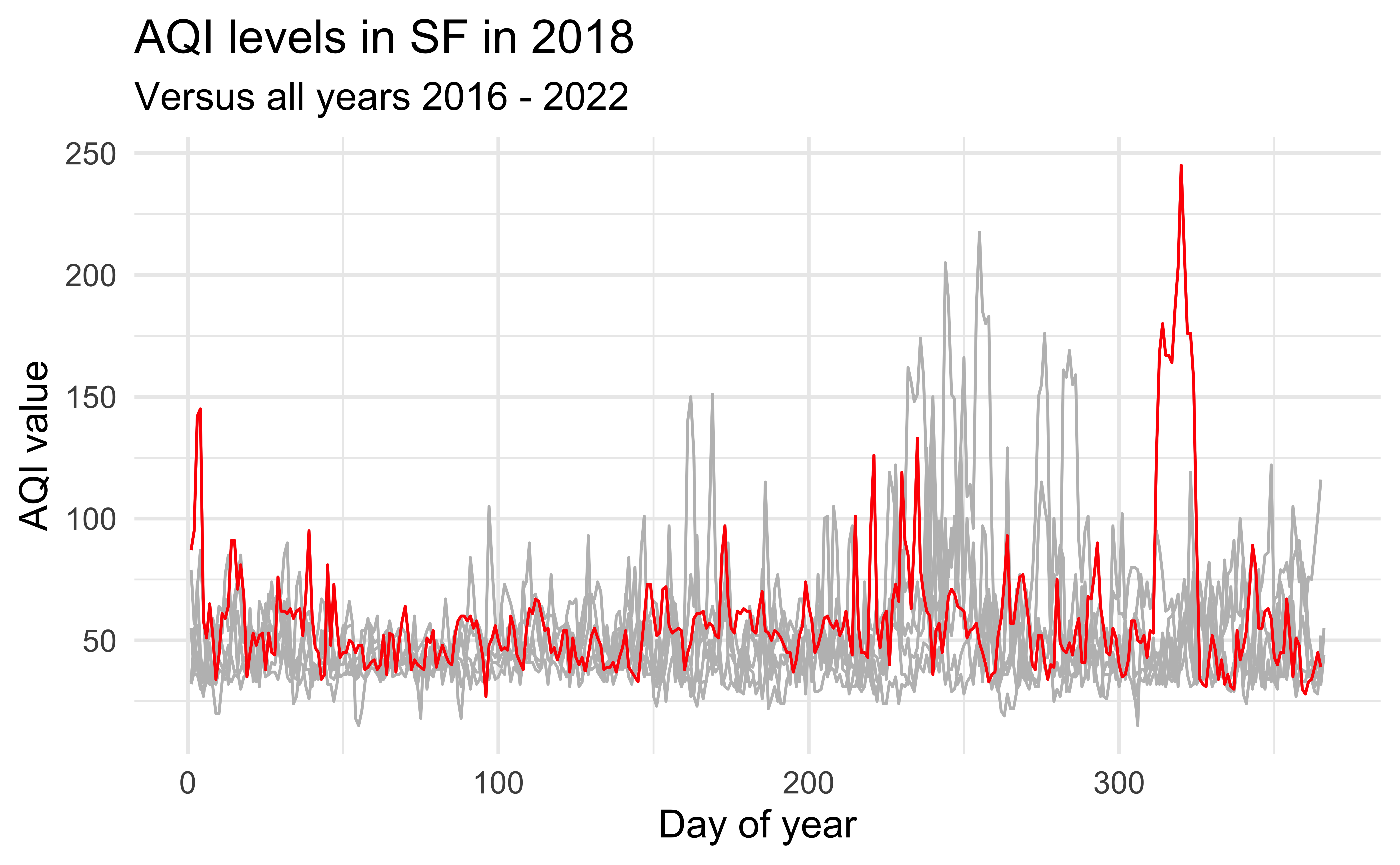
Highlight 2018
Highlight any year
year_to_highlight <- 2018

ggplot(sf, aes(x = day_of_year, y = aqi_value, group = year)) +
  geom_line(color = "gray") +
  geom_line(data = sf |> filter(year == year_to_highlight), color = "red") +
  labs(
    title = glue("AQI levels in SF in {year_to_highlight}"),
    subtitle = "Versus all years 2016 - 2022",
    x = "Day of year", y = "AQI value"
    )
Highlight with gghighlight
Time permitting!
Highlight years using gghighlight instead in Part 3 of ae-09.
![]()