# load packages
library(countdown)
library(tidyverse)
library(lubridate)
library(janitor)
library(colorspace)
library(broom)
library(fs)

# set theme for ggplot2
ggplot2::theme_set(ggplot2::theme_minimal(base_size = 14))

# set width of code output
options(width = 65)

# set figure parameters for knitr
knitr::opts_chunk$set(
  fig.width = 7, # 7" width
  fig.asp = 0.618, # the golden ratio
  fig.retina = 3, # dpi multiplier for displaying HTML output on retina
  fig.align = "center", # center align figures
  dpi = 300 # higher dpi, sharper image
)Visualizing time series data II
Lecture 9
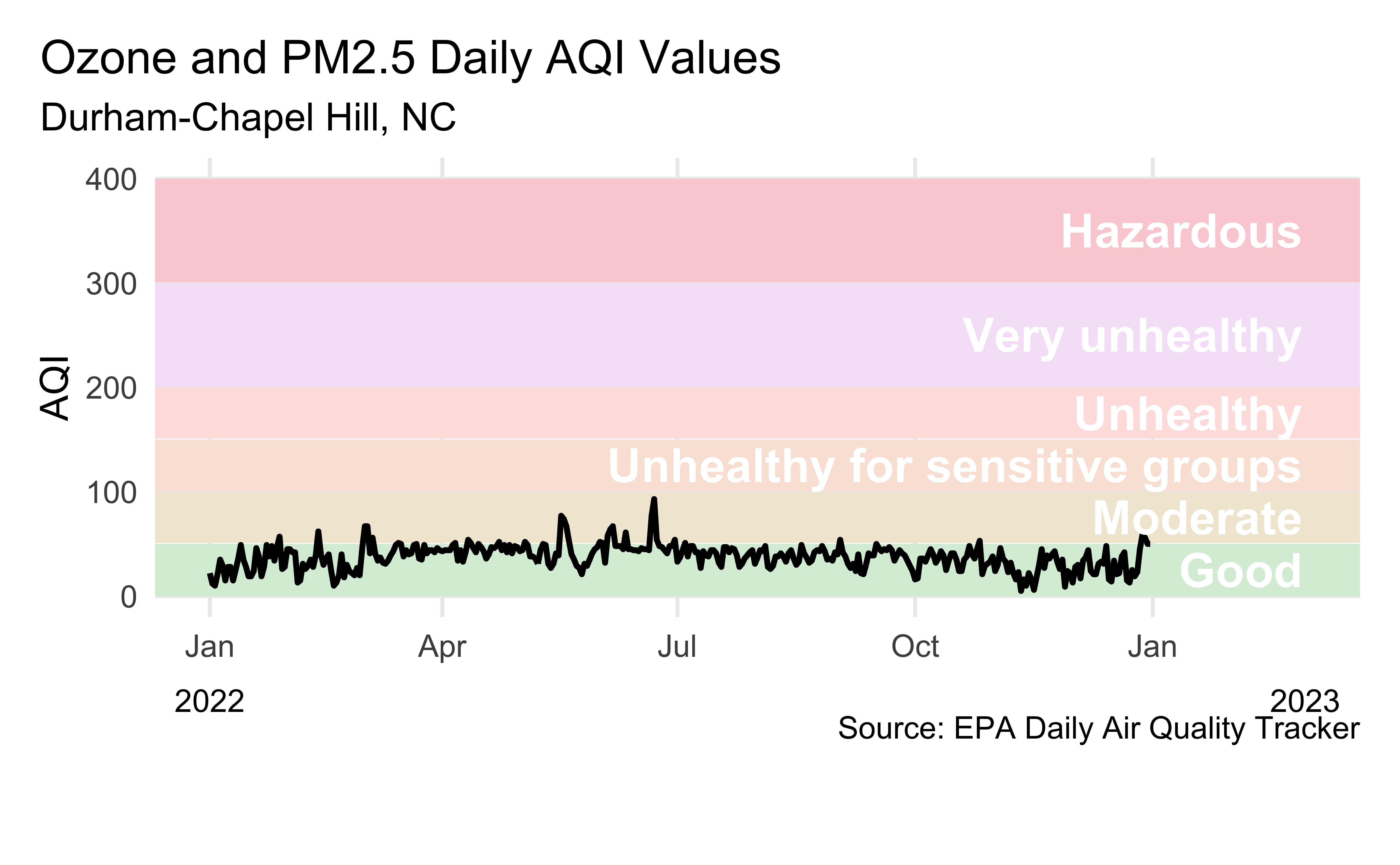
Visualizing Durham AQI
Recreate the following visualization.
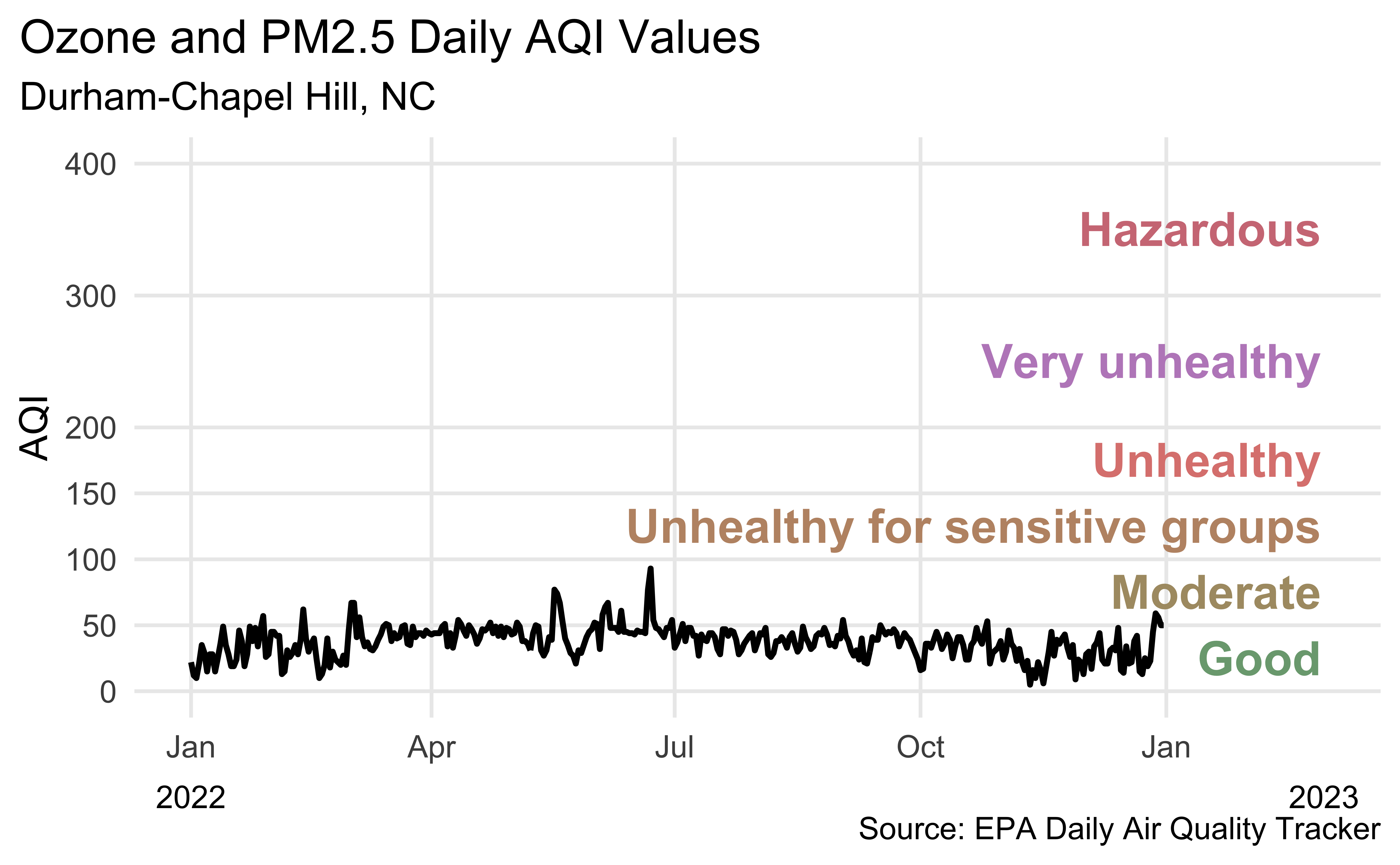
Another visualization of Durham AQI
Recreate the following visualization.
Plotting cumulatives
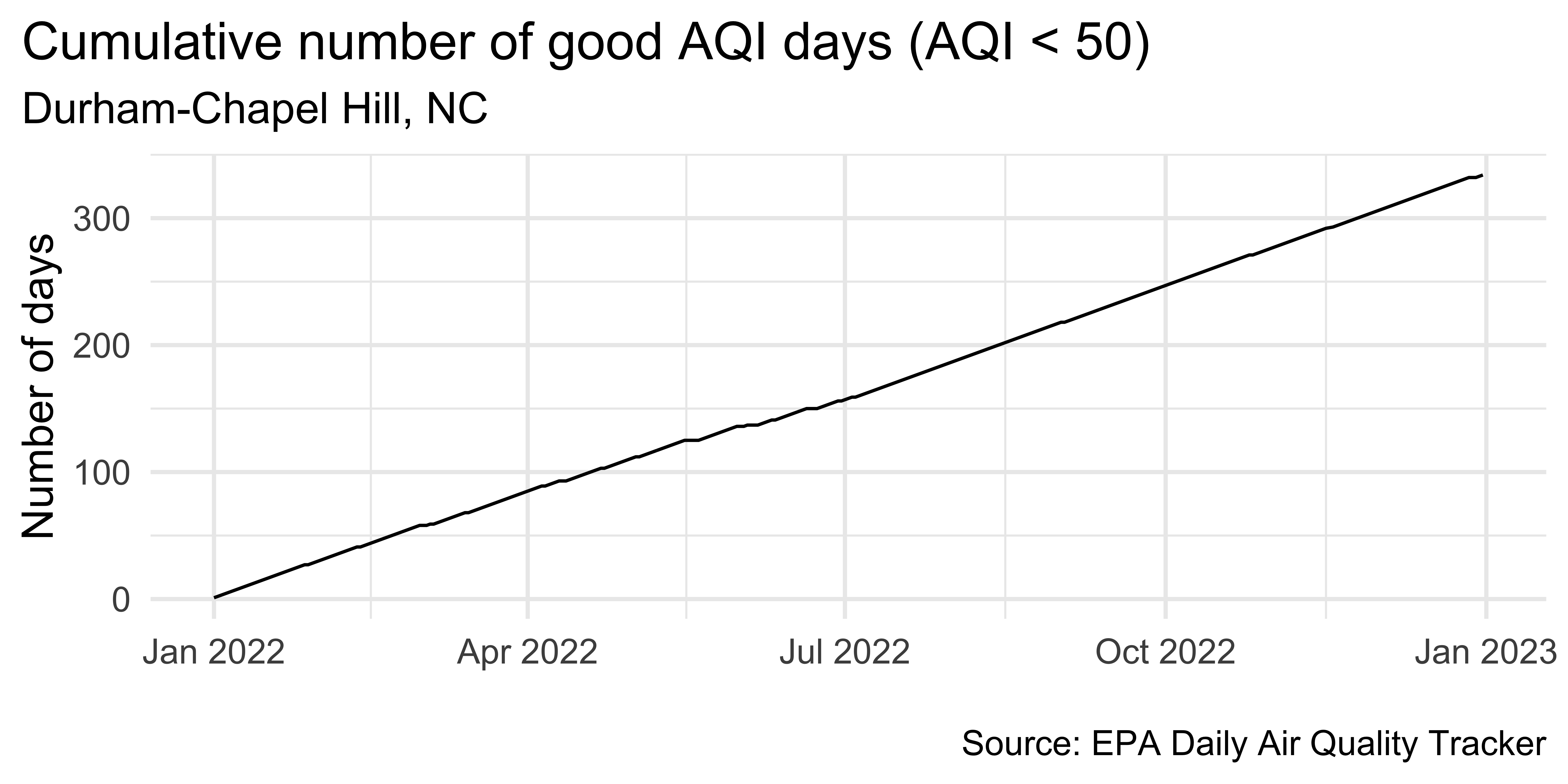
dch_2022 |>
  select(date, aqi_value) |>
  filter(!is.na(aqi_value)) |>
arrange(date) |>
mutate(
good_aqi = if_else(aqi_value <= 50, 1, 0),
cumsum_good_aqi = cumsum(good_aqi)
) |>
ggplot(aes(x = date, y = cumsum_good_aqi, group = 1)) +
geom_line() +
scale_x_date(date_labels = "%b %Y") +
labs(
x = NULL, y = "Number of days",
title = "Cumulative number of good AQI days (AQI < 50)",
subtitle = "Durham-Chapel Hill, NC",
caption = "\nSource: EPA Daily Air Quality Tracker"
) +
theme(plot.title.position = "plot")Plot trend since 2016
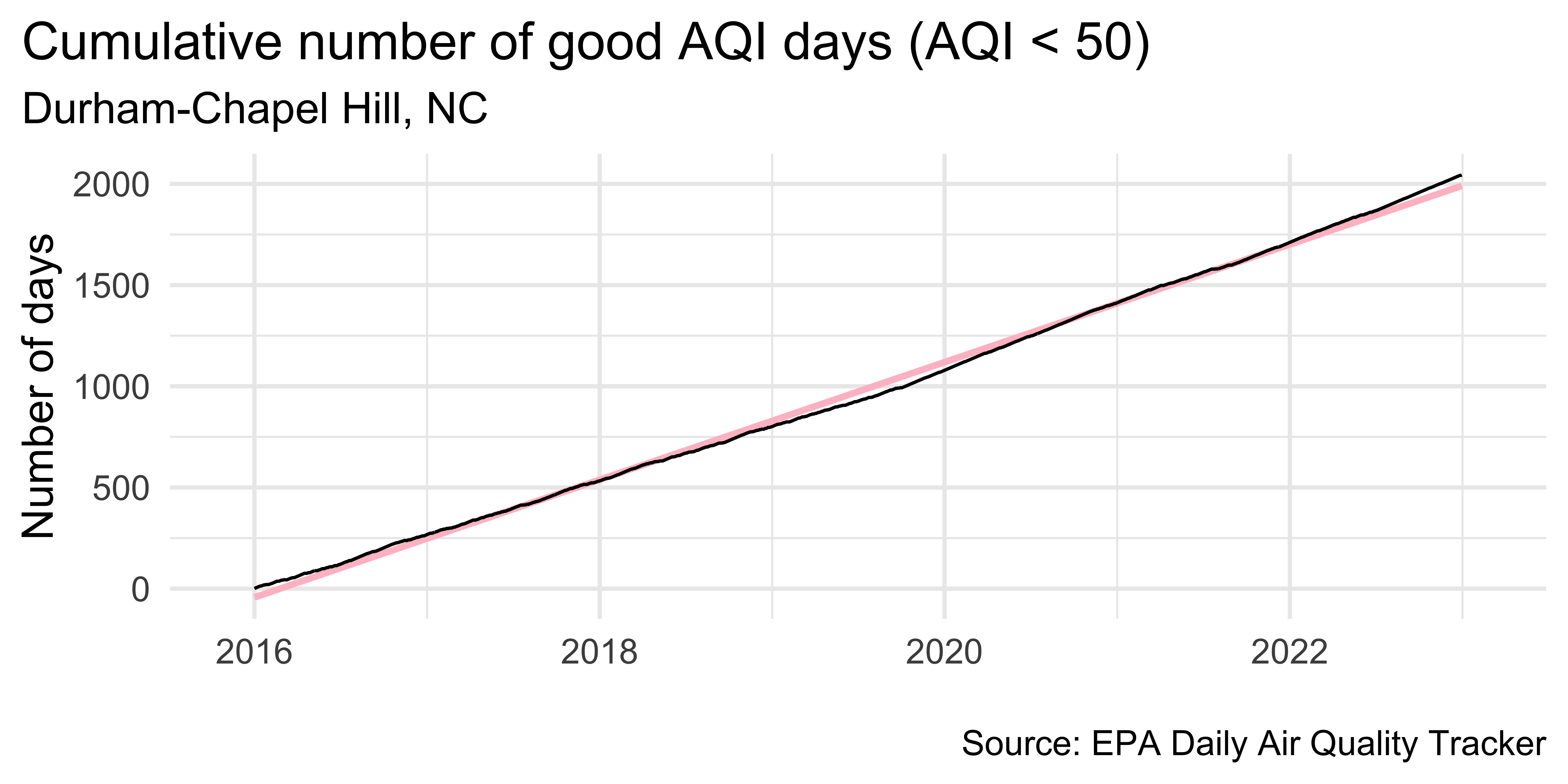
dch |>
  ggplot(aes(x = date, y = cumsum_good_aqi, group = 1)) +
  geom_smooth(method = "lm", color = "pink") +
  geom_line() +
  scale_x_date(
    expand = expansion(mult = 0.07),
    date_labels = "%Y"
  ) +
  labs(
    x = NULL, y = "Number of days",
    title = "Cumulative number of good AQI days (AQI < 50)",
    subtitle = "Durham-Chapel Hill, NC",
    caption = "\nSource: EPA Daily Air Quality Tracker"
  ) +
  theme(plot.title.position = "plot")
`geom_smooth()` using formula = 'y ~ x'Visualize detrended data
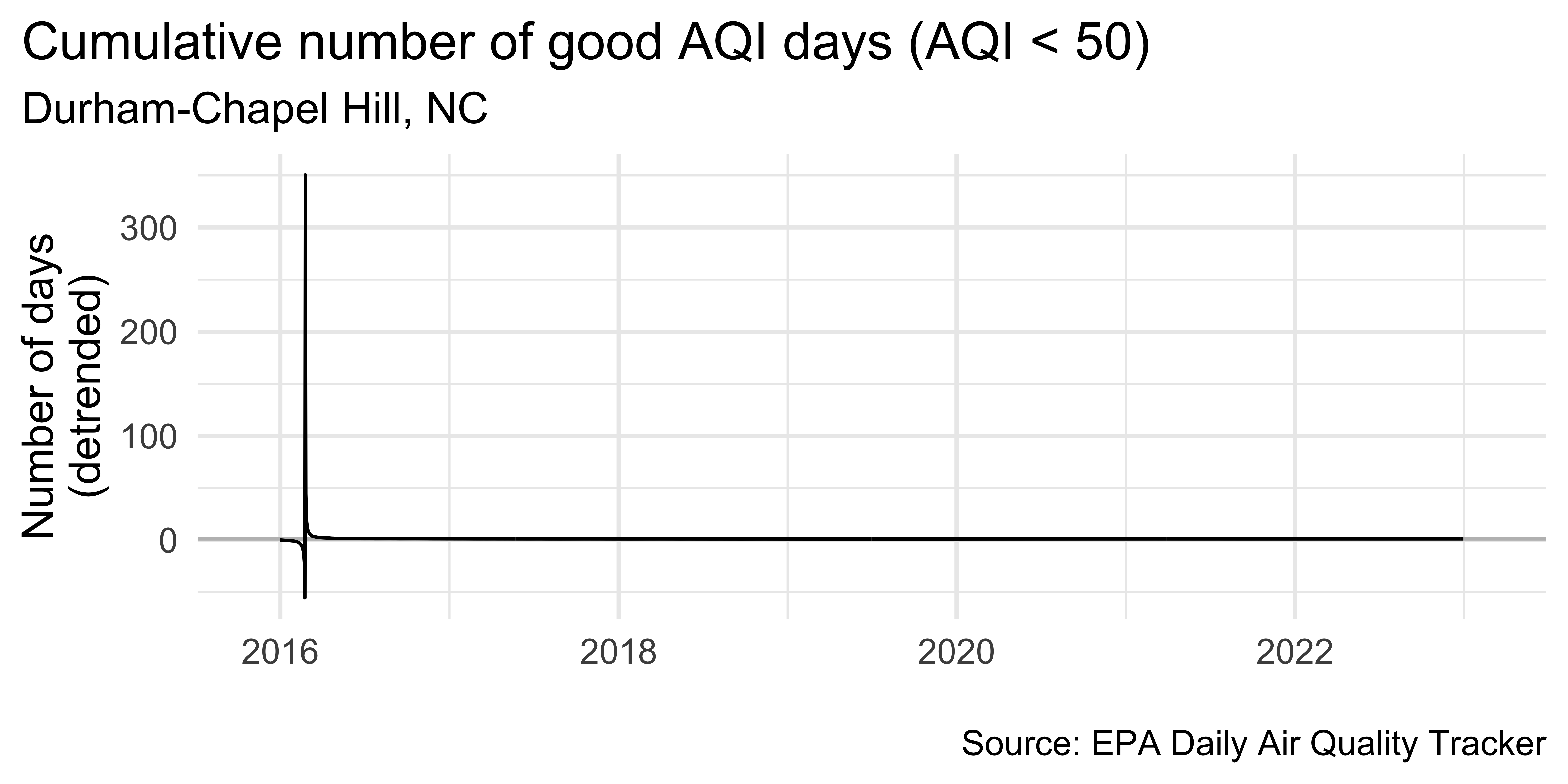
dch_aug |>
  ggplot(aes(x = date, y = ratio, group = 1)) +
  geom_hline(yintercept = 1, color = "gray") +
  geom_line() +
  scale_x_date(
    expand = expansion(mult = 0.07),
    date_labels = "%Y"
  ) +
  labs(
    x = NULL, y = "Number of days\n(detrended)",
    title = "Cumulative number of good AQI days (AQI < 50)",
    subtitle = "Durham-Chapel Hill, NC",
    caption = "\nSource: EPA Daily Air Quality Tracker"
  ) +
theme(plot.title.position = "plot")Plot trend since 2016
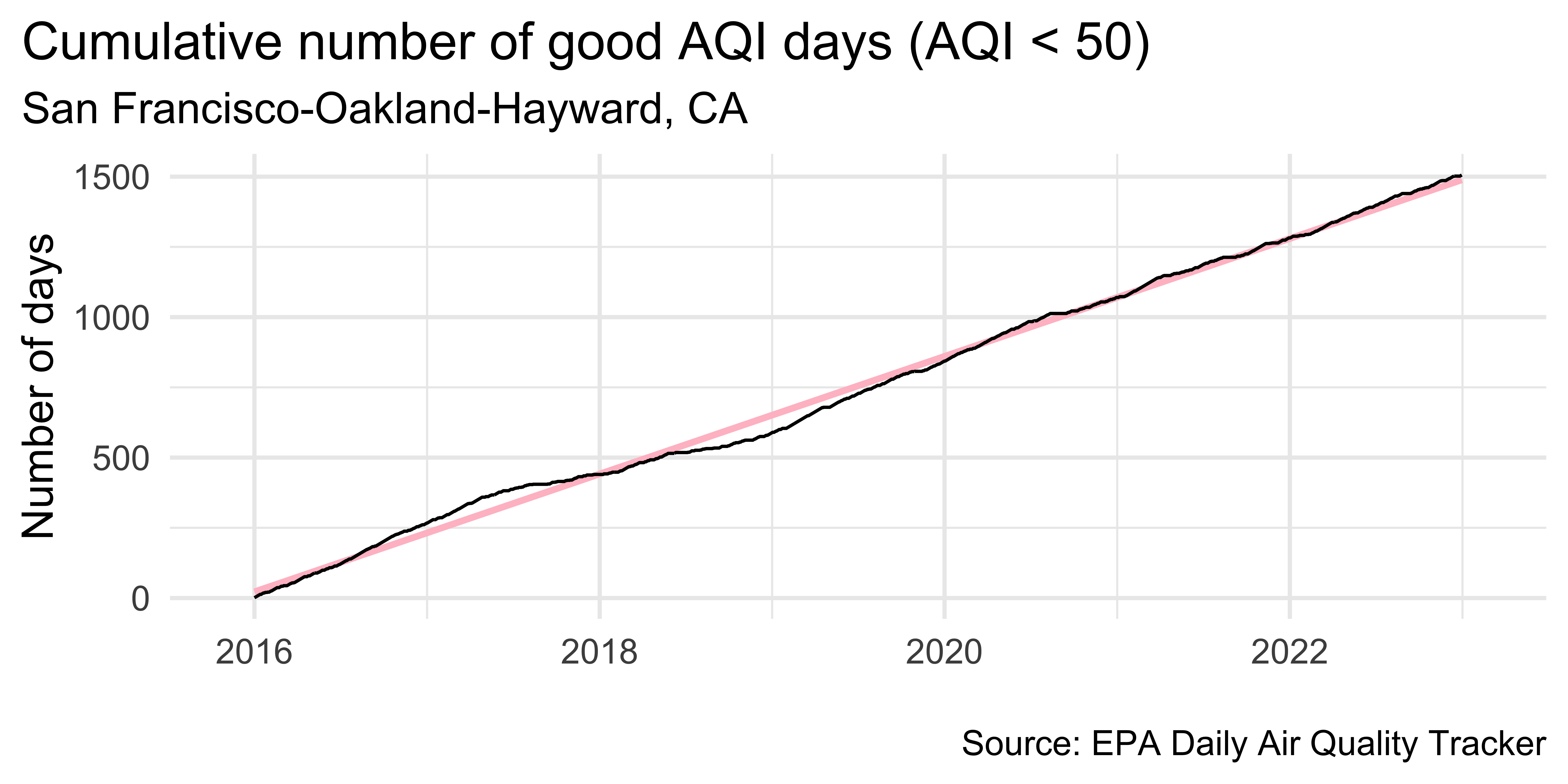
sf |>
  ggplot(aes(x = date, y = cumsum_good_aqi, group = 1)) +
  geom_smooth(method = "lm", color = "pink") +
  geom_line() +
  scale_x_date(
    expand = expansion(mult = 0.07),
    date_labels = "%Y"
  ) +
  labs(
    x = NULL, y = "Number of days",
    title = "Cumulative number of good AQI days (AQI < 50)",
    subtitle = "San Francisco-Oakland-Hayward, CA",
    caption = "\nSource: EPA Daily Air Quality Tracker"
  ) +
  theme(plot.title.position = "plot")
`geom_smooth()` using formula = 'y ~ x'Visualize detrended data
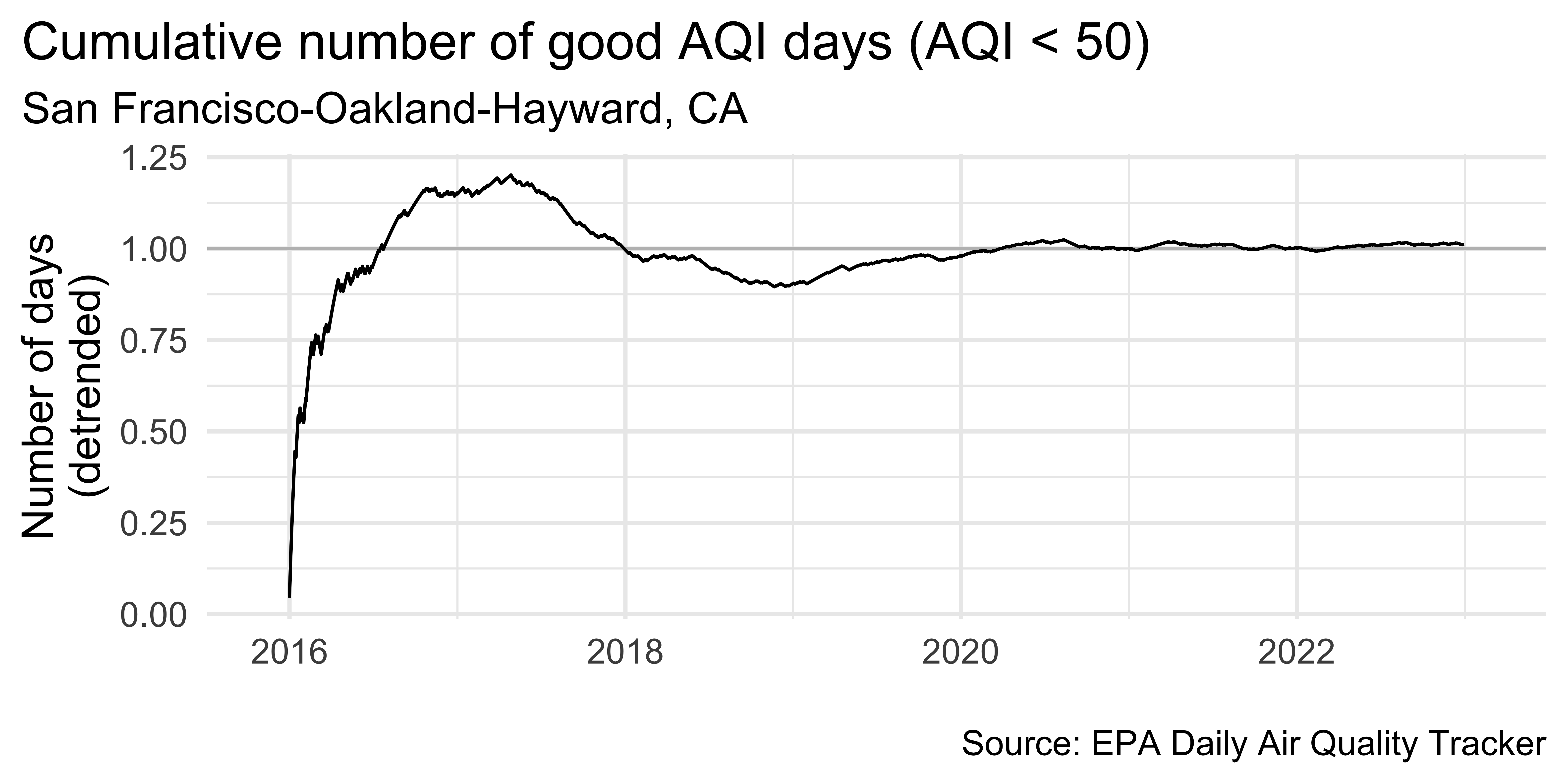
sf_aug |>
  ggplot(aes(x = date, y = ratio, group = 1)) +
  geom_hline(yintercept = 1, color = "gray") +
  geom_line() +
  scale_x_date(
    expand = expansion(mult = 0.07),
    date_labels = "%Y"
  ) +
  labs(
    x = NULL, y = "Number of days\n(detrended)",
    title = "Cumulative number of good AQI days (AQI < 50)",
    subtitle = "San Francisco-Oakland-Hayward, CA",
    caption = "\nSource: EPA Daily Air Quality Tracker"
  ) +
  theme(plot.title.position = "plot")
Detrending
In step 2 we fit a very simple model
Depending on the complexity you’re trying to capture you might choose to fit a much more complex model
You can also decompose the trend into multiple trends, e.g. monthly, long-term, seasonal, etc.
![]()