# load packages
library(countdown)
library(tidyverse)
library(lubridate)
library(janitor)
library(colorspace)
library(broom)
library(fs)

# set theme for ggplot2
ggplot2::theme_set(ggplot2::theme_minimal(base_size = 14))

# set width of code output
options(width = 65)

# set figure parameters for knitr
knitr::opts_chunk$set(
  fig.width = 7, # 7" width
  fig.asp = 0.618, # the golden ratio
  fig.retina = 3, # dpi multiplier for displaying HTML output on retina
  fig.align = "center", # center align figures
  dpi = 300 # higher dpi, sharper image
)Visualizing time series data I
Lecture 8
Dr. Mine Çetinkaya-Rundel
Duke University
STA 313 - Spring 2023
Warm up
Announcements
Project 1 proposal due Friday, 5pm
RQ 3 due Tuesday by class, covers everything since last reading quiz
Project 1 presentations – Feb 22 in lab, all team members must be there
Setup
Working with dates
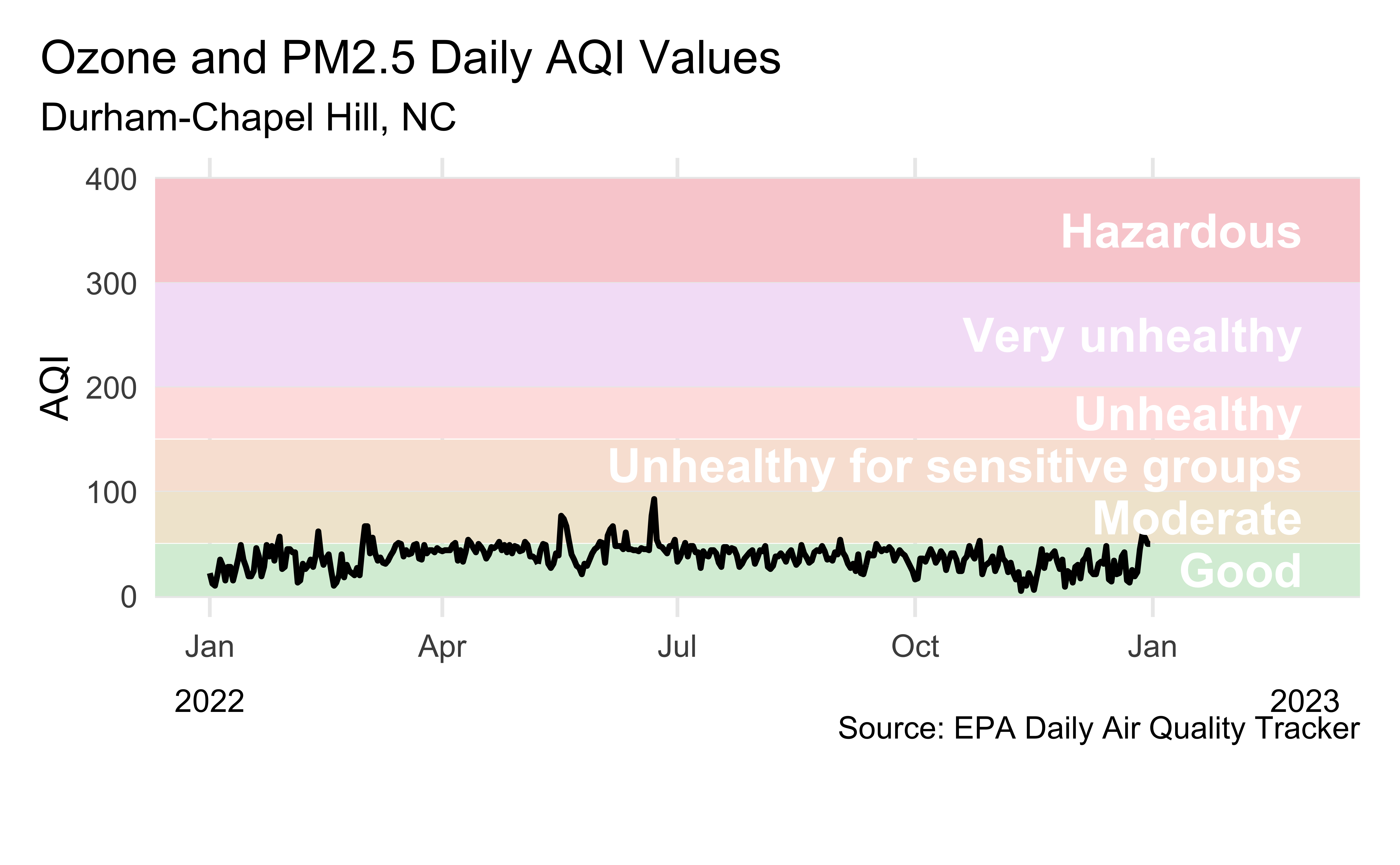
Air Quality Index
The AQI is the Environmental Protection Agency’s index for reporting air quality
Higher values of AQI indicate worse air quality
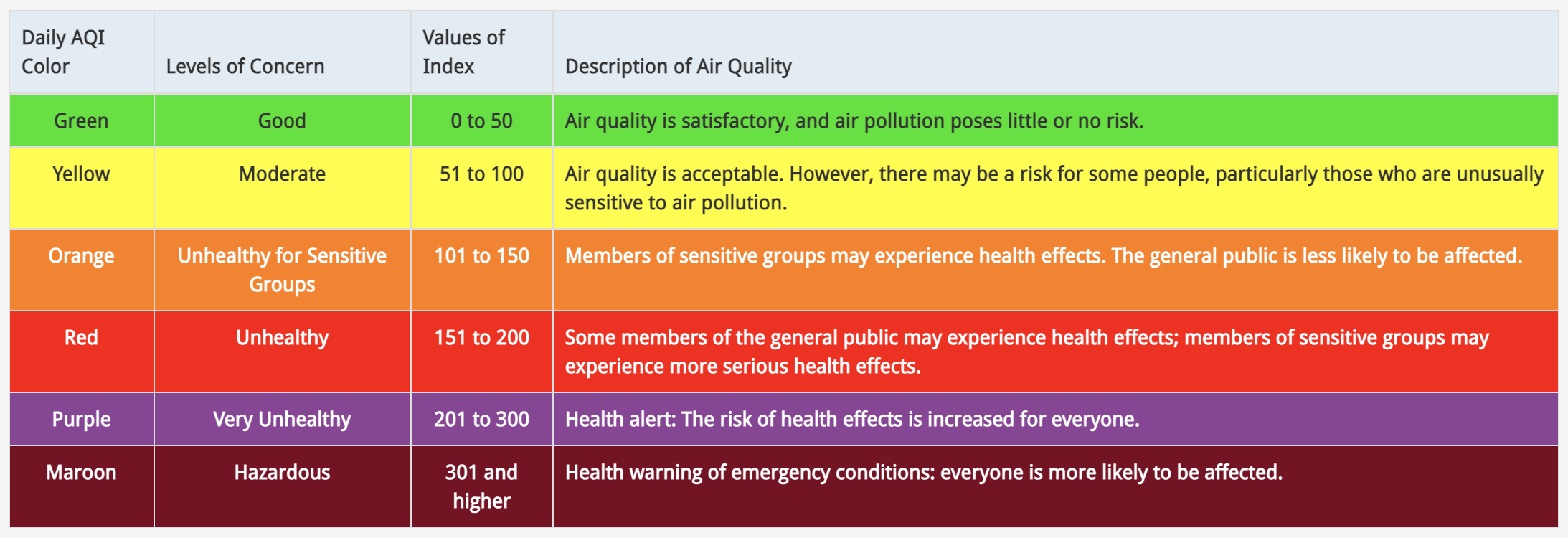
AQI levels
The previous graphic in tibble form, to be used later…
AQI data
Source: EPA’s Daily Air Quality Tracker
2016 - 2022 AQI (Ozone and PM2.5 combined) for Durham-Chapel Hill, NC core-based statistical area (CBSA), one file per year
2016 - 2022 AQI (Ozone and PM2.5 combined) for San Francisco-Oakland-Hayward, CA CBSA, one file per year
2022 Durham-Chapel Hill
- Load data
Clean variable names
First look
This plot looks quite bizarre. What might be going on?
Peek at data
# A tibble: 365 × 4
   date       aqi_value site_name     site_id
   <chr>      <chr>     <chr>         <chr>
 1 01/01/2022 22        Durham Armory 37-063-0015
 2 01/02/2022 12        Durham Armory 37-063-0015
 3 01/03/2022 10        Durham Armory 37-063-0015
 4 01/04/2022 21        Durham Armory 37-063-0015
 5 01/05/2022 35        Durham Armory 37-063-0015
 6 01/06/2022 29        Durham Armory 37-063-0015
 7 01/07/2022 15        Durham Armory 37-063-0015
 8 01/08/2022 28        Durham Armory 37-063-0015
 9 01/09/2022 28        Durham Armory 37-063-0015
10 01/10/2022 15        Durham Armory 37-063-0015
# … with 355 more rows
Transforming date
Using lubridate::mdy():
# A tibble: 365 × 11
date aqi_value main_pol…¹ site_…² site_id source x20_y…³
<date> <chr> <chr> <chr> <chr> <chr> <dbl>
1 2022-01-01 22 PM2.5 Durham… 37-063… AQS 111
2 2022-01-02 12 PM2.5 Durham… 37-063… AQS 76
3 2022-01-03 10 PM2.5 Durham… 37-063… AQS 66
4 2022-01-04 21 PM2.5 Durham… 37-063… AQS 61
5 2022-01-05 35 PM2.5 Durham… 37-063… AQS 83
6 2022-01-06 29 PM2.5 Durham… 37-063… AQS 71
7 2022-01-07 15 PM2.5 Durham… 37-063… AQS 75
8 2022-01-08 28 PM2.5 Durham… 37-063… AQS 76
9 2022-01-09 28 PM2.5 Durham… 37-063… AQS 57
10 2022-01-10 15 PM2.5 Durham… 37-063… AQS 71
# … with 355 more rows, 4 more variables:
# x20_year_low_2000_2019 <dbl>,
# x5_year_average_2015_2019 <dbl>, date_of_20_year_high <chr>,
# date_of_20_year_low <chr>, and abbreviated variable names
# ¹main_pollutant, ²site_name, ³x20_year_high_2000_2019Transforming AQI values
What does this warning mean?
Warning: There was 1 warning in `mutate()`.
ℹ In argument: `aqi_value = as.numeric(aqi_value)`.
Caused by warning:
! NAs introduced by coercion
# A tibble: 365 × 11
date aqi_v…¹ main_…² site_…³ site_id source x20_y…⁴ x20_y…⁵
<chr> <dbl> <chr> <chr> <chr> <chr> <dbl> <dbl>
1 01/01/2… 22 PM2.5 Durham… 37-063… AQS 111 10
2 01/02/2… 12 PM2.5 Durham… 37-063… AQS 76 8
3 01/03/2… 10 PM2.5 Durham… 37-063… AQS 66 14
# … with 362 more rows, 3 more variables:
# x5_year_average_2015_2019 <dbl>, date_of_20_year_high <chr>,
# date_of_20_year_low <chr>, and abbreviated variable names
# ¹aqi_value, ²main_pollutant, ³site_name,
# ⁴x20_year_high_2000_2019, ⁵x20_year_low_2000_2019Investigating AQI values
- Take a peek at distinct values of AQI
 [1] "22" "12" "10" "21" "35" "29" "15" "28" "25" "36" "49" "19"
[13] "24" "46" "38" "48" "34" "47" "57" "26" "45" "42" "13" "31"
[25] "39" "62" "40" "30" "20" "18" "27" "67" "41" "56" "37" "32"
[37] "43" "51" "50" "44" "33" "54" "52" "77" "74" "53" "58" "64"
[49] "61" "93" "16" "17" "23" "5" "6" "." "9" "14" "59""."likely indicatesNA, and it’s causing the entire column to be read in as characters
Rewind, and start over
Rows: 365
Columns: 11
$ Date                         <chr> "01/01/2022", "01/02/2022"…
$ `AQI Value`                  <dbl> 22, 12, 10, 21, 35, 29, 15…
$ `Main Pollutant`             <chr> "PM2.5", "PM2.5", "PM2.5",…
$ `Site Name`                  <chr> "Durham Armory", "Durham A…
$ `Site ID`                    <chr> "37-063-0015", "37-063-001…
$ Source                       <chr> "AQS", "AQS", "AQS", "AQS"…
$ `20-year High (2000-2019)`   <dbl> 111, 76, 66, 61, 83, 71, 7…
$ `20-year Low (2000-2019)`    <dbl> 10, 8, 14, 9, 8, 15, 18, 1…
$ `5-year Average (2015-2019)` <dbl> 39.2, 36.8, 38.2, 30.4, 26…
$ `Date of 20-year High`       <chr> "01/01/2000", "01/02/2005"…
$ `Date of 20-year Low`        <chr> "01/01/2007", "01/02/2012"…
Data cleaning
# A tibble: 365 × 11
date aqi_value main_pol…¹ site_…² site_id source x20_y…³
<date> <dbl> <chr> <chr> <chr> <chr> <dbl>
1 2022-01-01 22 PM2.5 Durham… 37-063… AQS 111
2 2022-01-02 12 PM2.5 Durham… 37-063… AQS 76
3 2022-01-03 10 PM2.5 Durham… 37-063… AQS 66
4 2022-01-04 21 PM2.5 Durham… 37-063… AQS 61
5 2022-01-05 35 PM2.5 Durham… 37-063… AQS 83
6 2022-01-06 29 PM2.5 Durham… 37-063… AQS 71
7 2022-01-07 15 PM2.5 Durham… 37-063… AQS 75
8 2022-01-08 28 PM2.5 Durham… 37-063… AQS 76
9 2022-01-09 28 PM2.5 Durham… 37-063… AQS 57
10 2022-01-10 15 PM2.5 Durham… 37-063… AQS 71
# … with 355 more rows, 4 more variables:
# x20_year_low_2000_2019 <dbl>,
# x5_year_average_2015_2019 <dbl>, date_of_20_year_high <chr>,
# date_of_20_year_low <chr>, and abbreviated variable names
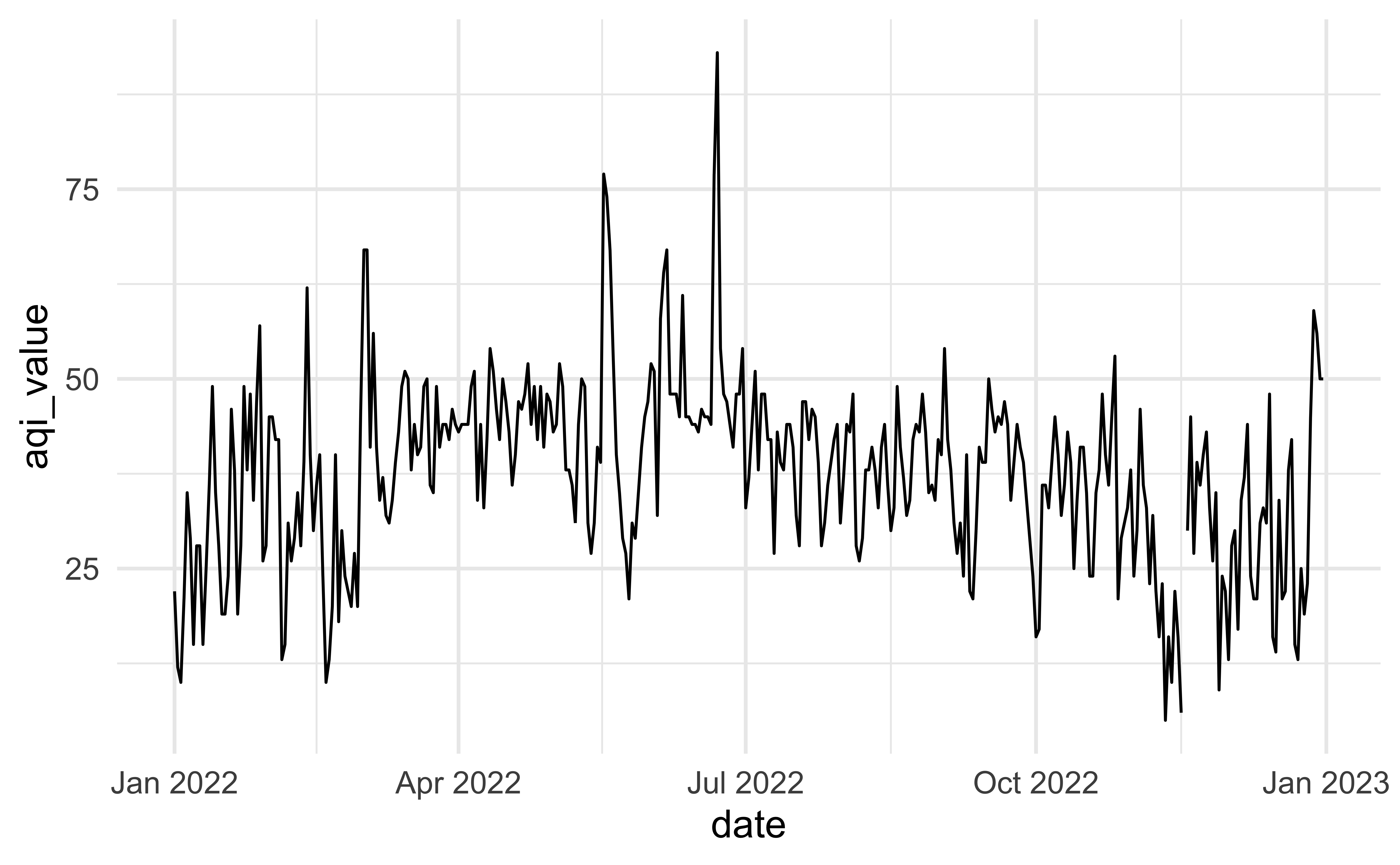
# ¹main_pollutant, ²site_name, ³x20_year_high_2000_2019Another look
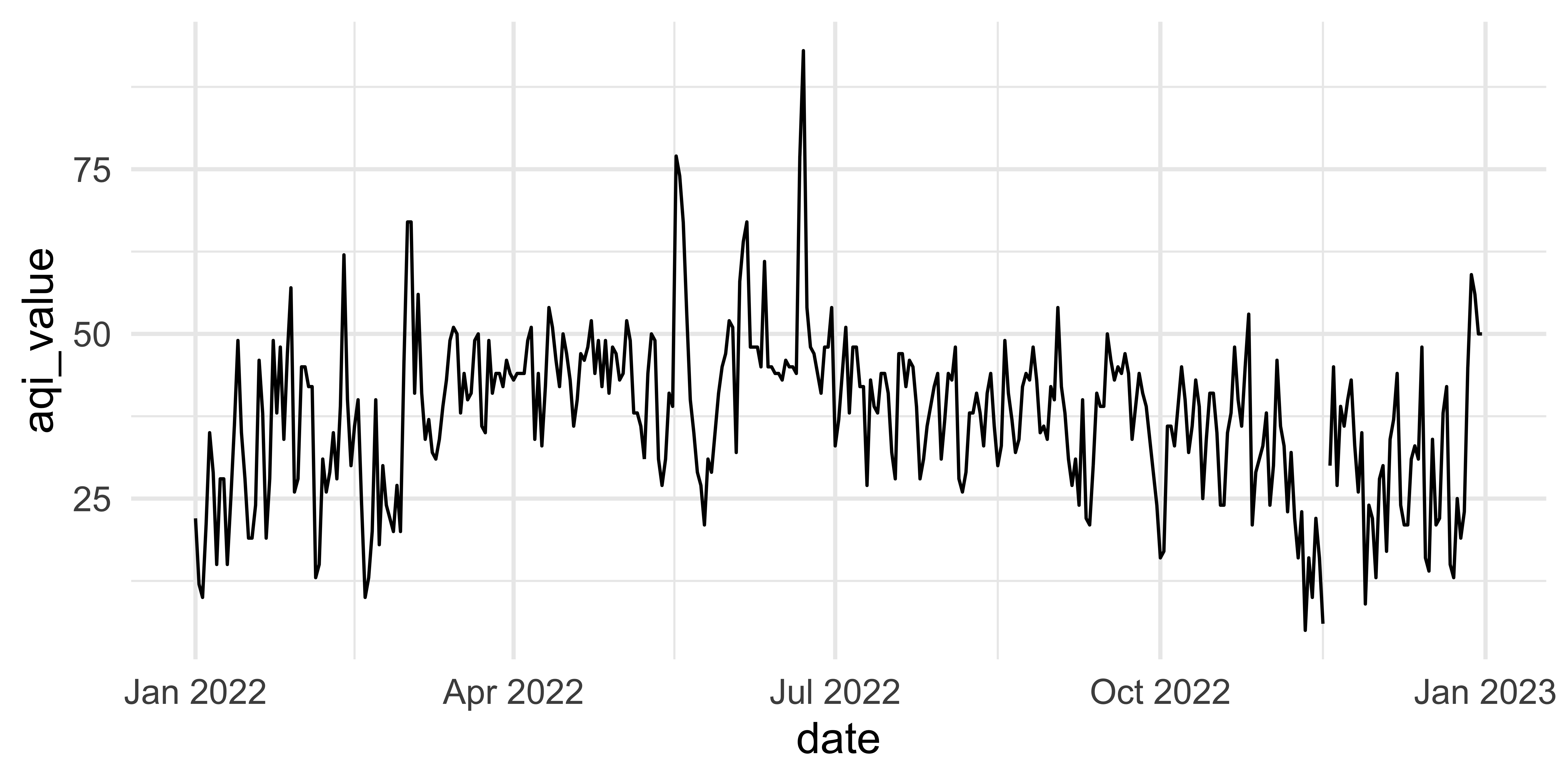
How would you improve this visualization?
Visualizing Durham AQI
Recreate the following visualization.