Visualizing density - II
Lecture 6
Important notes from last time
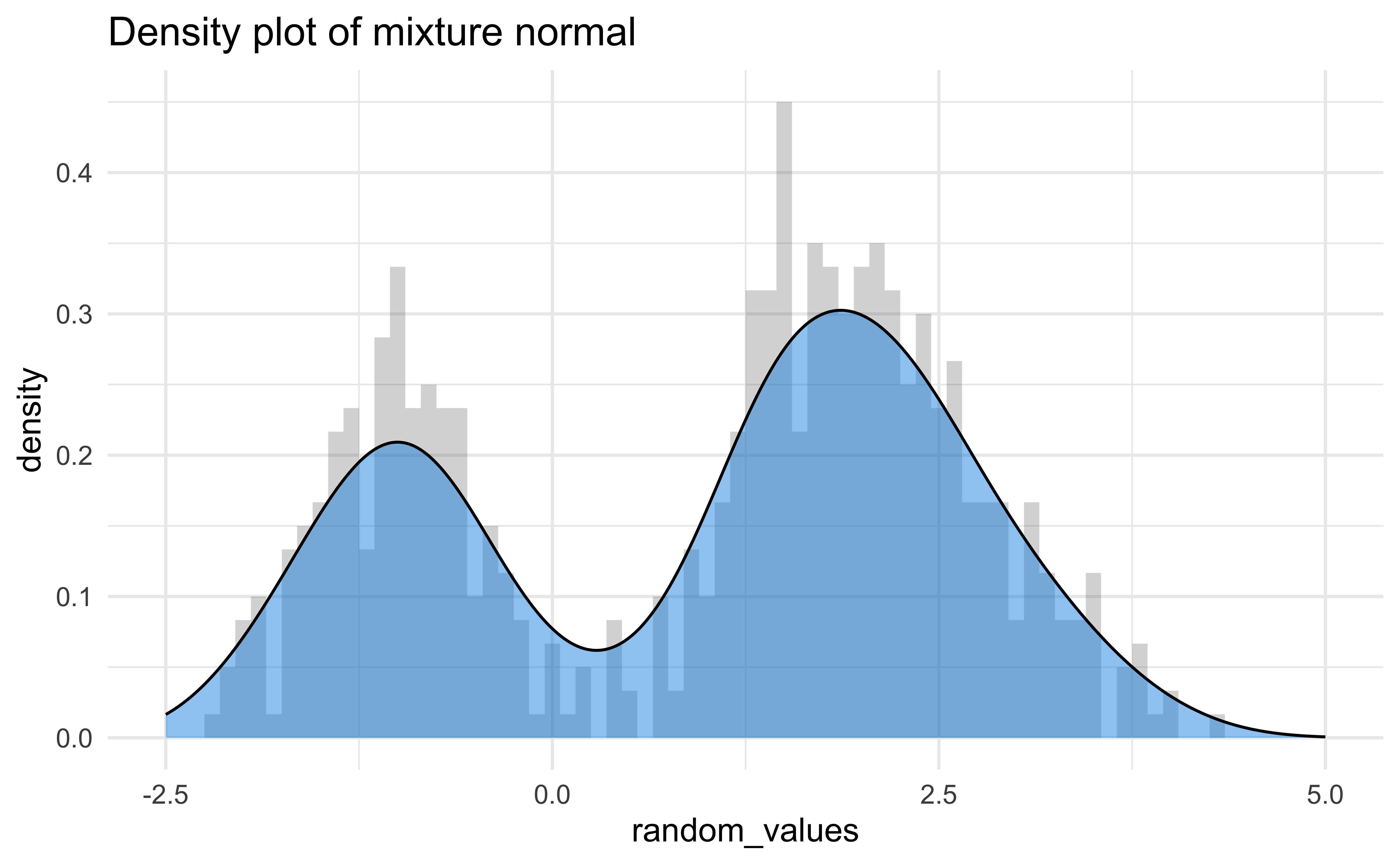
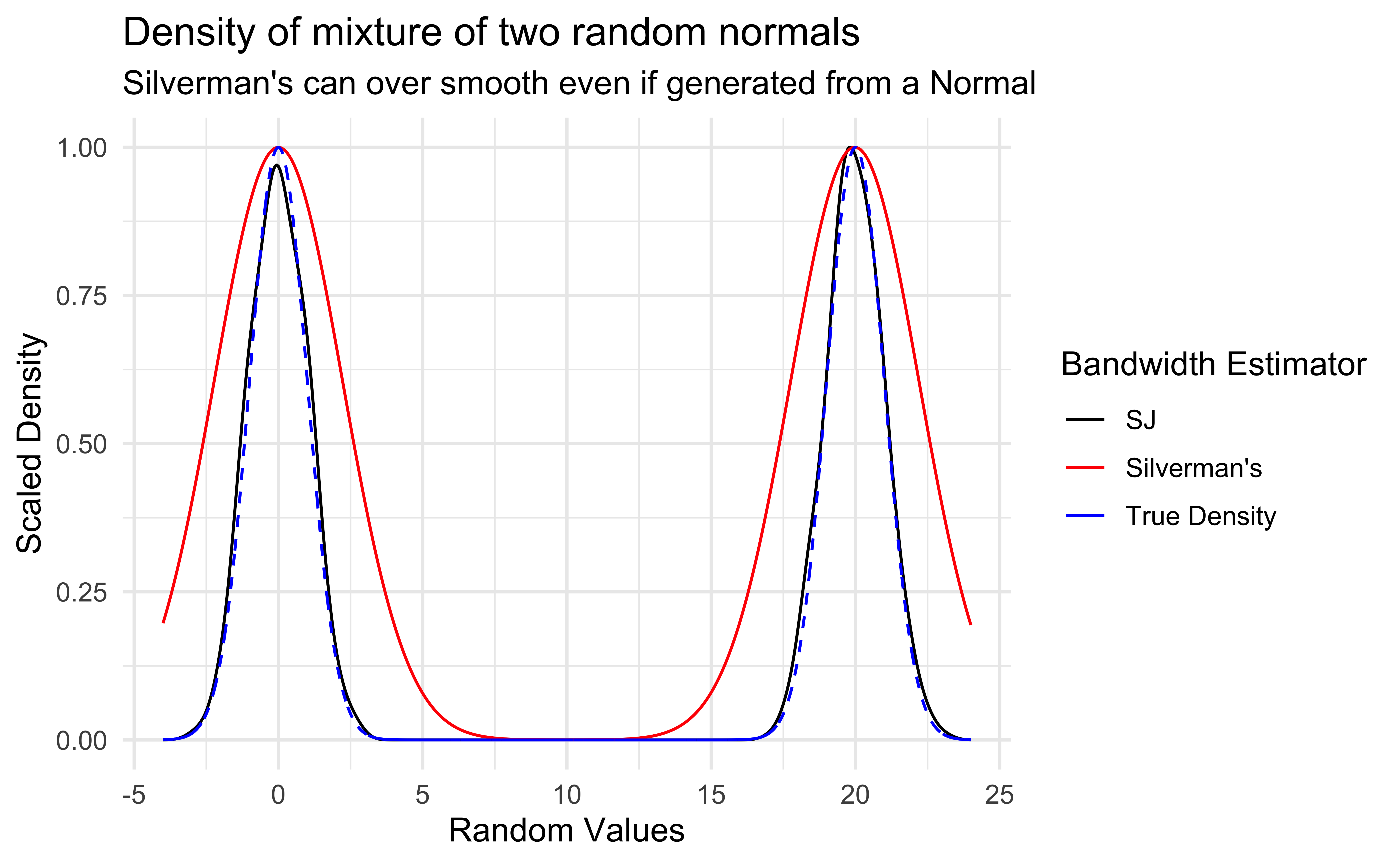
Although density graphs are very useful and can display lots of information, they can be sensitive to bandwidth.
It was not clear how to properly determine if two distributions were significantly different.
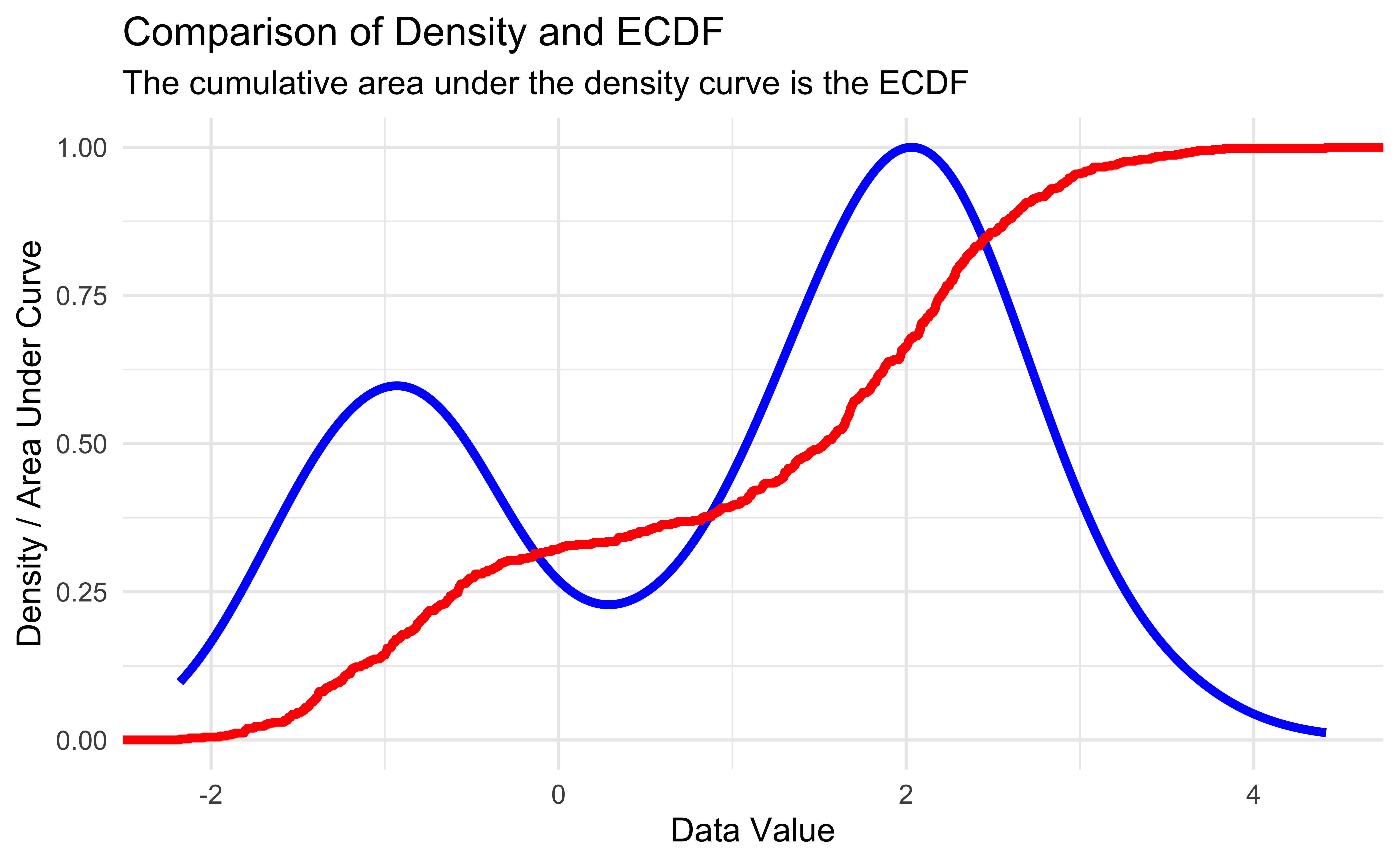
Empirical CDFs in R
| Function Call | Probability less than value |
|---|---|
| mix_ecdf(-3) | 0.0000 |
| mix_ecdf(-1) | 0.1433 |
| mix_ecdf(0) | 0.3217 |
| mix_ecdf(2) | 0.6633 |
| mix_ecdf(5) | 1.0000 |
Comparing Distributions 1
# Closest 4 years
HRearly2010s <- home_runs |>
  filter(yearID %in% 2011:2014)

# Years up to COVID season
HRlate2010s <- home_runs |>
  filter(yearID %in% 2016:2019)

ks.test(HRearly2010s$HR, HRlate2010s$HR)
    Asymptotic two-sample Kolmogorov-Smirnov test

data:  HRearly2010s$HR and HRlate2010s$HR
D = 0.16691, p-value = 6.463e-12
alternative hypothesis: two-sided
get_ks_df <- function(dat1, dat2) {
# Make ECDF of each set of data
ecdf1 <- ecdf(dat1)
ecdf2 <- ecdf(dat2)
# Calculate the absolute difference between the 2 ECDFs on the support
grid_points <- seq(0, max(c(dat1, dat2)), length.out=1000)
differences <- abs(ecdf1(grid_points) - ecdf2(grid_points))
# Get the KS statistic and where it occurs
ks_stat <- max(differences)
first_max_location <- grid_points[which.max(differences)]
# Return tibble to help with plotting
tibble(
x = first_max_location,
xend = first_max_location,
y = ecdf1(first_max_location),
yend = ecdf2(first_max_location)
)
}
ks_stat_2010s <- get_ks_df(HRearly2010s$HR, HRlate2010s$HR)
ggplot(rbind(HRearly2010s, HRlate2010s), aes(HR, color = factor(yearID < 2015))) +
stat_ecdf(geom = "step") +
geom_segment(
data = ks_stat_2010s,
aes(
x = x,
y = y,
xend = xend,
yend = yend
),
color = "black",
linetype = "dashed"
) +
labs(
x = "Homeruns per player per year",
y = "Empirical CDF",
title = "Empirical CDFs of player home runs per year in years 2011-2019 ",
subtitle = "Dashed line is the Kolmogorov-Smirnov Statistic"
) +
theme(legend.position = "bottom")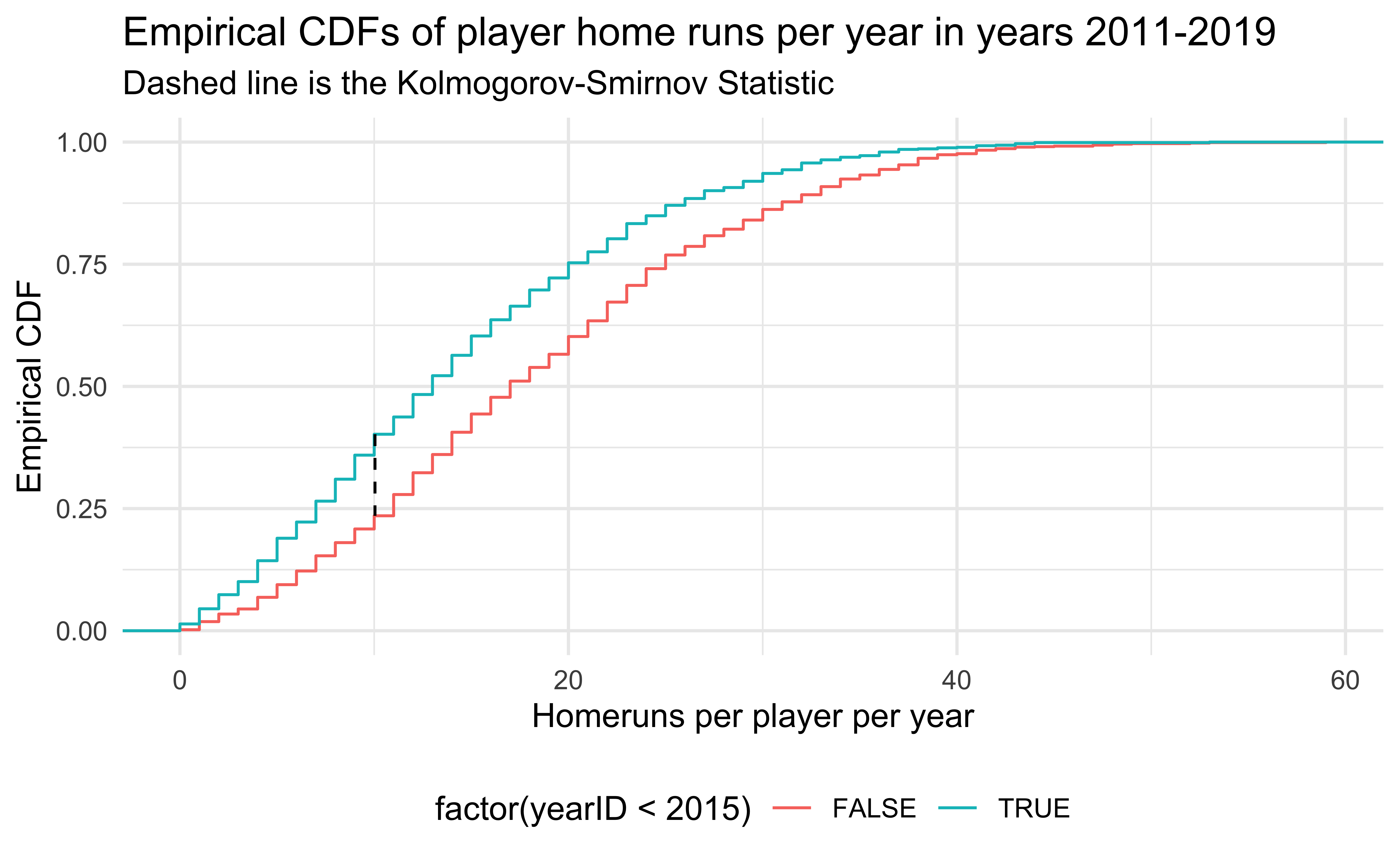
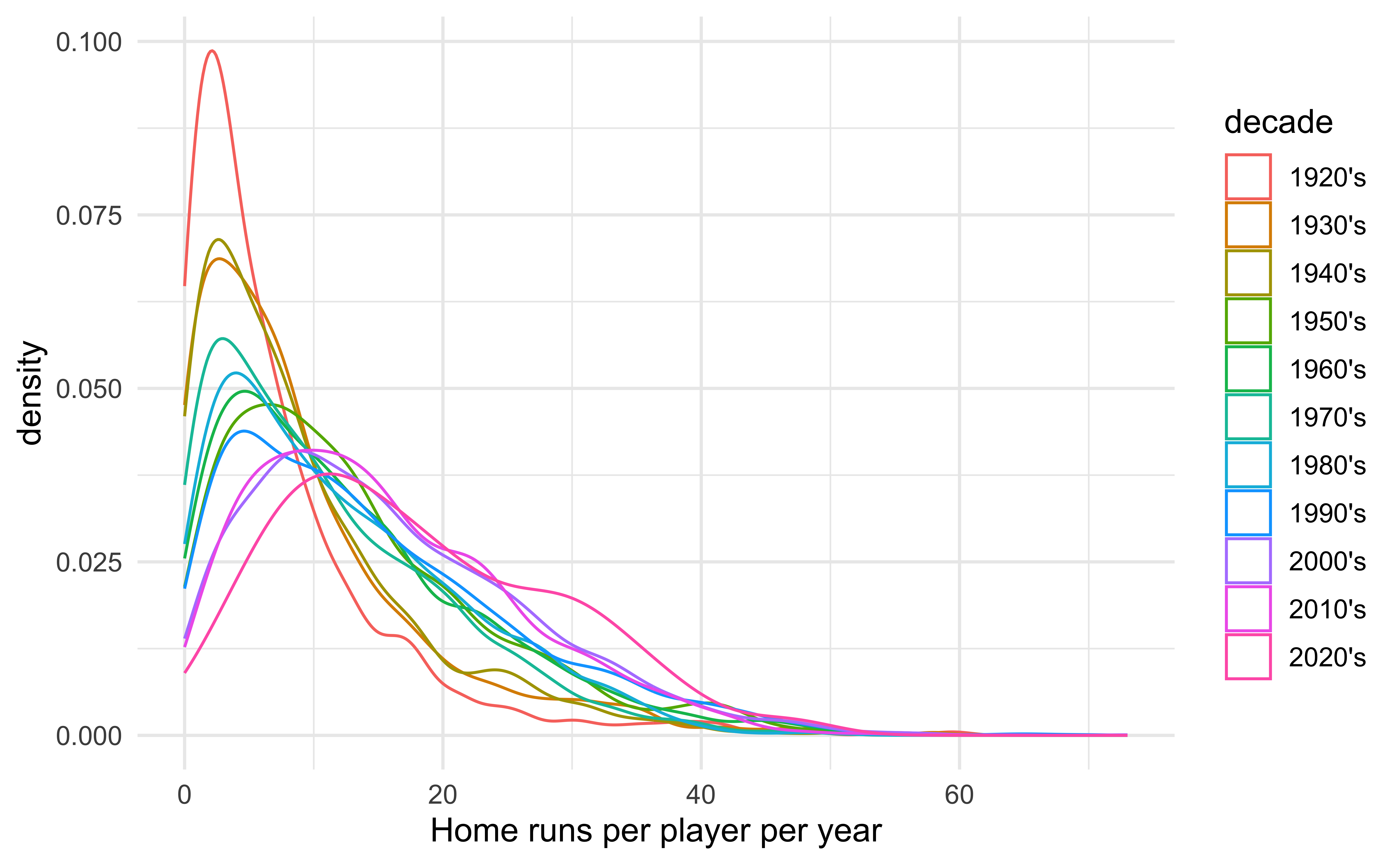
Major League Baseball was accused of replacing the standard baseballs with “juiced” baseballs (easier to hit home runs) secretly in the middle of 2015. Is there credence to this claim?
Comparing Distributions 2
HR2005 <- home_runs |>
  filter(yearID == 2005)
HR2006 <- home_runs |>
  filter(yearID == 2006)

ks.test(HR2005$HR, HR2006$HR)
    Asymptotic two-sample Kolmogorov-Smirnov test

data:  HR2005$HR and HR2006$HR
D = 0.073827, p-value = 0.503
alternative hypothesis: two-sided
ks_stat_0506 <- get_ks_df(HR2005$HR, HR2006$HR)
ggplot(rbind(HR2005, HR2006), aes(HR, color = factor(yearID))) +
stat_ecdf(geom = "step") +
geom_segment(
data = ks_stat_0506,
aes(
x = x,
y = y,
xend = xend,
yend = yend
),
color = "black",
linetype = "dashed"
) +
labs(
x = "Homeruns per player per year",
y = "Empirical CDF",
title = "Empirical CDFs of player home runs per year in years 2005 and 2006 ",
subtitle = "Dashed line is the Kolmogorov-Smirnov Statistic",
color = "Year"
) +
theme(legend.position = "bottom")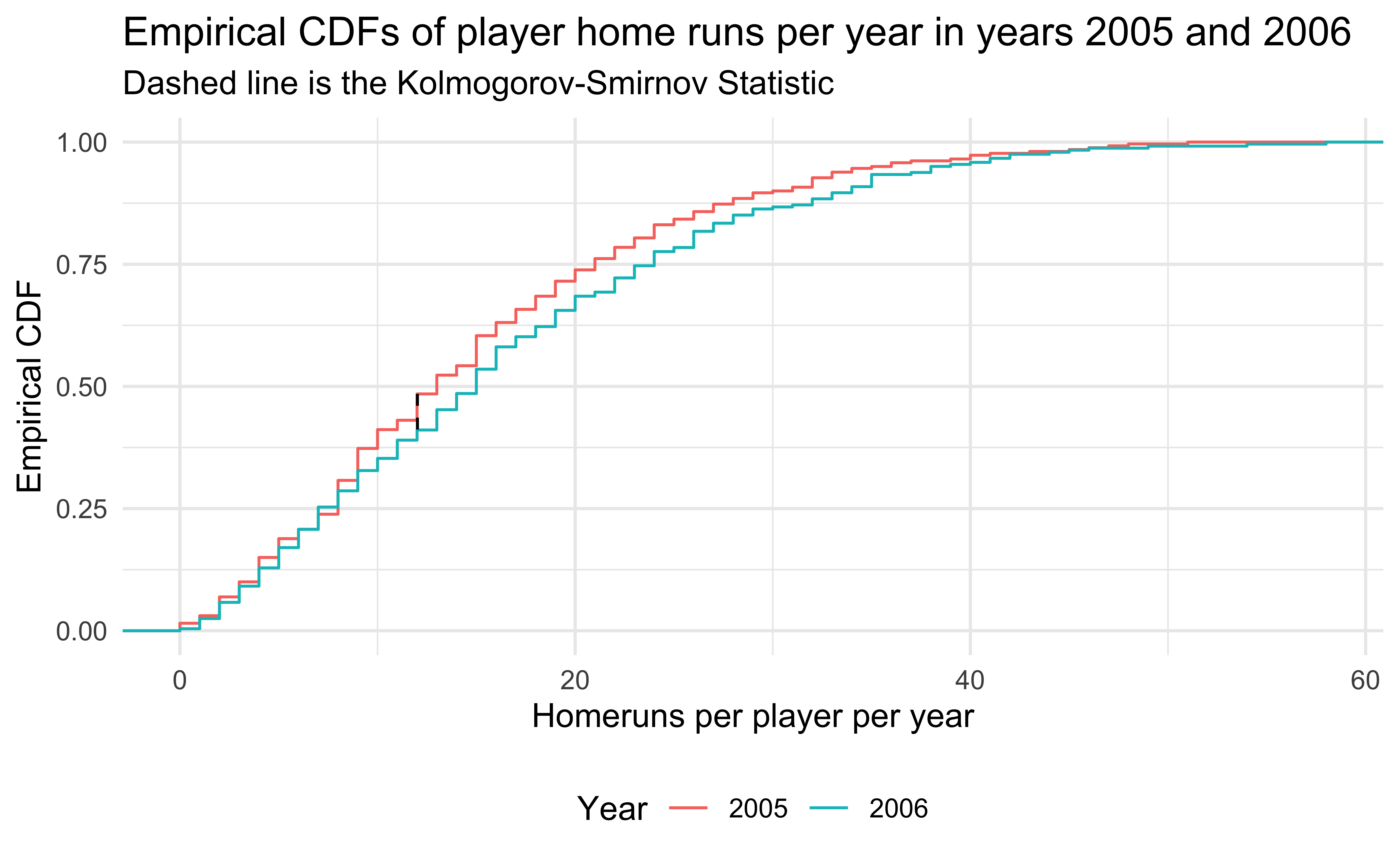
- 2005 and 2006 are similar years in terms of home runs, so the Kolmogorov-Smirnov test does not reject.
Visualizing the Matrix (p-values)
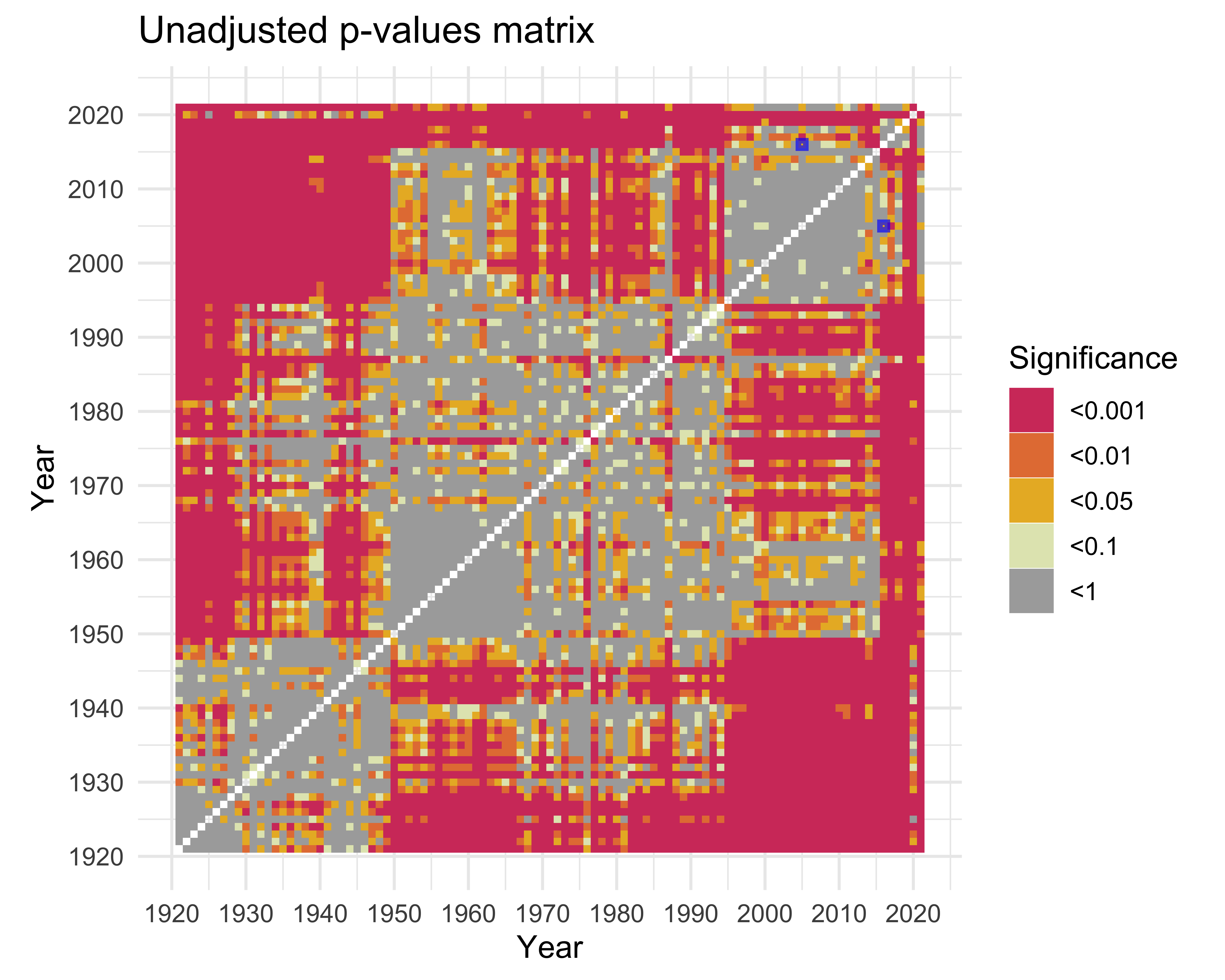
ks_matrix |>
  mutate(signif = cut(
    p_value,
    breaks = c(0, 0.001, 0.01, 0.05, 0.1, 1.001),
    labels = c("<0.001", "<0.01", "<0.05", "<0.1", "<1"),
    include.lowest = T,
  )) |>
  ggplot(aes(
    x = year1,
    y = year2,
    fill = factor(signif)
  )) +
  geom_tile() +
  scale_x_continuous(breaks = 1920 + seq(0, 10) * 10) +
  scale_y_continuous(breaks = 1920 + seq(0, 10) * 10) +
  scale_fill_manual(values = c(colorspace::heat_hcl(4), "#AAAAAA")) +
  labs(
    title = "Unadjusted p-values matrix",
    fill = "Significance",
    x = "Year",
    y = "Year"
  ) +
  coord_fixed() +
  annotate(
    "rect",
    xmin = c(2004.5, 2015.5),
    ymin = c(2015.5, 2004.5),
    xmax = c(2005.5, 2016.5),
    ymax = c(2016.5, 2005.5),
    color = "#0000FFaa",
    alpha = 0,
    size = 1
  )
HR2016 <- home_runs |>
  filter(yearID == 2016)

ks.test(HR2005$HR, HR2016$HR)
    Asymptotic two-sample Kolmogorov-Smirnov test

data:  HR2005$HR and HR2016$HR
D = 0.14405, p-value = 0.01089
alternative hypothesis: two-sided- There seems to be some patterns in our matrix, but there’s a problem…
Visualizing the Matrix (Corrections)
ks_matrix |>
  pivot_longer(
    c(
      "p_holm",
      "p_hochberg",
      "p_hommel",
      "p_bonferroni",
      "p_fdr",
      "p_BY"
    ),
    names_to = "adjustment",
    values_to = "adjusted_p"
  ) |>
  mutate(signif = cut(
    adjusted_p,
    breaks = c(0, 0.001, 0.01, 0.05, 0.1, 1.001),
    labels = c("<0.001", "<0.01", "<0.05", "<0.1", "<1"),
    include.lowest = T,
  )) |>
  ggplot(aes(
    x = year1,
    y = year2,
    fill = factor(signif)
  )) +
  geom_tile() +
  scale_x_continuous(breaks = 1920 + seq(0, 10) * 10) +
  scale_y_continuous(breaks = 1920 + seq(0, 10) * 10) +
  scale_fill_manual(values = c(colorspace::heat_hcl(4), "#AAAAAA")) +
  labs(
    x = "Year",
    y = "Year",
    fill = "Significance"
  ) +
  facet_wrap(~adjustment) +
  coord_fixed() +
  theme(
    axis.text.x = element_blank(),
    axis.ticks.x = element_blank(),
    axis.text.y = element_blank(),
    axis.ticks.y = element_blank()
  )
Controlling for the Family Wise Error Rate got rid of a lot of our interesting patterns. We don’t mind some false positives so we choose the BY adjustment as it controls False Discovery Rate but is a bit more conservative than FDR.
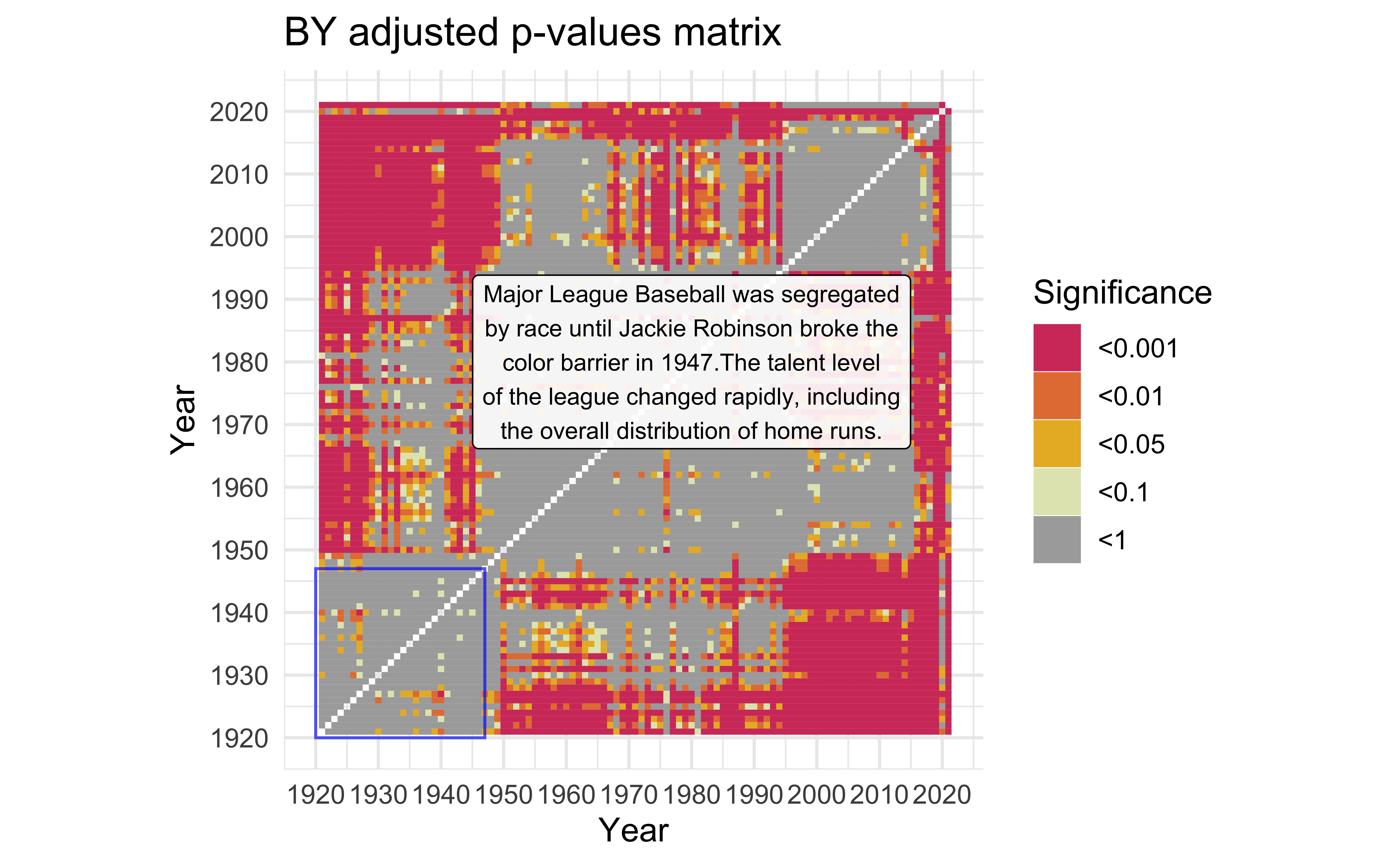
Pre-Integration
mat_BY <-
  ks_matrix |>
  mutate(signif = cut(
    p_BY,
    breaks = c(0, 0.001, 0.01, 0.05, 0.1, 1.001),
    labels = c("<0.001", "<0.01", "<0.05", "<0.1", "<1"),
    include.lowest = T,
  )) |>
  ggplot(aes(x = year1,
             y = year2)) +
  geom_tile(aes(fill = factor(signif))) +
  scale_x_continuous(breaks = 1920 + seq(0, 10) * 10) +
  scale_y_continuous(breaks = 1920 + seq(0, 10) * 10) +
  scale_fill_manual(values = c(colorspace::heat_hcl(4), "#AAAAAA")) +
  labs(title = "BY adjusted p-values matrix",
       fill = "Significance",
       x = "Year",
       y = "Year") +
  coord_fixed()

description <- "Major League Baseball was segregated by race until Jackie Robinson broke the color barrier in 1947.The talent level of the league changed rapidly, including the overall distribution of home runs." |>
  str_wrap(width=40)

mat_BY +
  annotate(
    "rect",
    xmin = 1920,
    ymin = 1920,
    xmax = 1947,
    ymax = 1947,
    color = "#0000FFaa",
    alpha = 0
  ) +
  annotate(
    "label",
    x = 1980,
    y = 1980,
    label = description,
    alpha = 0.9,
    size = 3
  )
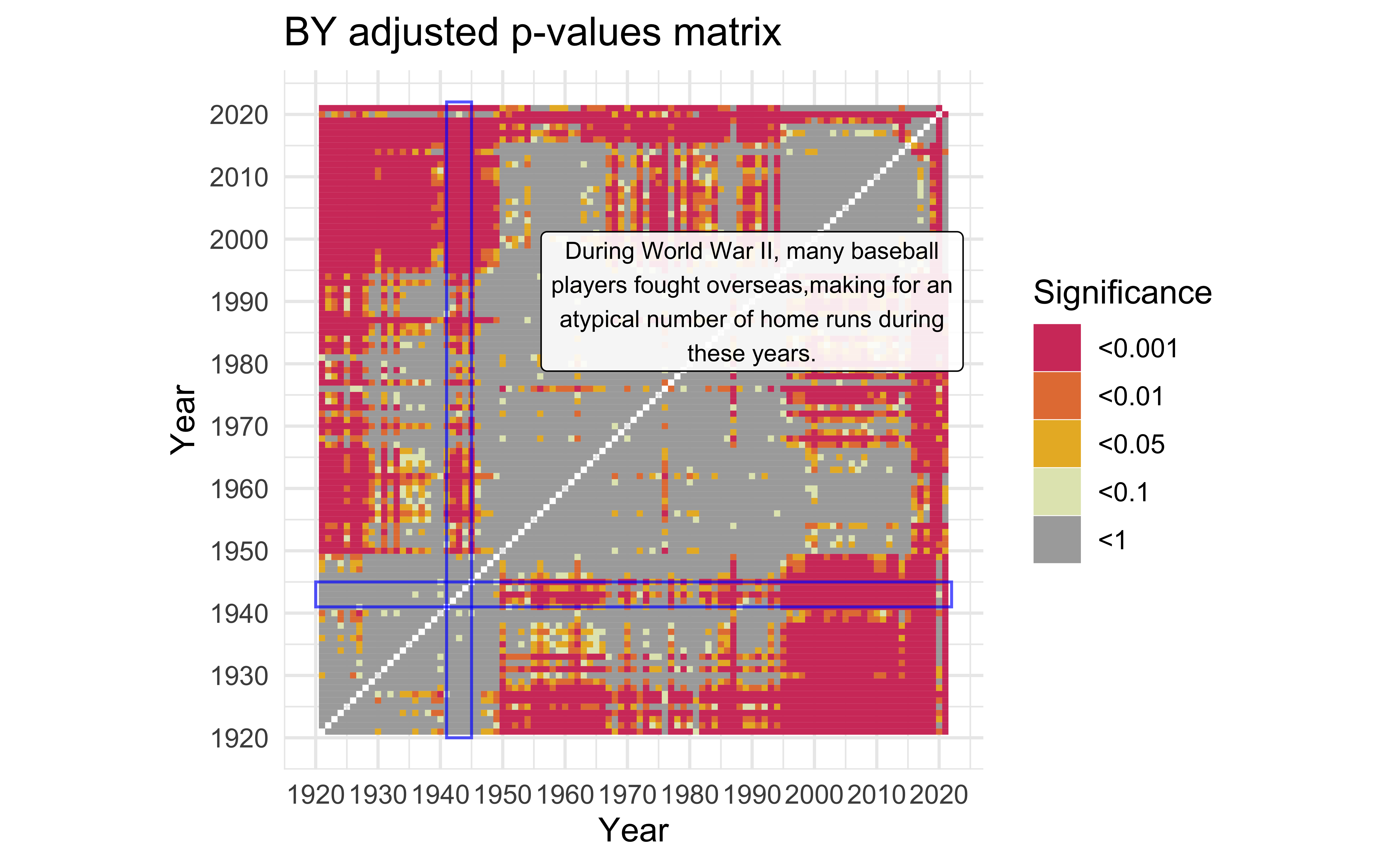
World War II
description <-
  "During World War II, many baseball players fought overseas,making for an atypical number of home runs during these years." |>
  str_wrap(width=40)

mat_BY +
  annotate(
    "rect",
    xmin = c(1920, 1941),
    ymin = c(1941, 1920),
    xmax = c(2022, 1945),
    ymax = c(1945, 2022),
    color = "#0000FFaa",
    alpha = 0
  ) +
  annotate(
    "label",
    x = 1990,
    y = 1990,
    label = description,
    alpha = 0.9,
    size = 3
  )
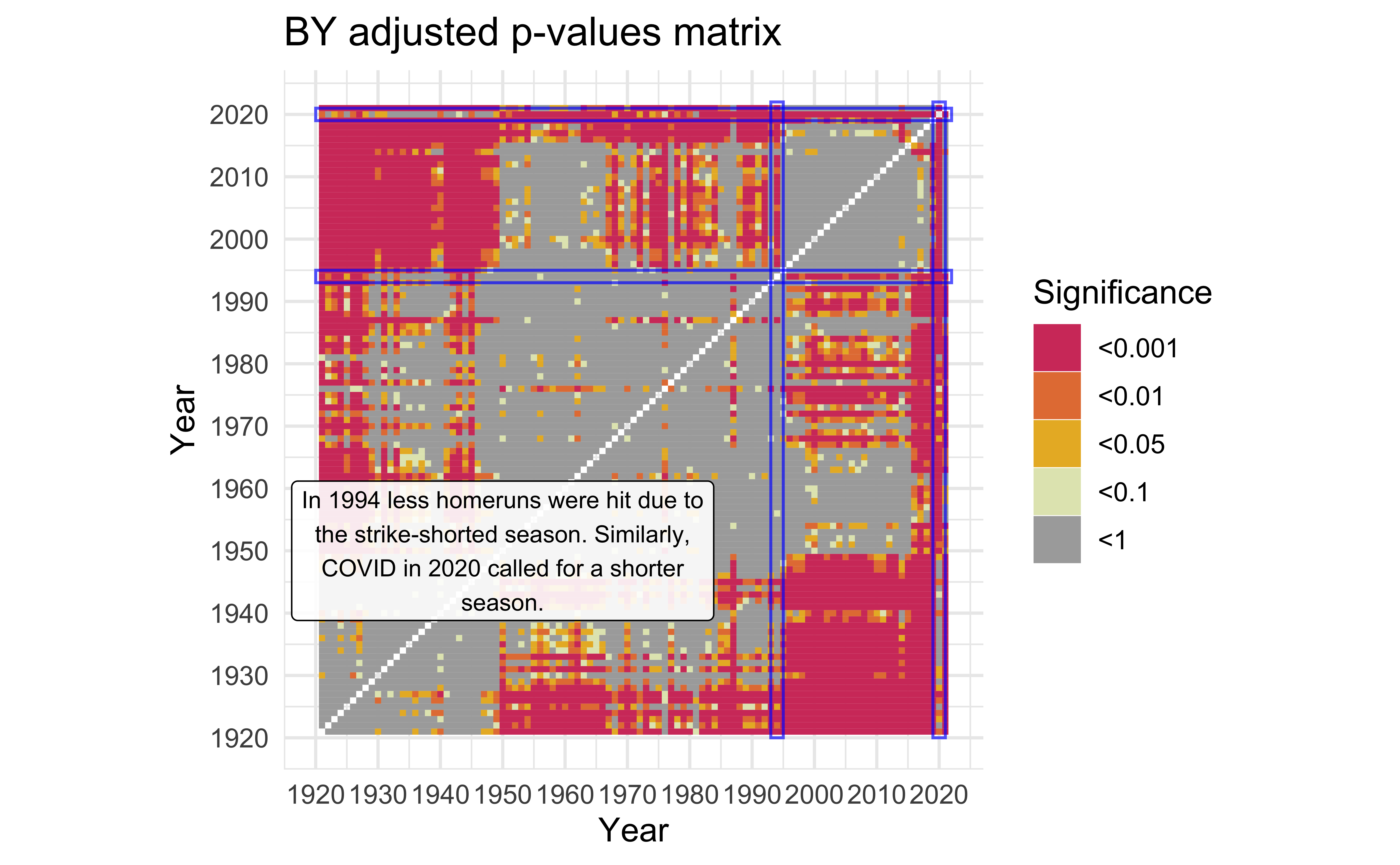
Shortened Seasons
description <-
  "In 1994 less homeruns were hit due to the strike-shorted season. Similarly, COVID in 2020 called for a shorter season." |>
  str_wrap(width=40)

mat_BY +
  annotate(
    "rect",
    xmin = c(1920, 2019, 1920, 1993),
    ymin = c(2019, 1920, 1993, 1920),
    xmax = c(2022, 2021, 2022, 1995),
    ymax = c(2021, 2022, 1995, 2022),
    color = "#0000FFaa",
    alpha = 0
  ) +
  annotate(
    "label",
    x = 1950,
    y = 1950,
    label = description,
    alpha = 0.9,
    size = 3
  )
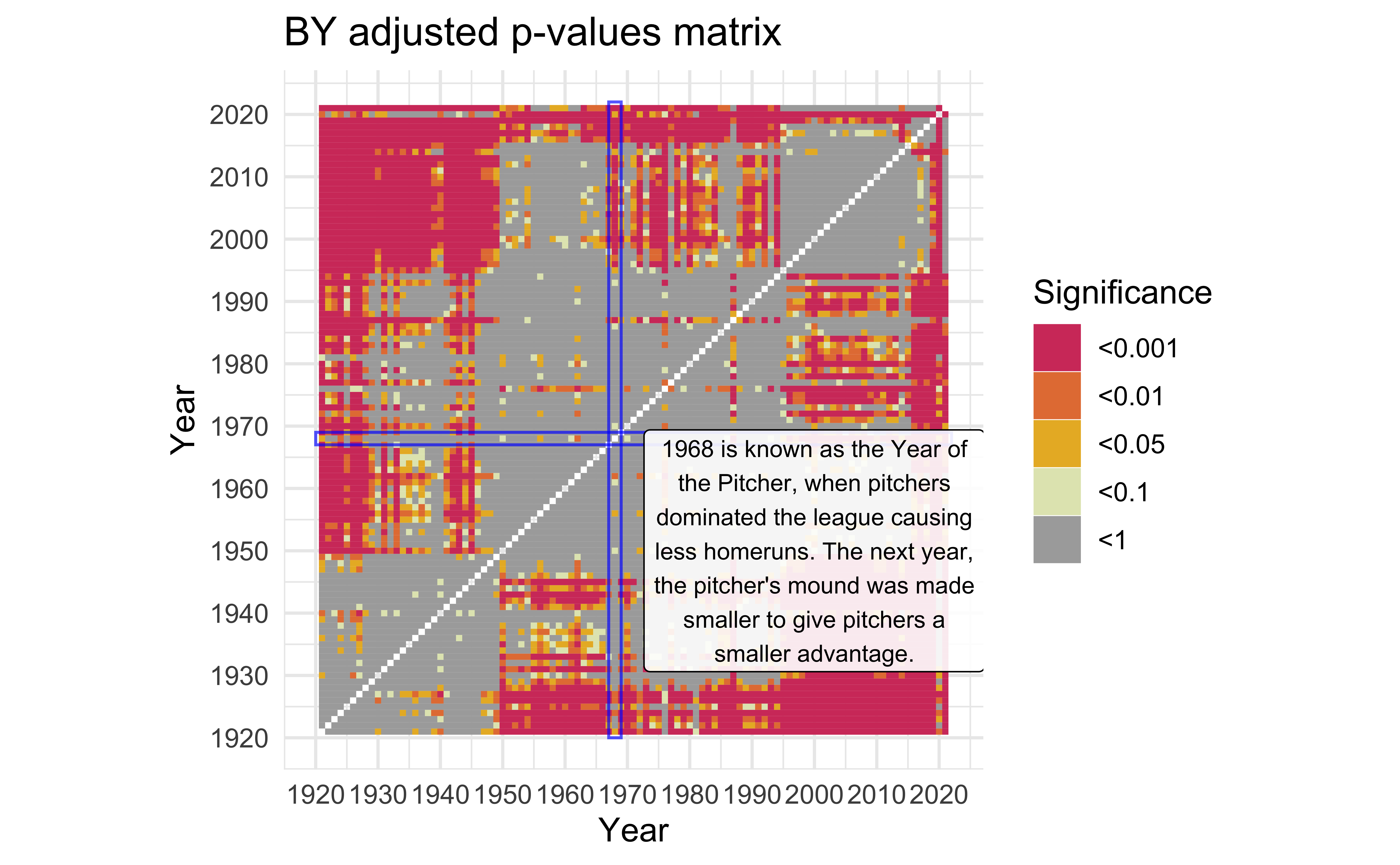
Year of the Pitcher
description <-
  "1968 is known as the Year of the Pitcher, when pitchers dominated the league causing less homeruns. The next year, the pitcher's mound was made smaller to give \npitchers a smaller advantage." |>
  str_wrap(width = 30)

mat_BY +
  annotate(
    "rect",
    xmin = c(1920, 1967),
    ymin = c(1967, 1920),
    xmax = c(2022, 1969),
    ymax = c(1969, 2022),
    color = "#0000FFaa",
    alpha = 0
  ) +
  annotate(
    "label",
    x = 2000,
    y = 1950,
    label = description,
    alpha = 0.9,
    size = 3
  )
Summary
- The Empirical CDF is a very useful tool in statistics, for both analysis and visualization.
- The Kolmogorov-Smirnov Test is a good way to test if two distributions of values are different.
- However, be careful as it is only an approximate test with discrete values.
- Furthermore, be sure to use multiple testing corrections if testing many different distributions.
- Baseball is interesting! (you may disagree on this one)
![]()