# load packages
library(tidyverse)
library(glue)
library(lubridate)
library(scales)
library(countdown)

# set theme for ggplot2
ggplot2::theme_set(ggplot2::theme_minimal(base_size = 14))

# set width of code output
options(width = 65)

# set figure parameters for knitr
knitr::opts_chunk$set(
  fig.width = 7,        # 7" width
  fig.asp = 0.618,      # the golden ratio
  fig.retina = 3,       # dpi multiplier for displaying HTML output on retina
  fig.align = "center", # center align figures
  dpi = 300             # higher dpi, sharper image
)Data wrangling - I
Lecture 3
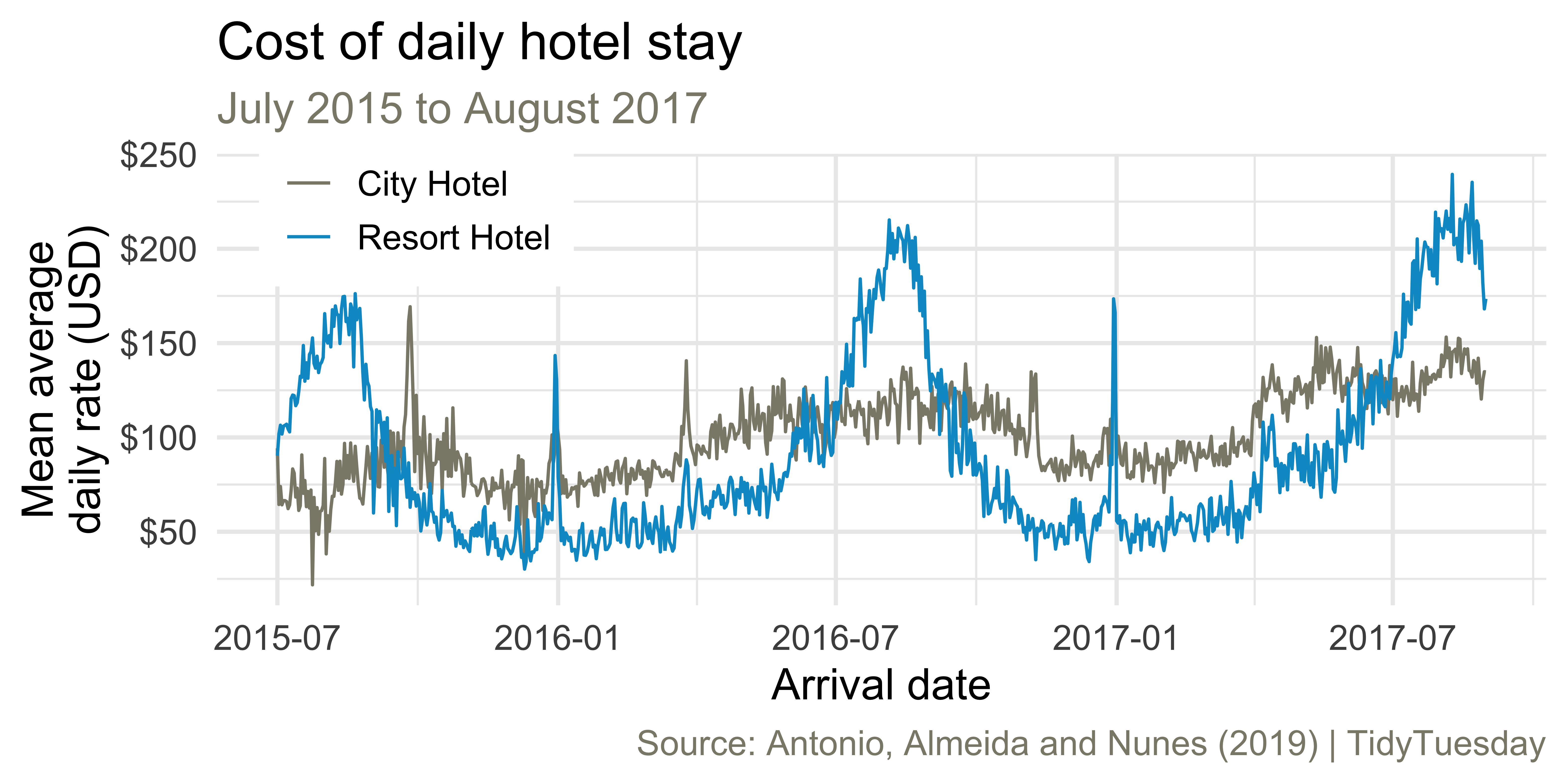
Average cost of daily stay
Let’s recreate this visualization!
Livecoding
Reveal below for code developed during live coding session.
Code
hotels |>
  mutate(
    arrival_date = glue::glue("{arrival_date_year}-{arrival_date_month}-{arrival_date_day_of_month}"),
    arrival_date = ymd(arrival_date)
    ) |>
  group_by(hotel, arrival_date) |>
  summarise(mean_adr = mean(adr), .groups = "drop") |>
  ggplot(aes(x = arrival_date, y = mean_adr, group = hotel, color = hotel)) +
  geom_line() +
  scale_color_manual(values = c("cornsilk4", "deepskyblue3")) +
  scale_y_continuous(labels = label_dollar()) +
  labs(
    x = "Arrival date",
    y = "Mean average\ndaily rate (USD)",
    color = NULL,
    title = "Cost of daily hotel stay",
    subtitle = "July 2015 to August 2017",
    caption = "Source: Antonio, Almeida and Nunes (2019) | TidyTuesday"
  ) +
  theme(
    legend.position = c(0.15, 0.9),
    legend.box.background = element_rect(fill = "white",
                                         color = "white"),
    plot.subtitle = element_text(color = "cornsilk4"),
    plot.caption = element_text(color = "cornsilk4")
)![]()